

Clickthrough Landing Page Inspirations
Landing pages designed to warm up visitors before directing them to purchase or conversion, often used in retargeting campaigns.
12 examples in this category
 View Example →Jones Road Beauty - Makeup SetOctober 16, 2025
 View Example →Taboola - Taboola AdsOctober 16, 2025
 View Example →Siddharth Rajsekar - Course PageOctober 16, 2025
 View Example →Supply - Shave ProductsOctober 16, 2025
 View Example →Jones Road BeautyOctober 16, 2025
 View Example →Jones Road Beauty - Beauty ProductOctober 16, 2025
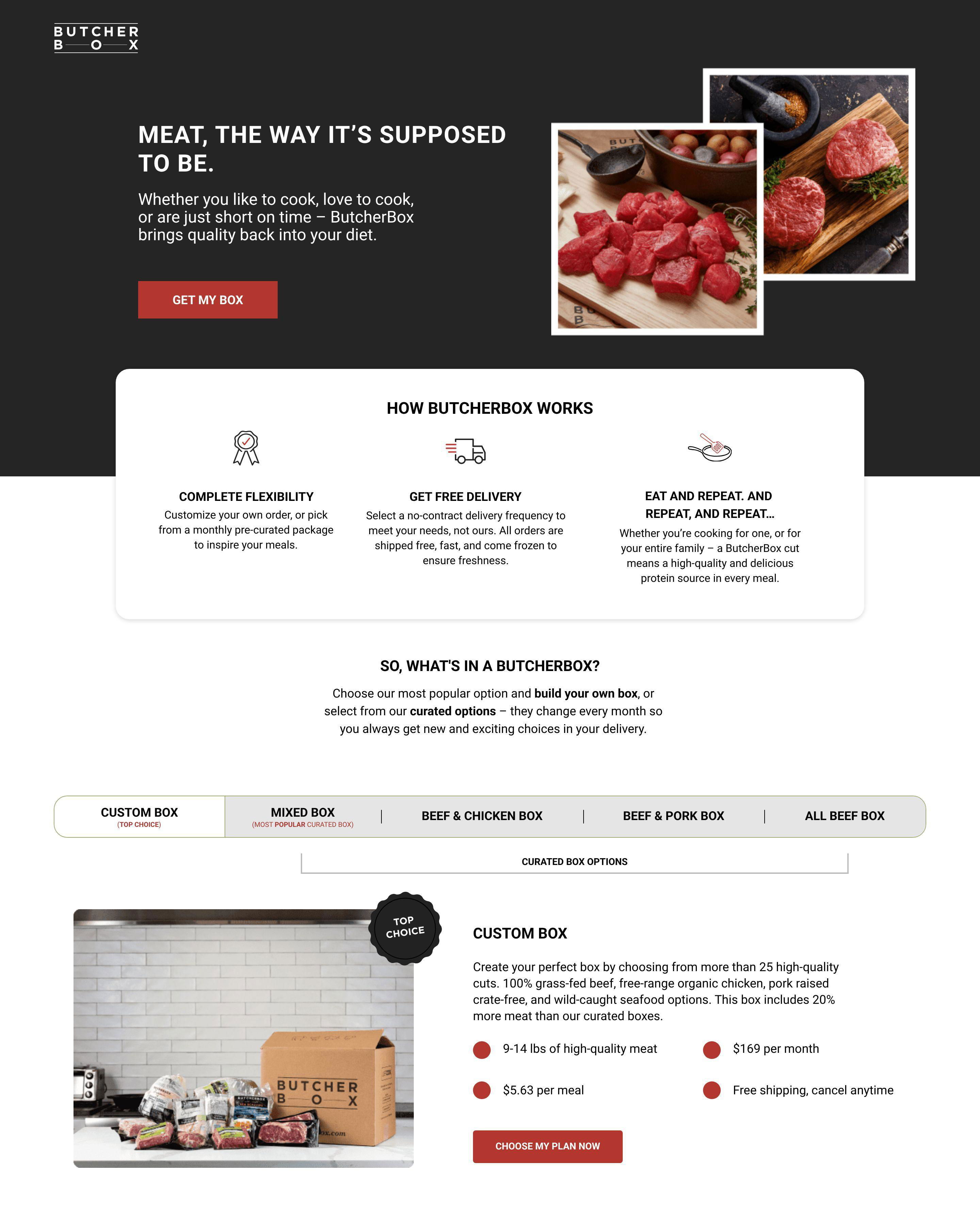 View Example →Meat SubscriptionJanuary 28, 2026
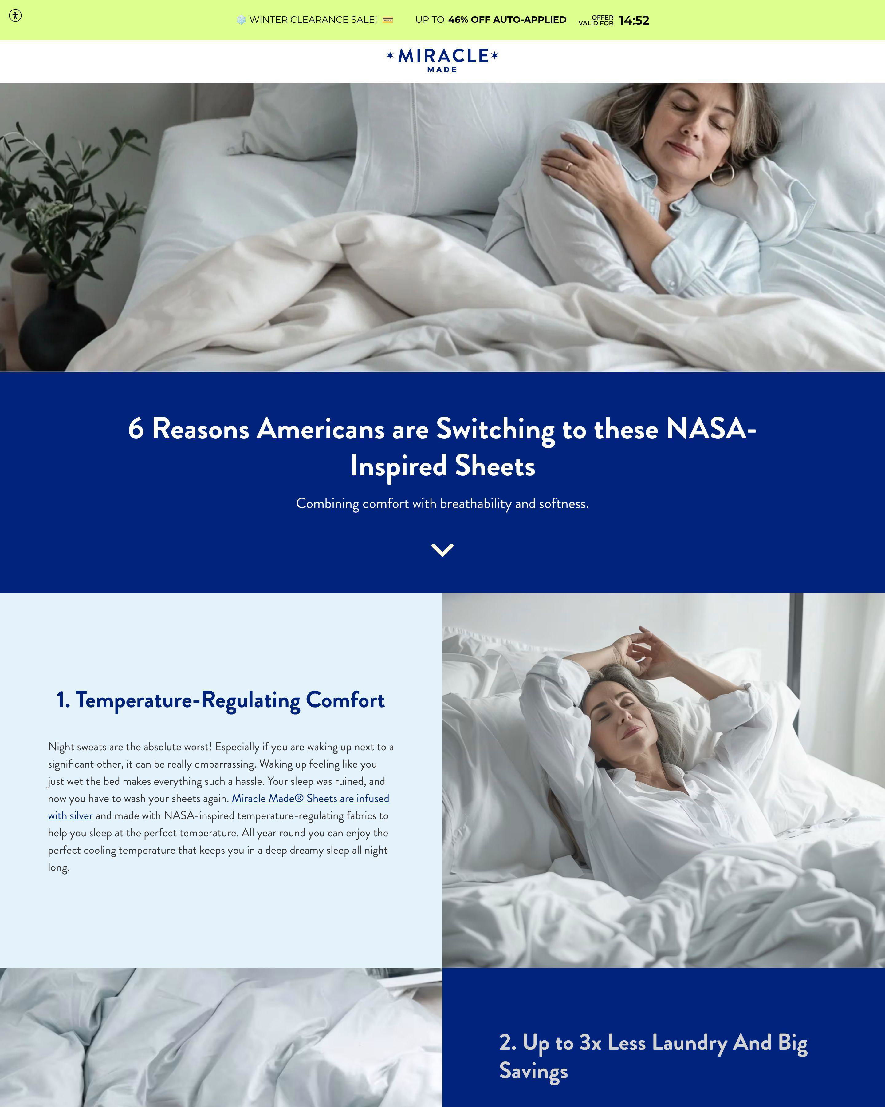 View Example →MiraclebrandJanuary 27, 2026
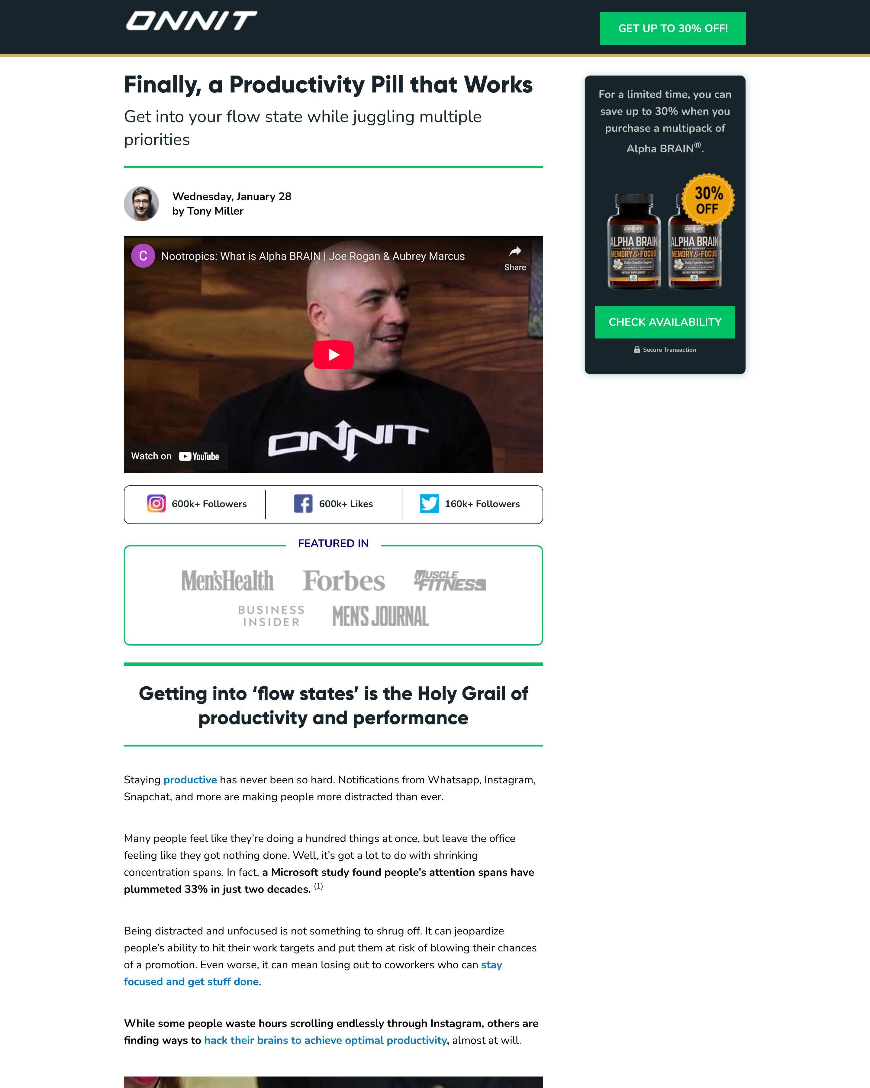 View Example →Brain NootropicJanuary 28, 2026
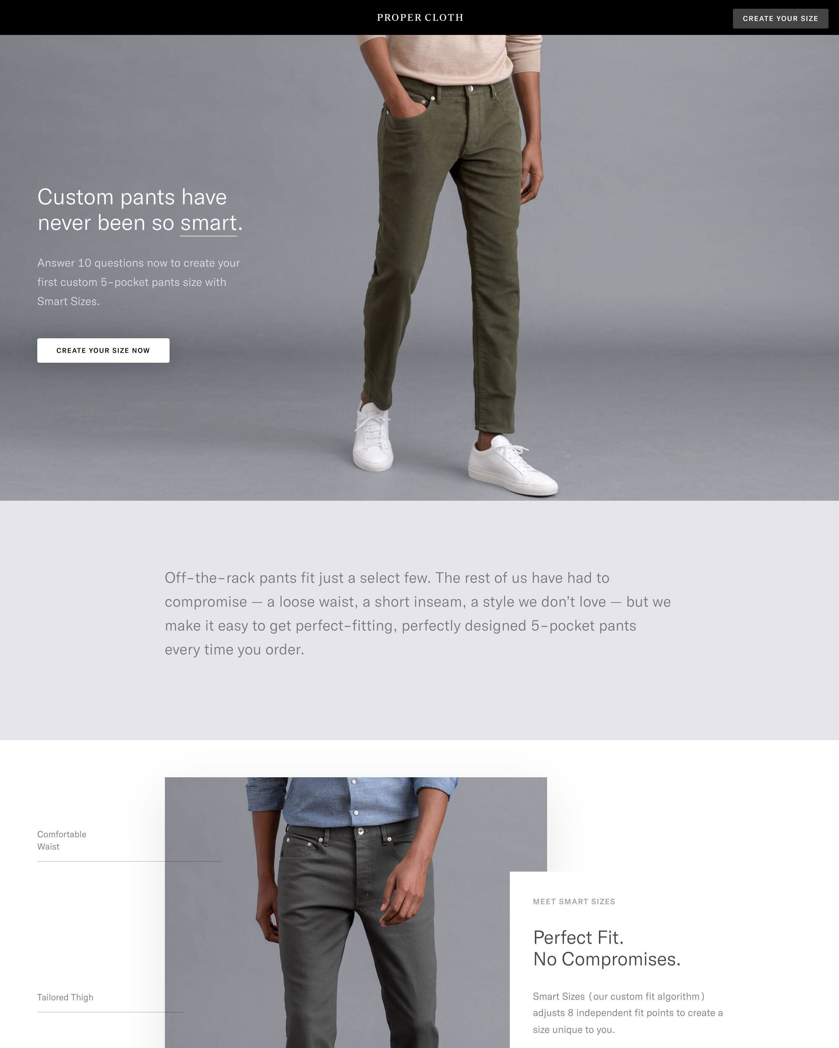 View Example →Custom FitJanuary 28, 2026
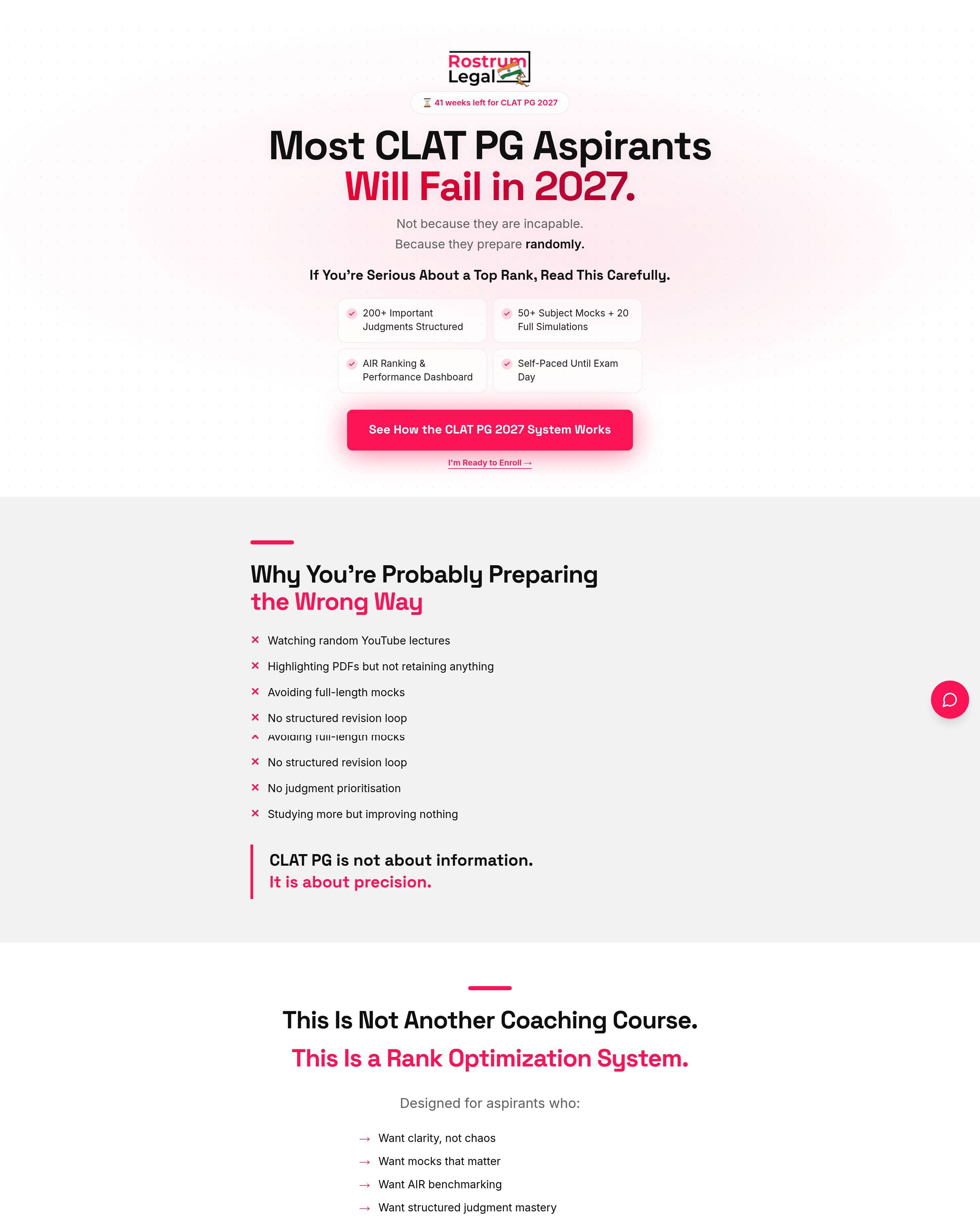 View Example →Rank OptimizerFebruary 26, 2026
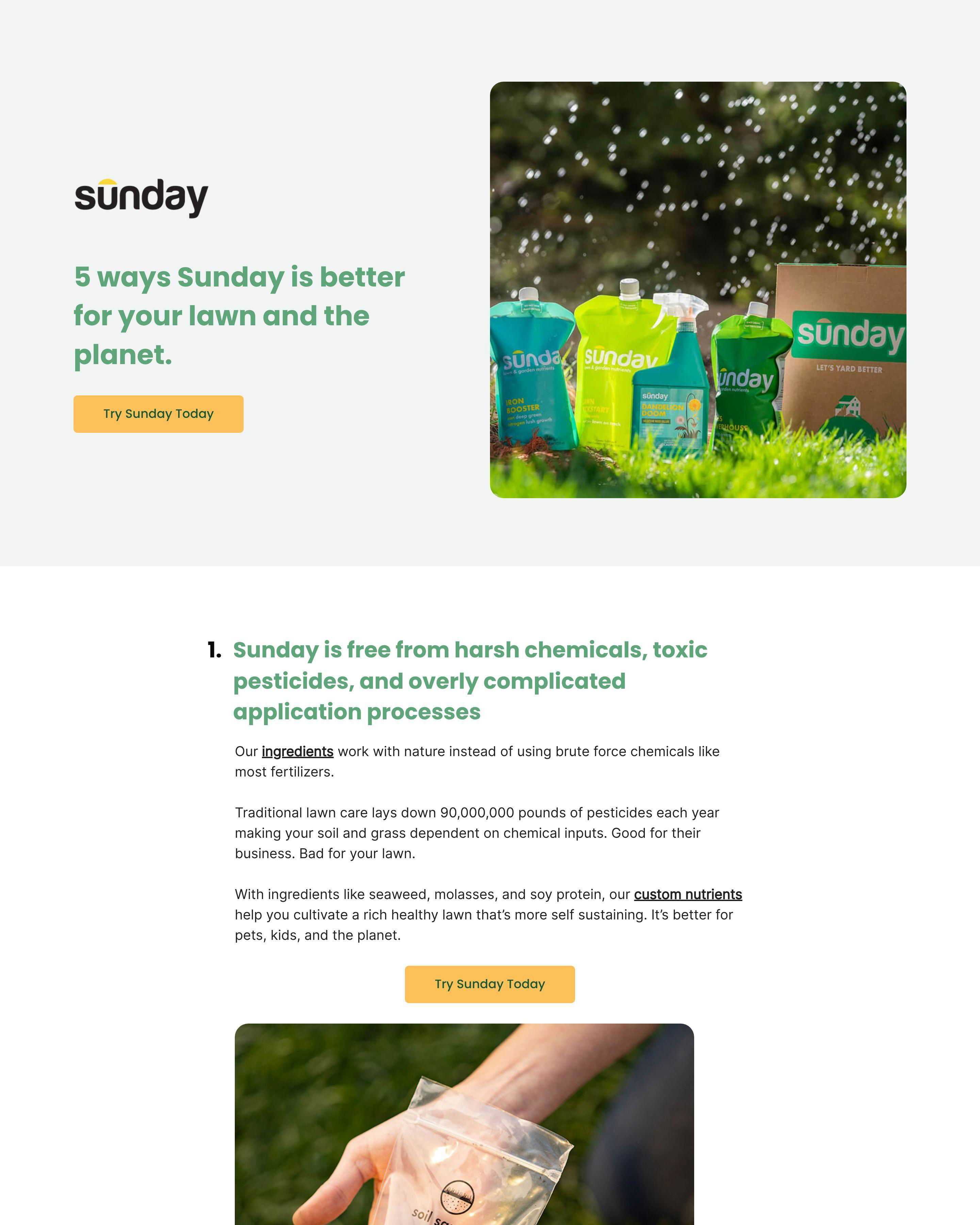 View Example →Smart LawnJanuary 28, 2026
What Makes Clickthrough Pages Different
Clickthrough pages serve one purpose: move visitors from curiosity to readiness. They sit between awareness and action. The visitor has clicked an ad but is not ready to buy. Your page bridges that gap.
Jones Road Beauty uses clickthrough pages masterfully. Their makeup set pages showcase products with beautiful photography, explain benefits briefly, and create desire. The page does not close the sale. It warms the visitor up before sending them to the product page or cart.
Taboola's advertising platform page follows the same logic. It explains the value proposition, shows results, and builds interest. The goal is not immediate signup but clicking through to learn more or start a conversation.
See our expert picks: Best Landing Page Examples of 2026 →
Key Patterns Across These Examples
Pattern 1: Visual-First Design
Jones Road Beauty's clickthrough pages lead with product photography that creates desire. Supply shows their razors in action. These pages understand that words convince but images compel. The visual does the heavy lifting while copy provides justification.
Pattern 2: Single, Clear CTA
Every page in this collection points to one action. Jones Road Beauty says "Shop Now." Taboola says "Get Started." Siddharth Rajsekar's course page says "Enroll Now." Multiple competing CTAs dilute focus. Clickthrough pages succeed by making the next step obvious.
Pattern 3: Benefit-Focused Copy Over Features
Supply's pages talk about smooth shaves and saved money, not blade angles and handle materials. Jones Road Beauty discusses "natural beauty" not "mineral ingredients." Clickthrough pages are not the place for specifications. Save details for the destination page.
Frequently Asked Questions
What makes a good clickthrough landing page?
Momentum without friction. Jones Road Beauty's pages create desire and make clicking through feel natural. The page does enough to interest but not so much that visitors feel sold. Strike the balance between intrigue and information.
What conversion rate should a clickthrough landing page achieve?
Clickthrough rates should hit 30-60% for retargeting audiences. Cold traffic clicks through at 10-20%. Supply and Jones Road Beauty optimize for qualified clicks, not maximum clicks. A visitor who clicks and bounces wastes everyone's time.
How long should a clickthrough landing page be?
Short. These pages exist to warm up, not close. Jones Road Beauty shows the product, explains the benefit, and invites the click. Three scrolls maximum. If your clickthrough page needs extensive content, you are trying to do too much on one page.
What is the most important element on a clickthrough landing page?
The hero image and primary CTA. Taboola's page works because the value proposition is clear within seconds and the button is obvious. Visitors decide quickly whether to click through. Make that decision easy with strong visuals and clear direction.
Related Resources
- Best Landing Page Examples of 2026 — Expert picks with detailed analysis
- Clickthrough Landing Page Templates — Start building today
- Browse All Landing Pages for Inspiration — Explore other industries and page types