

Cancer Workshop Landing Page Example
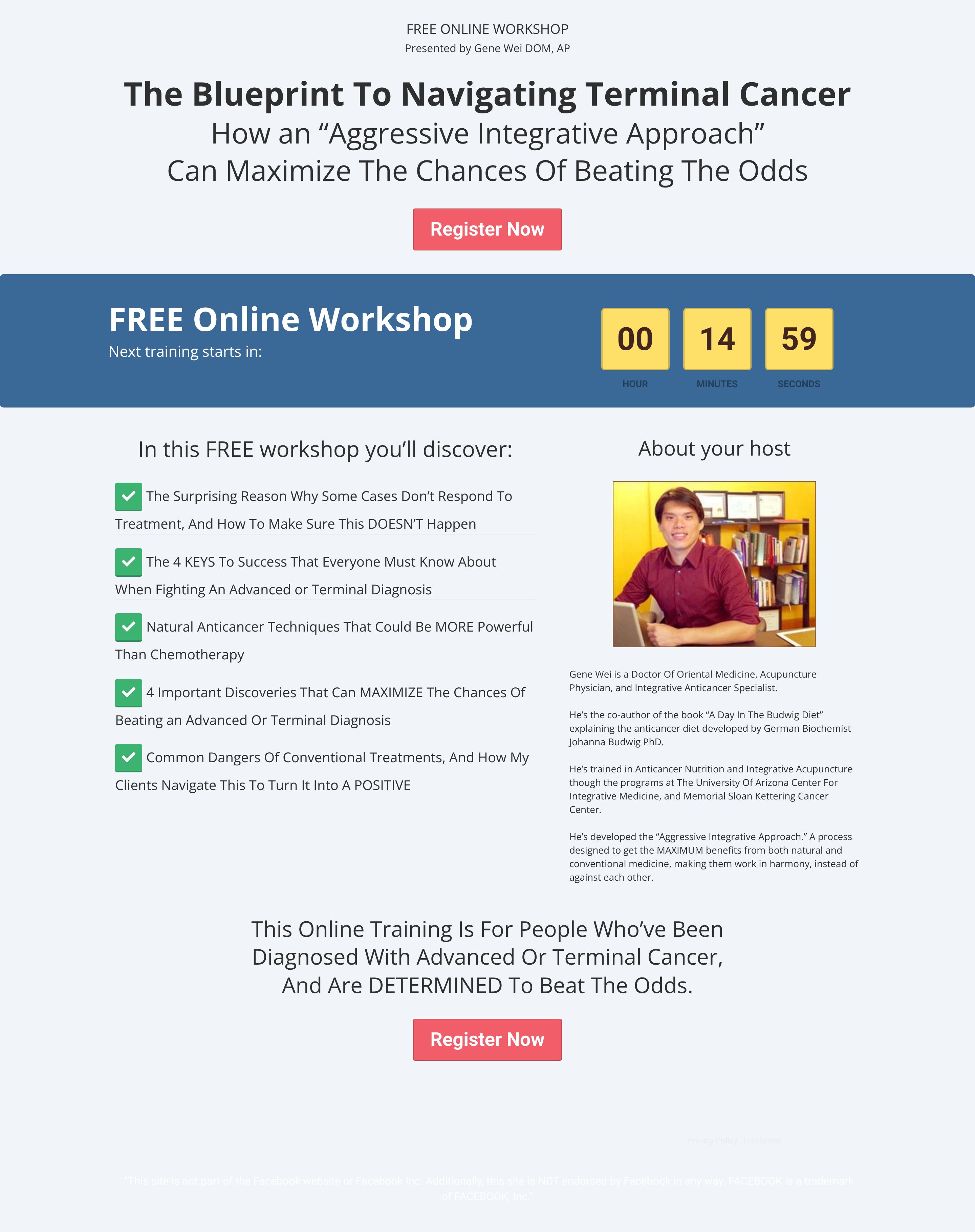
The landing page is for a free online workshop titled "The Blueprint To Navigating Terminal Cancer," hosted by a specialist in integrative medicine. The primary business goal is lead generation, encouraging visitors to register for the upcoming webinar session.
Check out our curated database of landing page examples to see what is working right now.
To create a high-converting page like this, use Swipe Pages, a leading landing page builder and funnel platform for conversion focussed marketers
Key Insights
What Works Well
- Clear Value Proposition: The headline directly addresses a specific, high-stakes pain point ("Navigating Terminal Cancer") and offers a promising solution ("Aggressive Integrative Approach").
- Prominent CTA: The "Register Now" buttons use a high-contrast red color against the light background, making them stand out effectively on both devices.
- Trust Signals: The "About your host" section details Gene Wei’s specific credentials (DOM, AP) and affiliations (University of Arizona, Memorial Sloan Kettering), establishing authority.
- Mobile Responsiveness: The mobile version effectively stacks the two-column desktop layout into a logical single column, maintaining legible font sizes and clear hierarchy.
- Supporting Content: The use of green checkmark icons with bolded bullet points makes the workshop takeaways easy to scan and digest.
Opportunities for Improvement
- Social Proof: There are no visible testimonials, success stories, or "As Seen On" media logos, which are critical for building trust in the health/medical niche.
- Visuals: The design is somewhat dated; adding images of the workshop interface, diagrams of the "Blueprint," or a video introduction could increase engagement.
- Objection Handling: While there is a host bio, a dedicated FAQ section or clearer scientific backing (referencing studies) would help address skepticism regarding "natural techniques."
- CTA Optimization: The CTA text "Register Now" is generic; testing benefit-driven copy like "Watch the Training" or "Start My Recovery Plan" might improve click-through rates.
Layout Differences: Desktop vs Mobile
- Desktop: Features a two-column layout where the "What you'll discover" benefits list sits side-by-side with the "About your host" section. The countdown timer is integrated into a blue banner.
- Mobile: All elements are stacked vertically in a single column. The countdown timer takes up more relative screen real estate, emphasizing urgency. The host image becomes full-width.
Summary
The page succeeds in clearly defining its offer and target audience with a strong, urgent headline and credible host details. However, to maximize conversions in such a sensitive niche, it urgently needs social proof (testimonials) and a visual refresh to boost perceived professionalism and trust.


