

Medicare Workshop Landing Page Example
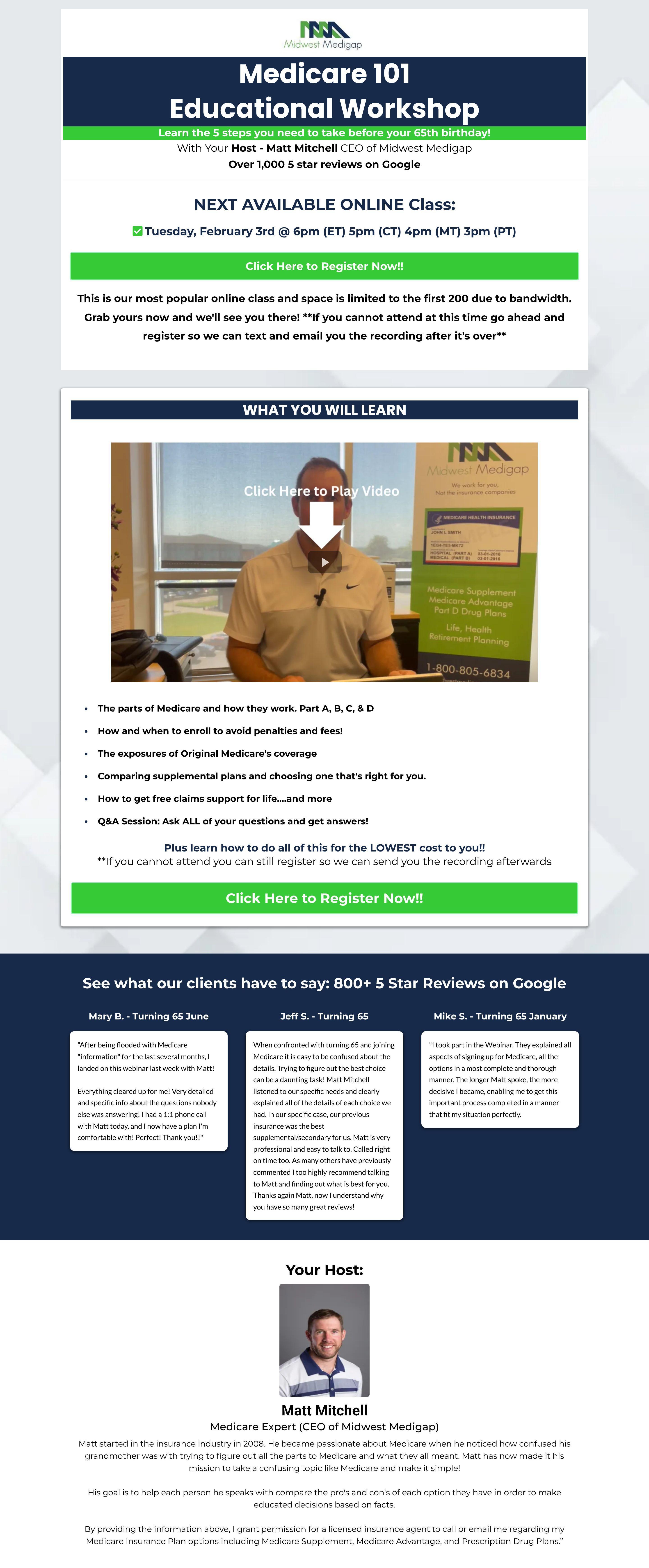
The landing page is for an "Educational Workshop" on "Medicare 101." It features Matt Mitchell, CEO of Midwest Medigap. The primary business goal is to get users to register for the workshop.
Check out our curated database of landing page examples to see what is working right now.
To create a high-converting page like this, use Swipe Pages, a leading landing page builder and funnel platform for conversion focussed marketers
Key Insights
What Works Well
- Clear Value Proposition: The main headline "Medicare 101 Educational Workshop" and the sub-headline "Learn the secrets your insurance company doesn't want you to take" immediately convey the topic and benefit of the workshop.
- Prominent CTA: The "Click Here to Register Now!!" buttons are clear, use contrasting green color, and are strategically placed above the fold and below the video section.
- Trust Signals: The claim "Over 1,000 5 star reviews on Google" is prominently displayed, and customer testimonials are present further down the page. The host's clear identification as "Matt Mitchell CEO of Midwest Medigap" also serves as a strong trust signal.
- Mobile Responsiveness: The mobile screenshot demonstrates good adaptation, with content, headlines, and CTAs stacking vertically for optimal viewing on smaller screens, maintaining readability and accessibility.
- Supporting Content: The "What You Will Learn" section effectively uses bullet points to detail the workshop's benefits, and a dedicated host biography adds credibility and personal connection.
Opportunities for Improvement
- Social Proof: While testimonials are present, personalizing them with headshots would enhance their impact. Adding specific platform logos (e.g., Google) with star ratings for the "1,000 5 star reviews" claim could further build trust.
- Objection Handling: A concise mini-FAQ section could address common user concerns, such as what to do if the live session is missed (though the recording note is helpful, it could be more prominent) or clarifying if it's a sales pitch.
- Visuals: The video thumbnail is generic and could be more engaging. Including screenshots or a short introductory video showcasing the actual workshop content would provide a clearer expectation and draw more interest.
- CTA Optimization: The CTA text "Click Here to Register Now!!" could be more benefit-oriented or specific, e.g., "Register for Free Medicare Workshop." A sticky CTA button on mobile could improve conversions on longer scrolls.
Layout Differences: Desktop vs Mobile
- Desktop: The desktop version utilizes a wider layout, allowing for elements like the video and bullet points to be positioned side-by-side. Testimonials are displayed in a grid-like fashion, making efficient use of space.
- Mobile: Elements are effectively stacked vertically for enhanced readability on smaller screens. Essential elements like the main CTA and headlines remain clearly visible at the top. Testimonials transition from a grid to a stacked layout.
Summary
The landing page clearly communicates its value proposition for a Medicare educational workshop and leverages strong trust signals. Key strengths include clear CTAs and good mobile responsiveness. Opportunities for optimization lie in enhancing social proof visuals, proactively addressing user objections through FAQs, improving the visual appeal of the workshop content, and refining CTA messaging and placement, particularly for mobile users.


