Loading...
Loading...
Landing pages promoting events, webinars, conferences, and workshops with registration forms designed to drive ticket sales and attendee signups.
24 examples in this category

Recently Added

Recently Added

Recently Added

Recently Added

Recently Added

Recently Added

Recently Added
Recently Added
Recently Added
Recently Added
Recently Added
Recently Added
Recently Added
Recently Added
Recently Added
Recently Added
Recently Added
Recently Added

Recently Added
Recently Added
Recently Added
Recently Added
Recently Added
Recently Added
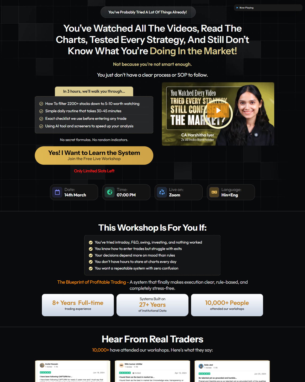
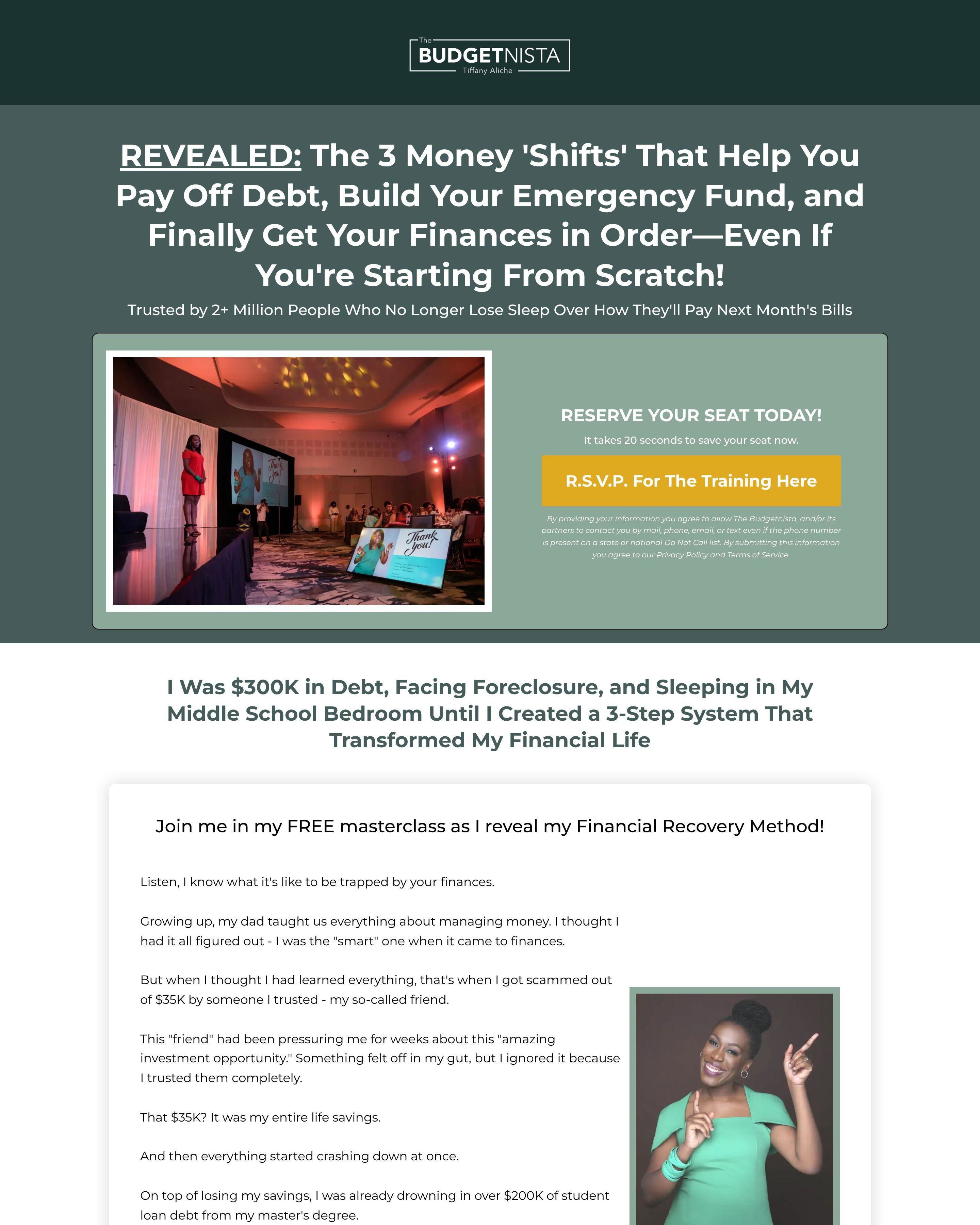
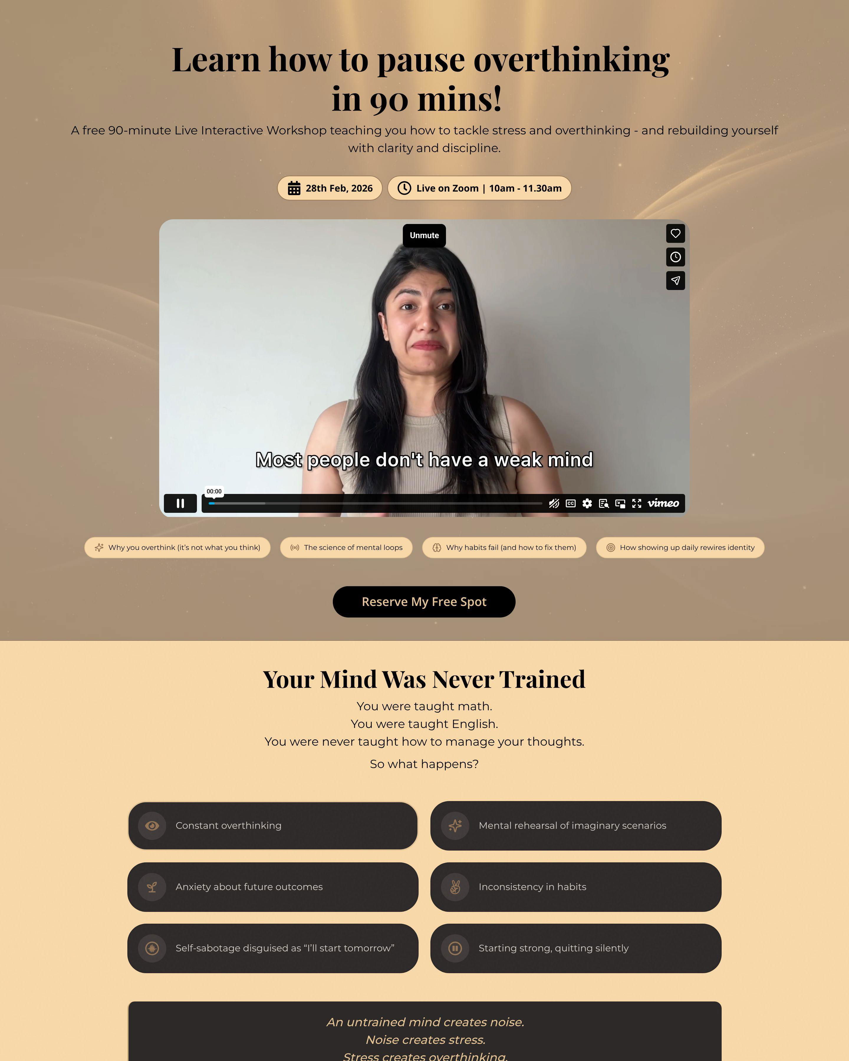
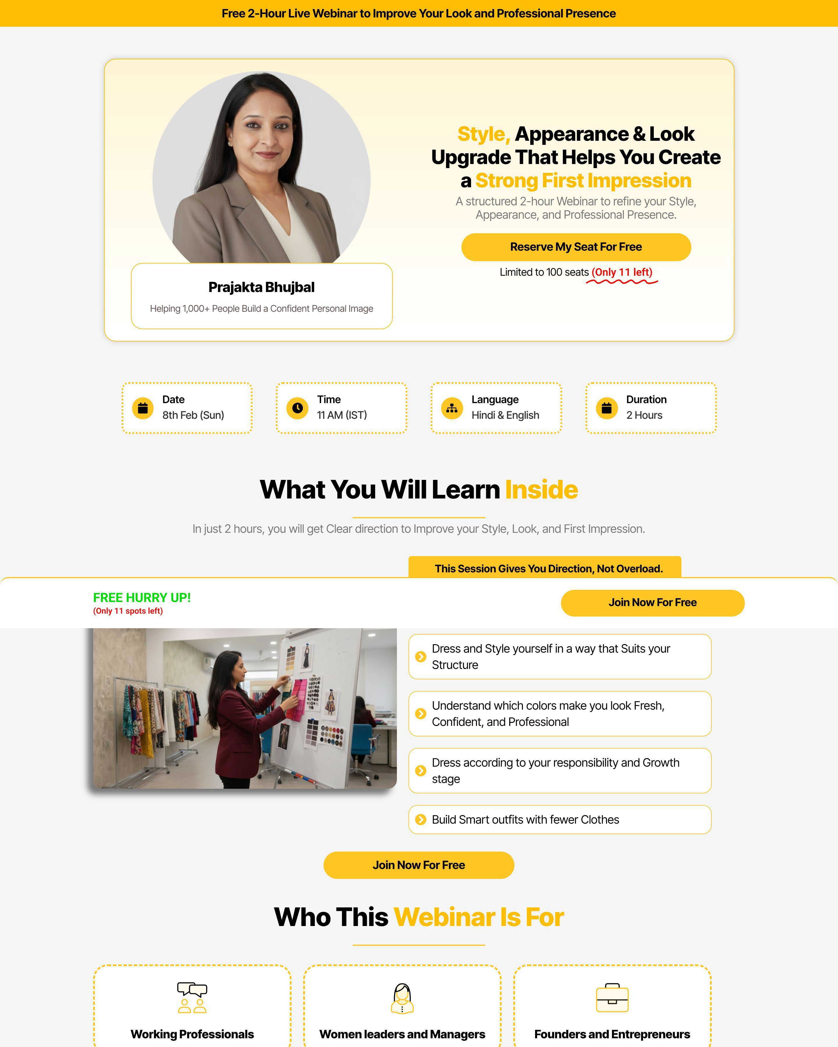
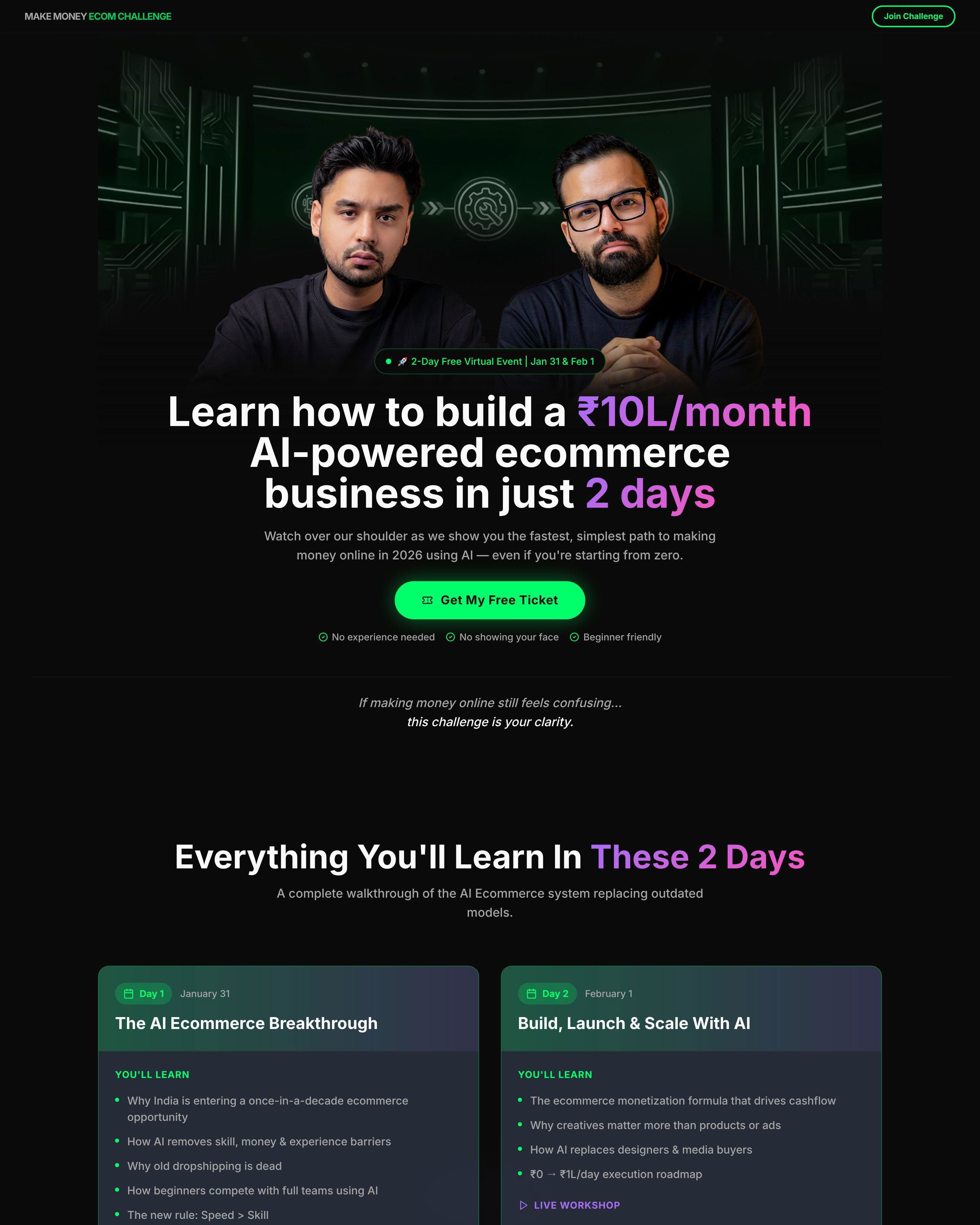
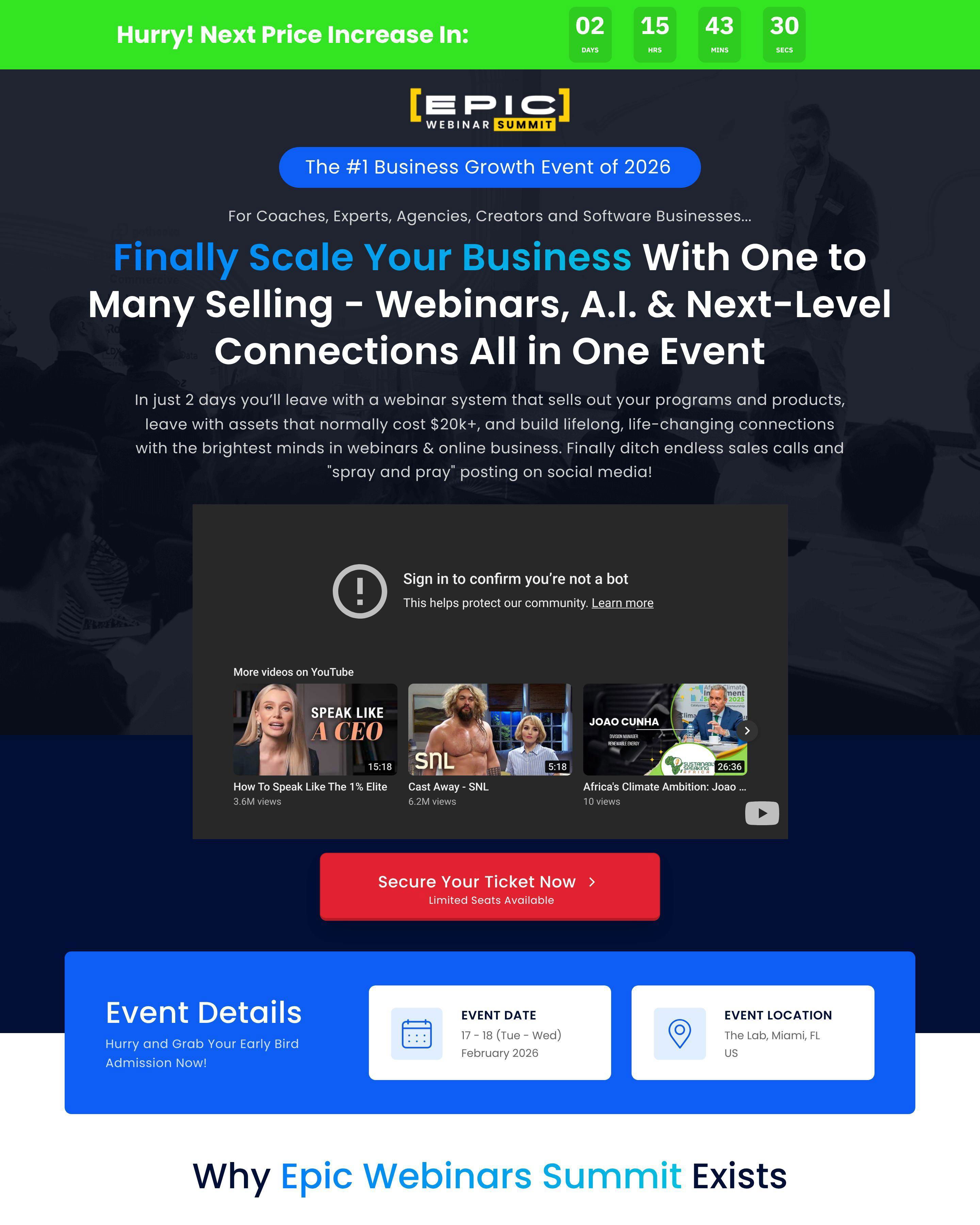
Event pages sell urgency. A product is always available. An event happens once, at a specific time, with limited capacity. Every element of your page should reinforce that this opportunity will not last.
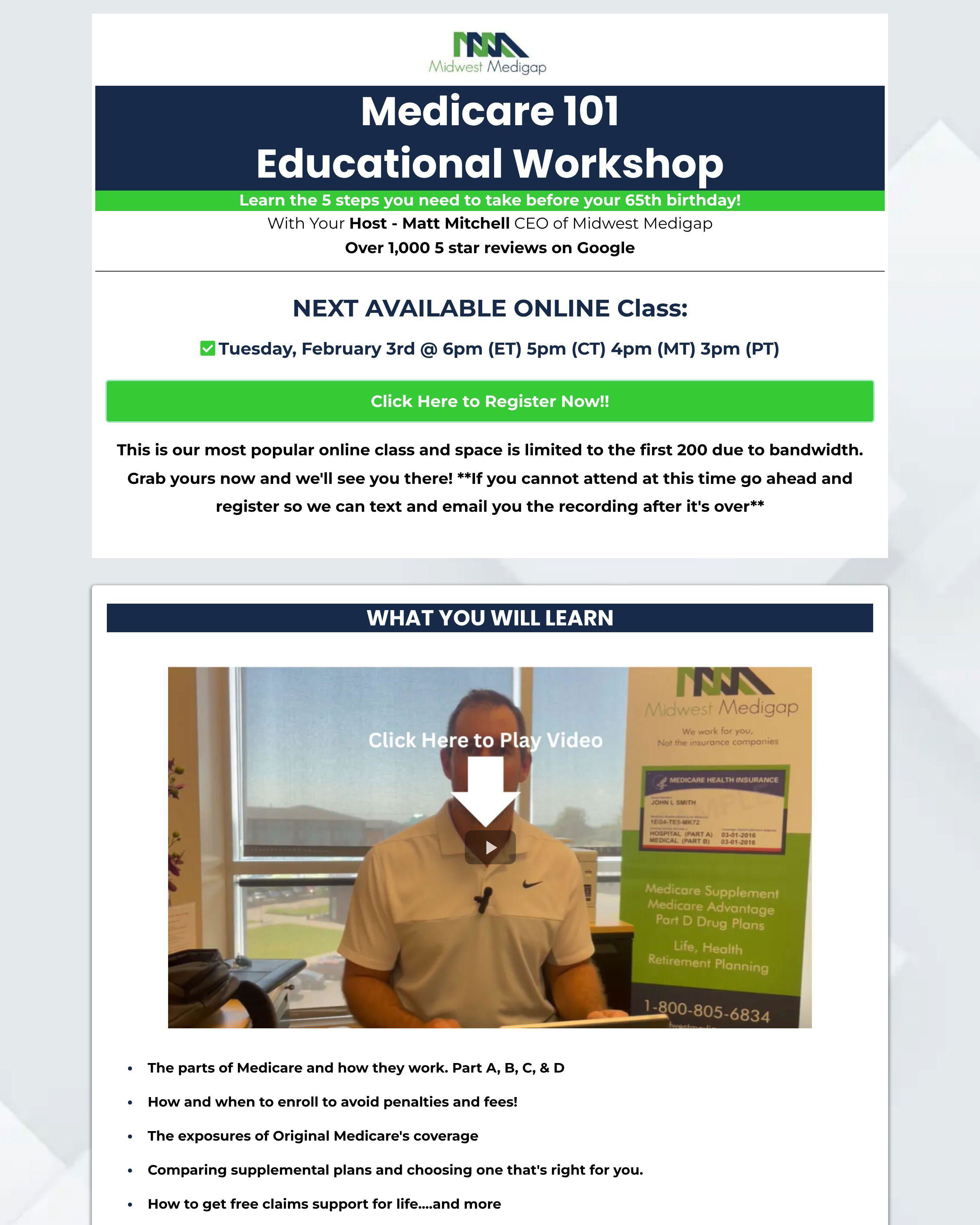
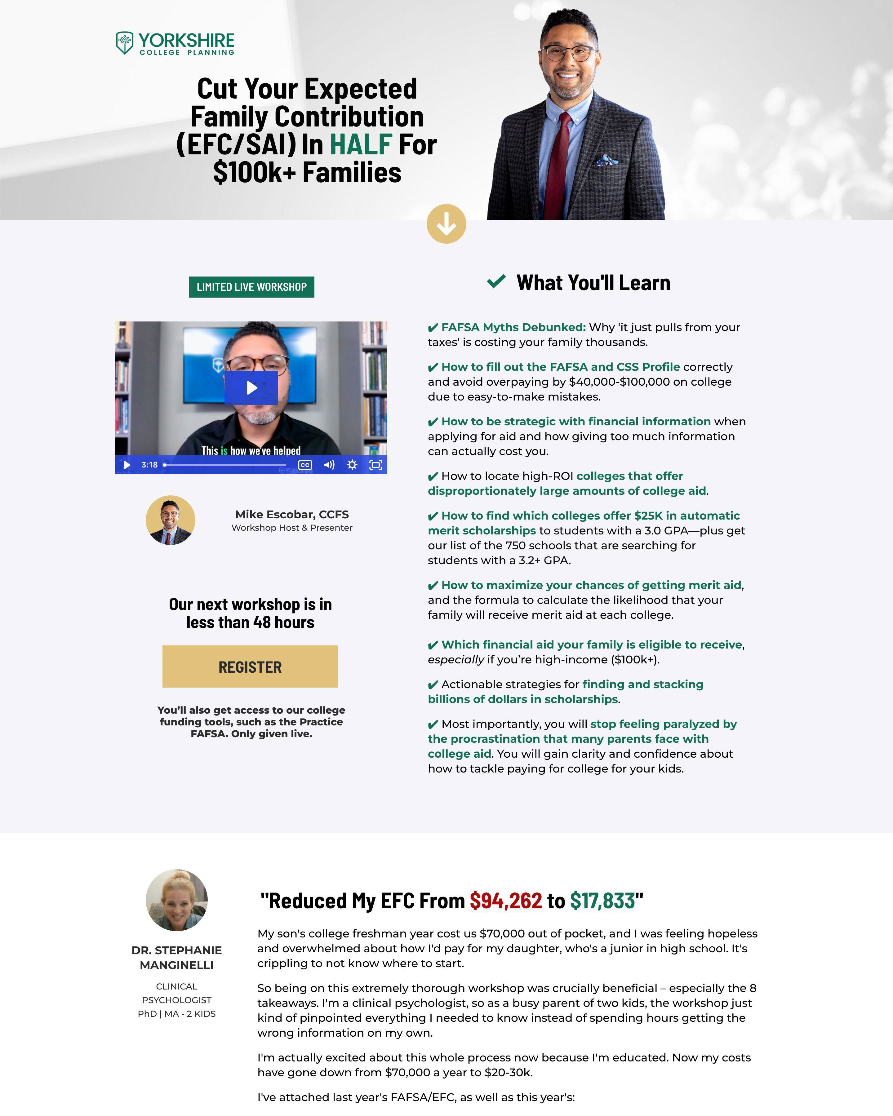
Wrike's event registration page promotes their comparison webinar with a clear date and time. The Ecom Mixer shows event details prominently with a countdown to registration close. AiSensy's AI summit page displays speaker lineups and session schedules. These pages answer the critical question: "Is this worth my time?"
The best event pages balance information and action. Visitors need enough details to commit but not so much that they save the page for later (and forget).
See our expert picks: Best Landing Page Examples of 2026 →
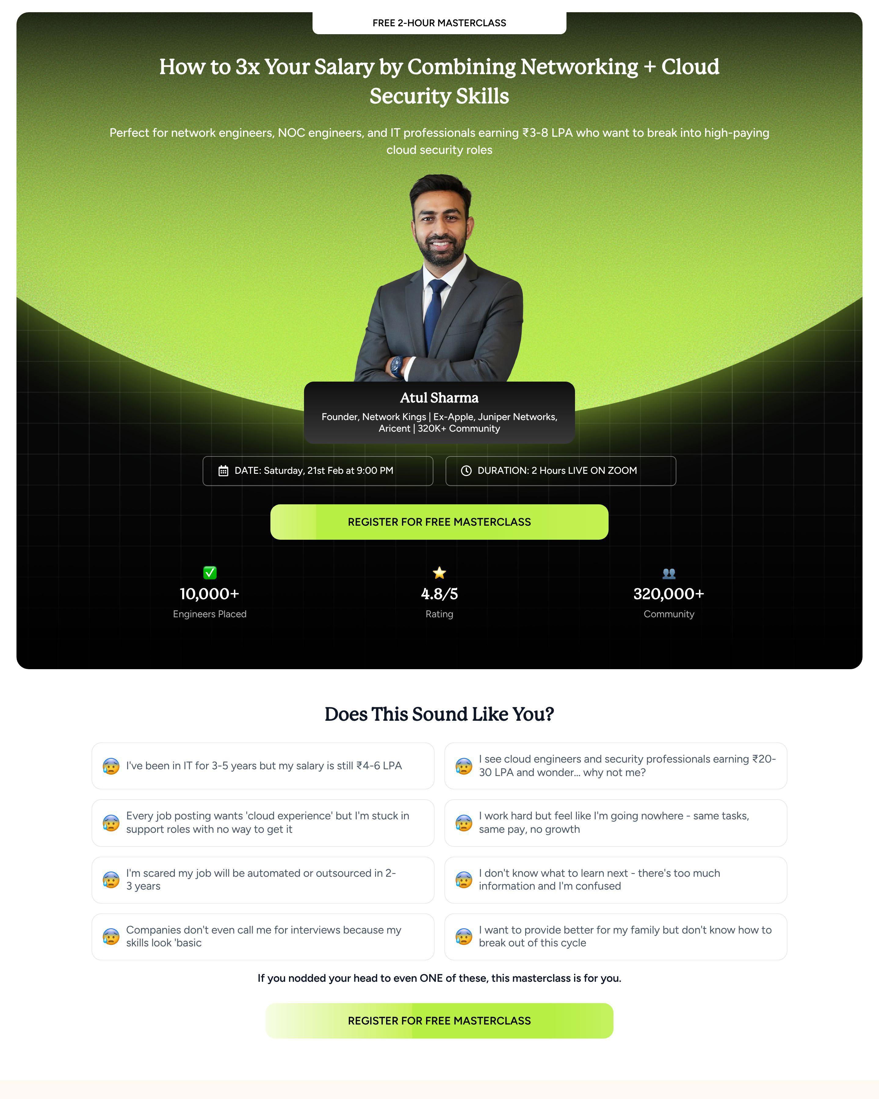
Pattern 1: Speaker and Session Highlights
Growth School's event pages feature instructor credentials prominently. AiSensy shows the AI summit speaker lineup. Visitors want to know who is presenting before they register. Strong speakers justify the time investment.
Pattern 2: Clear Date, Time, and Access Details
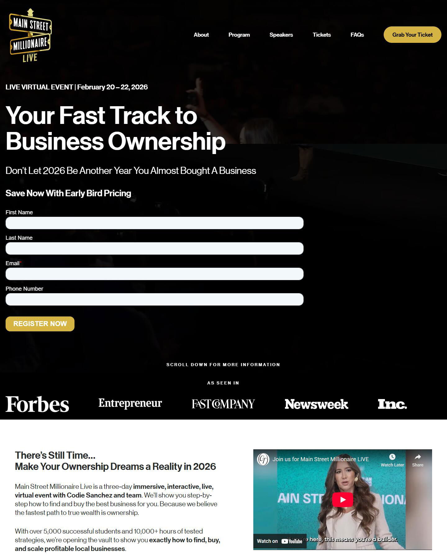
The Ecom Mixer displays event timing with timezone clarity. Wrike shows exactly when the webinar happens. Sobha Realty's property events include location details. Ambiguity about logistics kills registrations. Answer practical questions immediately.
Pattern 3: Scarcity and Social Proof
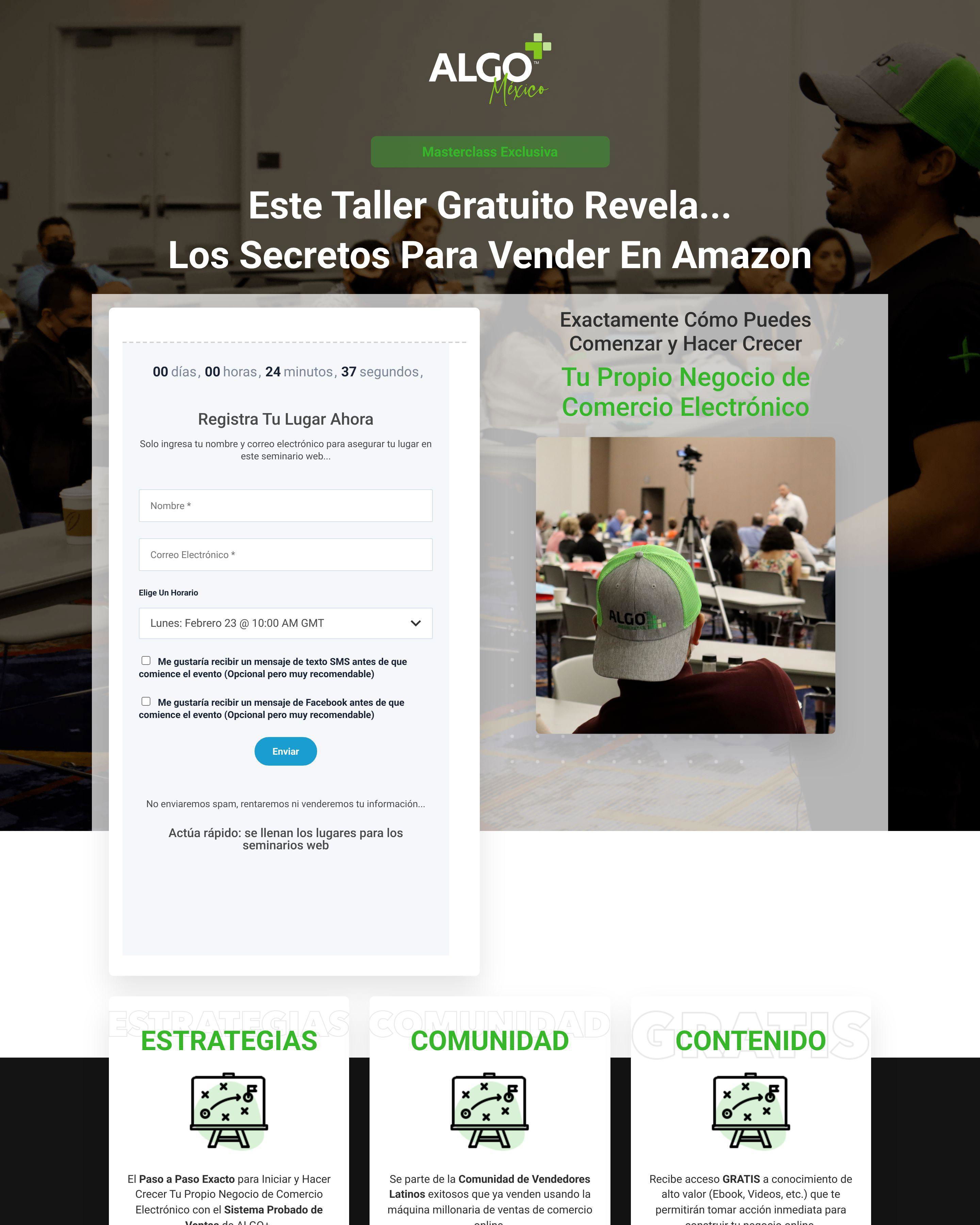
Iman Gadhzi's event pages create urgency with limited spots. The Ecom Mixer shows past attendee testimonials. When visitors see that others value the event and spots are filling, they act faster. Fear of missing out is a legitimate conversion driver.
What makes a good event registration landing page?
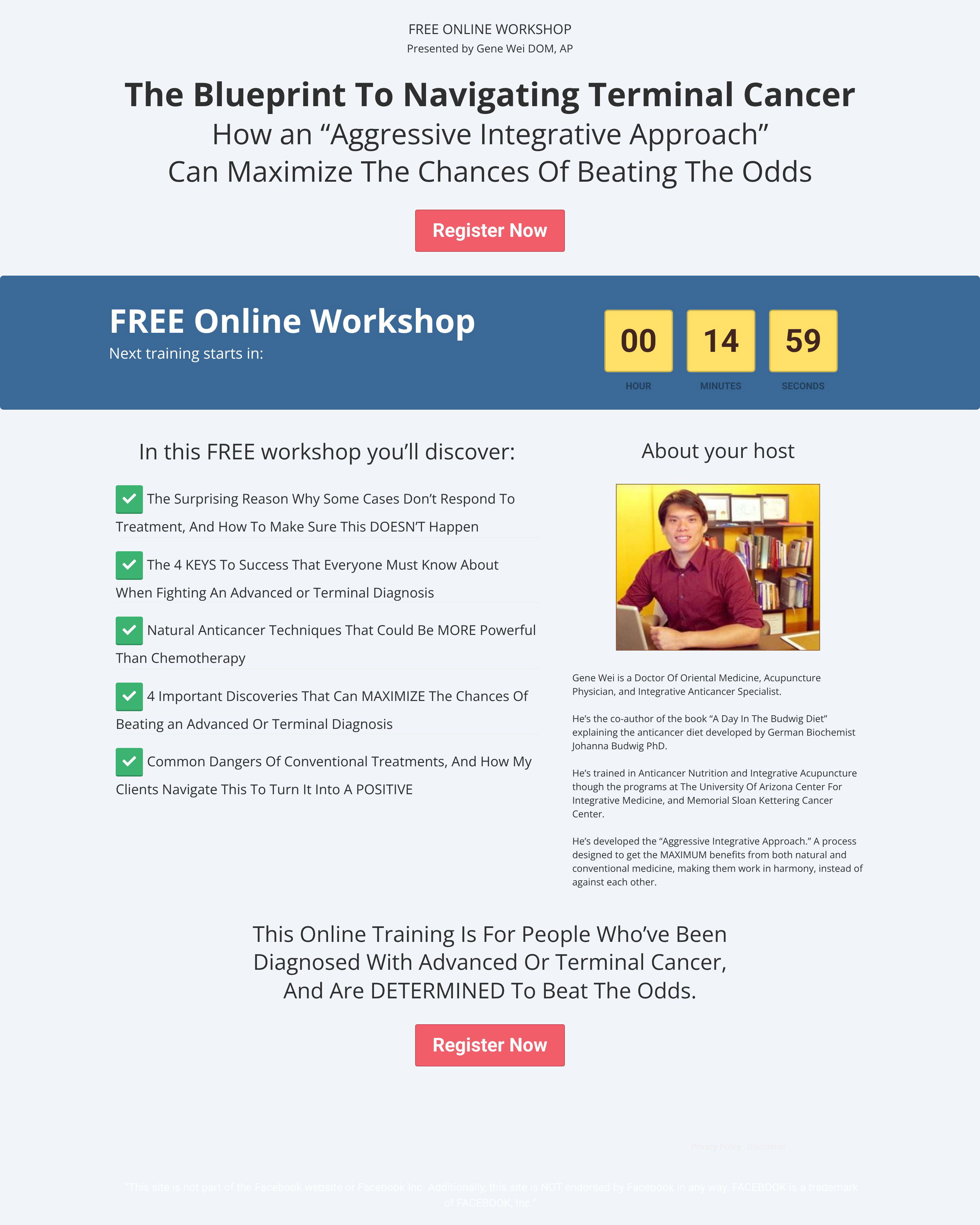
Clear value proposition and obvious logistics. Growth School explains exactly what attendees learn. Wrike states who should attend. The page should help visitors self-select: if this sounds relevant, register; if not, move on. Clarity beats persuasion.
What conversion rate should an event registration page achieve?
Free webinar registrations convert at 20-40% from targeted traffic. Paid events convert at 5-15% depending on price point. AiSensy and Growth School optimize for qualified attendees who actually show up, not just registration numbers.
How long should an event registration landing page be?
Detailed enough to justify the time commitment. Free webinars need less convincing than multi-day conferences. Sobha Realty's property events need location details and amenity information. Match page length to what your audience needs to make the decision.
What is the most important element on an event registration landing page?
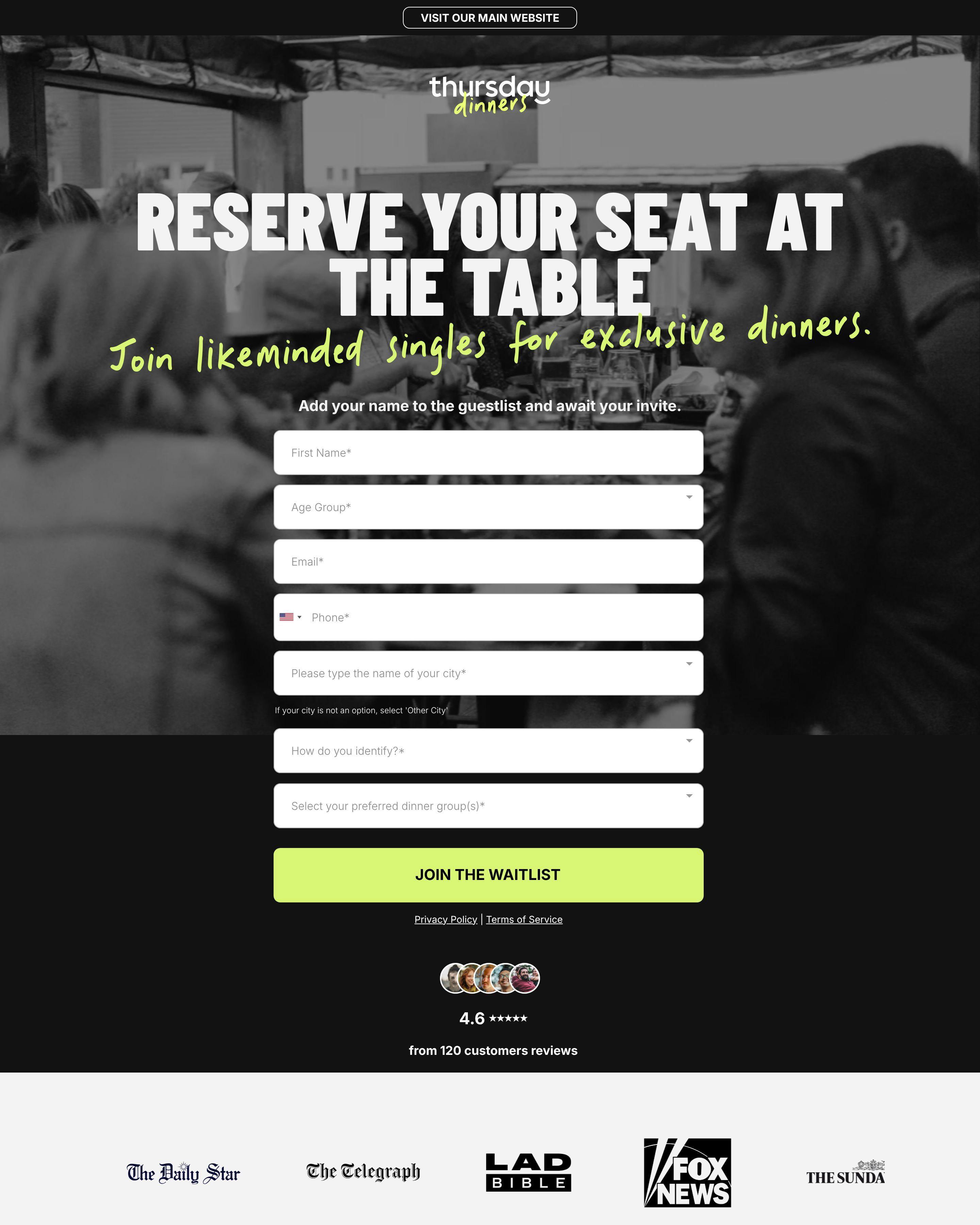
The registration form placement and event date visibility. Wrike puts the registration CTA above the fold. The Ecom Mixer shows the date prominently. Visitors need to see when and how to register without scrolling. Make the commitment clear and simple.