

Mind Workshop Landing Page Example
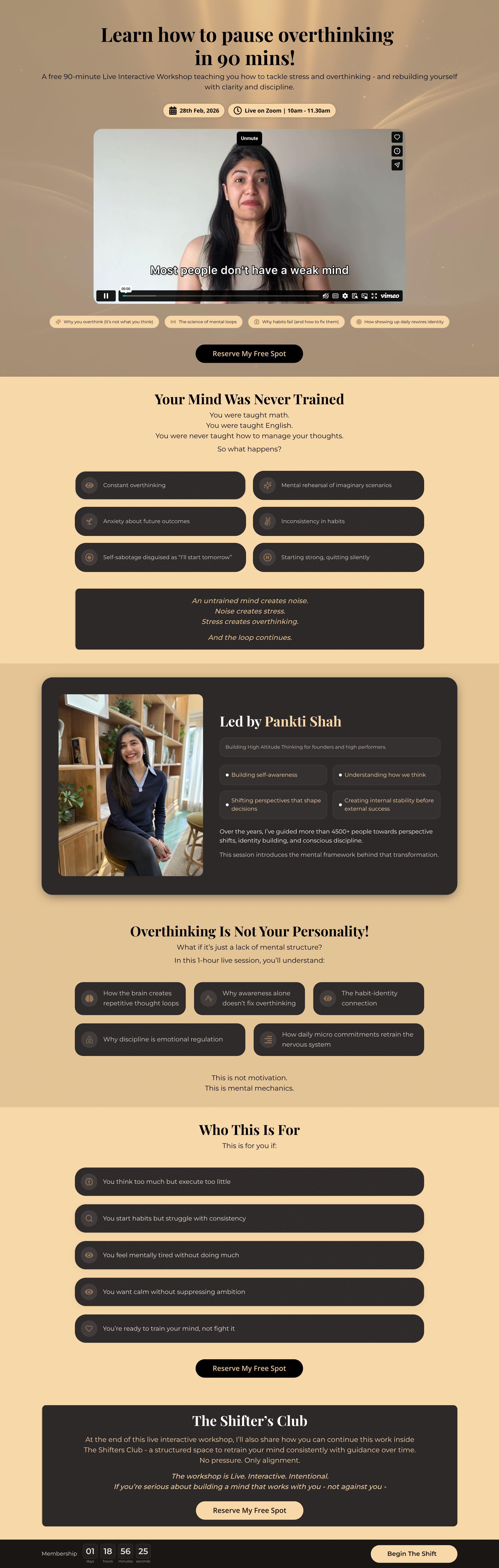
The landing page is for a free 90-minute live interactive workshop titled "Learn how to pause overthinking in 90 mins!". The primary business goal is to generate registrations for the workshop and introduce participants to "The Shifter's Club" for continued mind training.
Check out our curated database of landing page examples to see what is working right now.
To create a high-converting page like this, use Swipe Pages, a leading landing page builder and funnel platform for conversion focussed marketers
Key Insights
What Works Well
- Clear Value Proposition: The time-bound headline ("in 90 mins") offers a specific, measurable benefit that appeals to those seeking quick relief from mental fatigue.
- Prominent CTA: High-contrast buttons are strategically placed throughout the page, and a sticky footer ensures the call to action is always accessible.
- Trust Signals: Stating that 4,500+ people have been guided adds significant authority and credibility to the host's expertise.
- Mobile Responsiveness: The page elements are well-optimized for vertical scrolling, ensuring that text and interactive elements remain legible on smaller screens.
- Supporting Content: The breakdown of "Your Mind Was Never Trained" uses relatable examples like math and English to create a logical bridge to the workshop's purpose.
Opportunities for Improvement
- Social Proof: Including individual user testimonials or before-and-after case studies would validate the specific claims made in the copy.
- Objection Handling: Implementing a mini-FAQ section would help resolve common user hesitations regarding session recordings or the "Shifter's Club" commitment.
- Visuals: The video section could benefit from a custom, high-resolution thumbnail that looks more professional than the default player state.
- CTA Optimization: Aligning the text on the sticky bar ("Begin The Shift") with the main body CTA ("Reserve My Free Spot") would create a more consistent user journey.
Layout Differences: Desktop vs Mobile
- Desktop: Pain points and session takeaways are displayed in a grid or row-based layout, utilizing horizontal space efficiently.
- Mobile: Content is re-ordered into a vertical stack, making it easier for users to digest one point at a time while scrolling.
Summary
The page effectively uses a strong, time-bound value proposition and personal authority to drive workshop signups. To maximize conversions, the creator should focus on adding concrete social proof and unifying the call-to-action messaging across all page elements.


