

Systematic Trading Workshop Landing Page Example
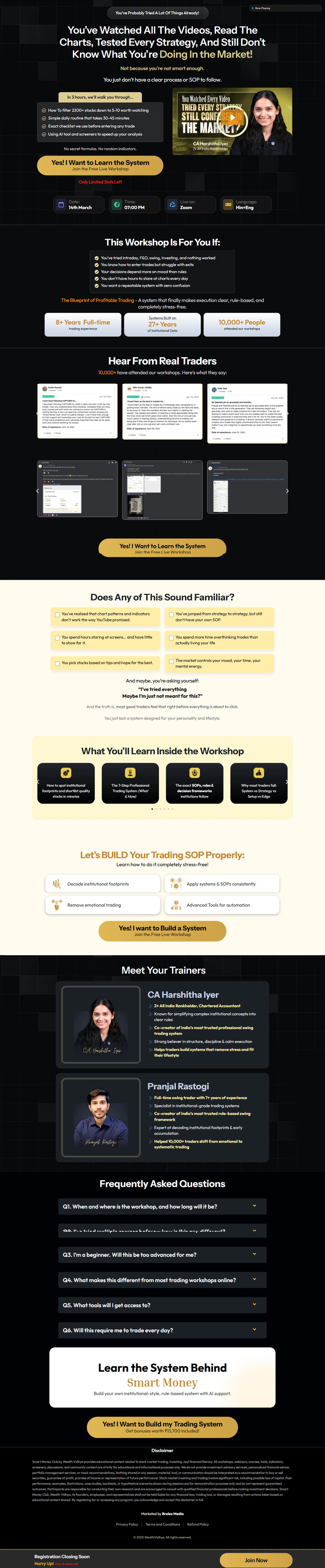
The landing page is for a free live workshop focused on systematic trading and building professional SOPs. The primary business goal is to generate sign-ups for the live event by highlighting the frustrations of disorganized trading and offering a structured, rule-based solution.
Check out our curated database of landing page examples to see what is working right now.
To create a high-converting page like this, use Swipe Pages, a leading landing page builder and funnel platform for conversion focussed marketers
Key Insights
What Works Well
- Clear Value Proposition: The headline and sub-bullets clearly define what the user will walk away with: a 30-45 minute routine and an AI-powered stock filtering process.
- Prominent CTA: High-contrast yellow buttons are used throughout the page, making the primary action stand out against the dark background.
- Trust Signals: The page highlights the credentials of the trainers, such as being a CA and an All India Rankholder, and provides hard numbers like 10,000+ attendees to build authority.
- Mobile Responsiveness: On mobile, a persistent sticky footer with a Join Now button and a seat counter maintains the conversion focus during scrolling.
- Supporting Content: The This Workshop Is For You If section does an excellent job of qualifying leads and identifying common trading pain points.
Opportunities for Improvement
- Social Proof: The testimonial section relies heavily on screenshots of chat messages, which can be difficult to read on mobile devices; replacing these with formatted text quotes would improve legibility.
- Objection Handling: While there is an FAQ section, adding a section on what happens after I sign up could clarify the post-registration process and reduce friction for new leads.
- Visuals: The hero video thumbnail is strong, but adding more process-oriented visuals or a preview of the actual AI tool or checklist mentioned would make the offer more tangible to prospects.
- CTA Optimization: The urgency text Only 15 Seats Left is effective, but using a dynamic countdown timer for the date of the event could further drive immediate action.
Layout Differences: Desktop vs Mobile
- Desktop: Features a horizontal split in the hero section with text on the left and video on the right, providing a balanced visual experience.
- Mobile: Elements are stacked vertically for better scrolling flow, and a sticky Join Now bar is added to the bottom of the viewport for easy access.
Summary
The page excels at identifying user pain points and positioning the workshop as a structured solution provided by authoritative figures. The most impactful optimizations would be improving the readability of social proof on mobile and providing more visual evidence of the proprietary trading tools discussed.


