Education landing pages have to sell something invisible.
You’re asking someone to pay thousands of dollars and commit months of their life to a promise. A better career. A new skill. A credential that opens doors. That’s not an easy decision.
The 11 pages in this list sell everything from leadership programs and AI certifications to private school admissions and preschool franchises. They come from Harvard, MIT, IIT Madras, and startup accelerators. Different audiences. Different price points. But they all solve the same problem: making an intangible investment feel like a concrete path to a real outcome.
Here’s what makes them work.
Key Takeaways:
Institutional Credibility Does the Heavy Lifting – Education buyers want proof before they trust. Simplilearn pairs Purdue University with Microsoft Azure. IIT Madras leads with IBM partnerships. Kapable displays logos from Amazon and Deloitte alumni. When you sell something people can’t see or touch, borrowed credibility from recognized names builds instant trust.
Career Outcomes Win Over Curriculum Details – The pages that convert don’t lead with the syllabus. They lead with results. Simplilearn shows a salary graph peaking at $159K. Harvard opens with “98% of certificate earners report a positive career impact.” IIT Madras promises “60% higher salaries.” Specific career numbers answer the real question: “Is this worth it?”
Low-Friction First Steps Close More Leads – Education is a high-commitment decision. The best pages make the first step feel easy. Harvard says “No application required to get started.” Their form shows a progress bar already at 50% complete. Boston University displays an open form in the hero section. No button click needed. Every barrier you remove increases conversions.
Urgency Works When It Has a Deadline – Vague urgency doesn’t convert. Real deadlines do. IIM Kozhikode offers a “Festive Enrolment Benefit” with a specific end date. MIT crosses out US$3,300 and shows US$2,805 next to it. Inc42 displays “25/50 seats left.” When the discount expires or seats run out, people take action.
Key Elements of High-Converting Education Landing Pages
Before diving into the list, here are the elements that separate education pages that convert from those that don’t:
Put institutional trust signals above the fold – University logos, accreditation badges, and partnership names should be visible immediately. Simplilearn shows Purdue and Microsoft within seconds. IIT Madras leads with IITM Pravartak and IBM. These logos answer “is this legitimate?” before visitors even scroll.
Show the certificate early – Education buyers want proof they’ll earn something tangible. IIM Kozhikode displays a sample certificate in the hero section. Simplilearn shows physical documents from Purdue and Microsoft. Make the reward visual and real.
Lead with specific career outcome numbers – “Advance your career” is vague. “98% report positive career impact” (Harvard) is proof. “$159K average salary” (Simplilearn) is a target. “60% higher salaries” (IIT Madras) is motivation. Always lead with a specific number.
Reduce form friction ruthlessly – Education forms often ask for too much too soon. Fields like “Work Experience” and “Current Job Title” create hesitation. Boston University keeps the form open and visible. Harvard shows you’re already 50% done. Start with name and email. Qualify later.
Create a “Who This Is For” section – IIM Kozhikode explains exactly why Senior Executives or Client-Facing roles need their program. MIT shows that 54% of past participants have 15+ years of experience. This helps visitors self-select and feel like they belong.
List specific tools and skills, not vague topics – “Learn AI” means nothing. “Gain experience with ChatGPT, LangChain, and AutoGPT” (MIT) means something. Inc42 promises you’ll “Build Your Leadership Operating System With n8n.” Specificity proves the curriculum is current and practical.
Be transparent about pricing – The Perse School lists “SGD 25,641 for Primary” upfront. Footprints states “Investment starts from Rs 55 Lakhs.” Hiding prices behind forms wastes everyone’s time. Show the number. Add financing options. Let qualified leads self-select.
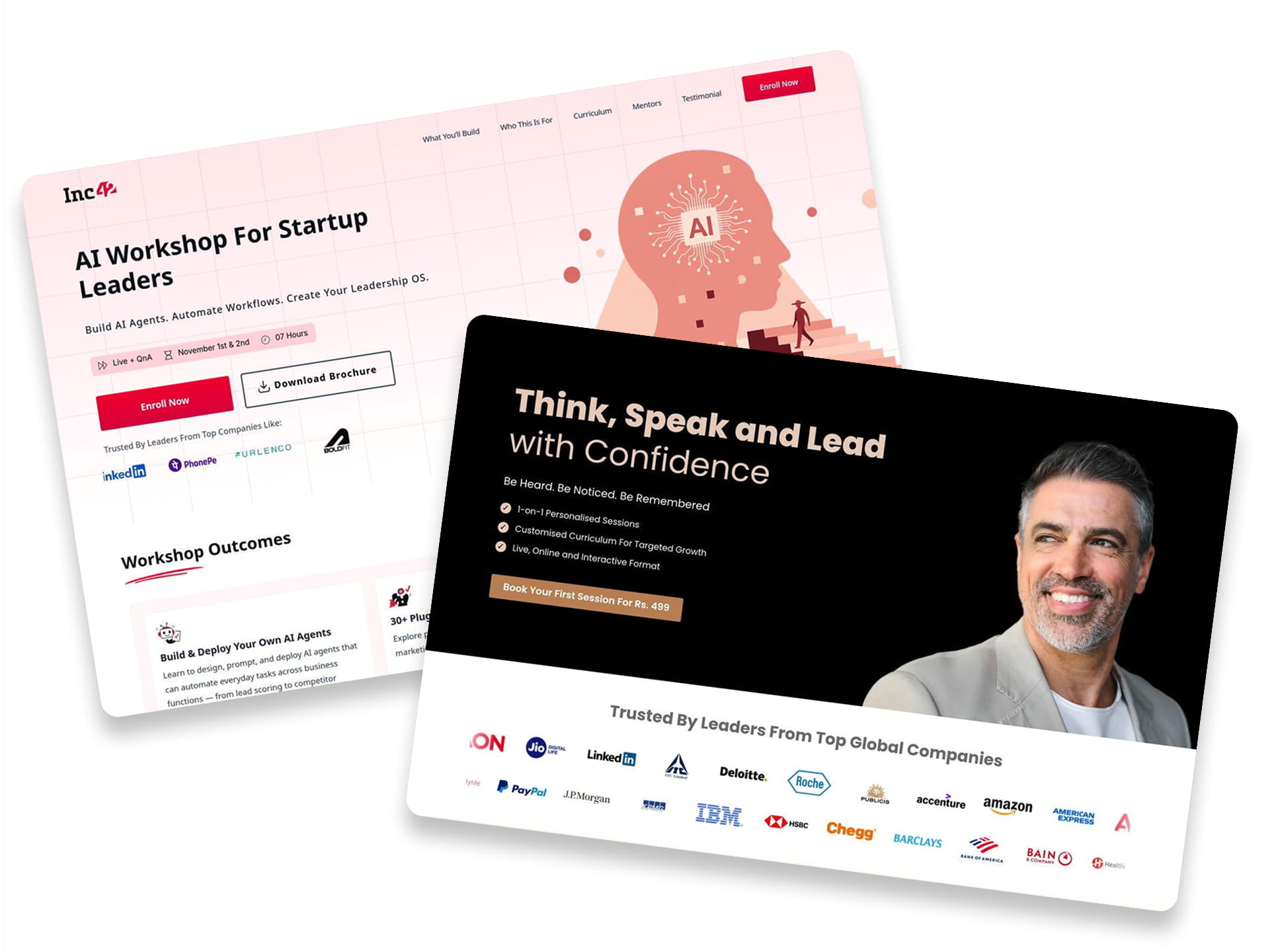
1. Kapable Leadership Program

Caption: Kapable promotes a leadership program with a low-cost introductory session. The hero section highlights a price of Rs. 499. It builds trust using massive logos from Amazon and Deloitte and many more. The page also outlines specific modules like “Influence & Charisma.”
Industry & Purpose: This is a lead generation page for the professional development industry. It’s meant to convert ambitious professionals into paying program participants.
What Works: Here’s what I love: the social proof hits you hard and fast. The section “Trusted By Leaders From Top Global Companies” is impossible to miss. Logos like Amazon and American Express do the heavy lifting here. It screams credibility instantly.
The curriculum section is also fantastic. They don’t just say “we teach leadership.” They break it down into specific skills. “Fast, Fluent & Structured Thinking” tells me exactly what I will learn. This specificity builds confidence in the product.
I also appreciate the “Application Process” timeline. It maps out exactly what happens next. You see steps like “Book A Discovery Session” and “Get Matched With Your Trainer.” It removes the fear of the unknown for the user.
What can be Improved:
- The “70.25 Net Promoter Score” is confusing for average users. A simple “4.8/5 Star Rating” would communicate quality much faster.
- The hero CTA button color blends too much with the background image. A higher contrast color like bright blue would make it pop more.
- The “What Will You Learn?” section on mobile requires too many clicks. Opening every single accordion creates friction for the user.
Why it inspires: Kapable creates authority without being boring. They leverage big brand names and university alumni status perfectly. This makes a soft skill like “leadership” feel like a tangible product you can buy.
2. Articulate

Caption: Articulate 360’s landing page features a bright blue hero section. It includes a direct signup form for a free trial. You can see logos from major companies like NVIDIA and MetLife. There are also huge stats showing over 133 million learners.
Industry & Purpose: This is a lead generation page for an e-learning software company. It’s meant to convert training professionals into free trial users.
What Works: Here’s what I love: the hero doesn’t hide the signup process. The “Start Free Trial” form is right there on the right. You can start typing your email immediately. This removes a lot of friction for new users.
The social proof on this page is very strong. They use logos from trusted brands like Publix and UPS. They also list big numbers like “125,000 Organizations.” This makes the platform look very reliable to big businesses.
The comparison chart is a smart move. It shows “articulate” next to “Other e-learning tools.” It highlights key features like “integrated AI” and “accessibility standards.” This helps the user see the extra value quickly.
What can be Improved:
- The “Select a data center” option on the form is tricky. New users might not know which one to pick. This adds an extra step that could cause hesitation.
- The text links like “Start creating today” are too small. They sit below large and colorful images. These need more visual weight to drive clicks.
Why it inspires: Articulate 360 shows exactly what the product can do. They use real screenshots and impressive stats to build trust. The page focuses on solving the user’s need for speed and quality.
3. Inc42 Workshop

Caption: Inc42’s landing page promotes an “AI Workshop For Startup Leaders.” It highlights a discounted price of ₹7,499. The layout features trusted logos like LinkedIn and PhonePe to build credibility. A “Certificate of Completion” image proves the course’s tangible value.
Industry & Purpose: This is an event registration page for the professional education industry. It’s meant to convert startup founders and executives into paid workshop attendees.
What Works: Here’s what I love: the curriculum section leaves nothing to the imagination. It doesn’t just promise “AI skills.” It lists specific outcomes like “Build Your Leadership Operating System With n8n.” This detail proves the course has real substance.
The sticky pricing card on the right is a smart move. It keeps the “Enroll Now” button visible while you scroll. The scarcity tactic “25/50 few seats left” works well here. It nudges you to act before the class fills up.
I also like how they handle authority. They don’t just list mentor names. They show their faces and bios mentioning “Matrix Partners” and “ClearTrip.” It tells you that you are learning from actual industry veterans.
What can be Improved:
- The “Download Brochure” button competes too hard with the “Enroll Now” CTA in the hero section. It creates an easy exit ramp for people who should be buying immediately.
- The “Sold Out” stamp on Edition 7 is visually messy. It creates clutter and distracts from the active “Edition 8” schedule right below it.
- The “Designed For Startup Leaders” section relies on generic red icons. Using real photos of founders or a workshop setting would build a stronger emotional connection.
Why it inspires: This page balances hype with hard facts perfectly. It uses a high price anchor of ₹24,999 to make the current offer look like a steal. The visual certificate makes the intangible knowledge feel like a real asset you can own.
4. Harvard Enrollment

Caption: This page promotes online learning at Harvard Extension School. It features a lead capture form with a progress bar starting at 50%. The copy highlights flexible degrees and specific statistics like “98% positive career impact.”
Industry & Purpose: This is a lead generation page for the higher education industry. It’s meant to convert prospective students into inquiries.
What Works: Here’s what I love: the sub-headline “No application required to get started” is brilliant. It immediately removes the fear of rejection. You don’t have to worry about transcripts or essays yet. It makes an elite brand feel accessible.
The form design is very clever. Notice the red bar that says “50%”. It makes you feel like you are already halfway finished. This is a classic psychological trigger called the Endowed Progress Effect. It encourages you to complete the task.
I also really like the specific numbers used for social proof. They don’t just say “many students.” They say “Choose from 750+ courses” and “98% of our certificate earners report a positive career impact.” These specific digits build trust much faster than vague promises.
What can be Improved:
- The “Mobile Phone Number” field is mandatory. This creates high friction and might lower conversion rates. It should be optional.
- The “Explore Programs” and “How to Get Started” buttons compete with the form. This distracts users from the main goal of filling out the “Introduce Yourself” section.
- On the mobile view, the form is pushed way down the page. Users have to scroll past a lot of text to find it.
Why it inspires: Harvard proves that even premium brands need to reduce friction. They don’t rely solely on their logo to do the work. They use clear value propositions and comforting statistics to reassure new students. It shows that accessibility is a powerful sales tool.
5. Purdue University Course by Simplilearn

Caption: Purdue University’s course by Simplilearn promotes an Applied Generative AI Specialization with Purdue University. The page highlights a collaboration with Microsoft Azure to build trust. It displays a $2,995 price tag and financing options. You can also see certificates and tool logos like ChatGPT.
Industry & Purpose: This is a course enrollment page for the professional education sector. It’s meant to convert tech professionals into student applicants.
What Works: Here’s what I love: the credibility is instant. You see the Purdue University logo and “In Collaboration with: Microsoft Azure” right away. That tells you this isn’t just a random online course. It signals a serious career investment.
The “Career Opportunities” section is smart. It doesn’t just promise a better job. It shows an “Average Salary” graph peaking at $159K. Seeing logos like Netflix and Amazon connects the learning to real goals.
I also like the “Earn Professional Certificates” section. They actually show you the physical documents from Purdue and Microsoft. It makes the reward feel tangible. You can visualize what you get for your money.
What can be Improved:
- The “Admission closes on Jan 31” timer appears in the hero and again in the form. It feels repetitive.
- The mobile view for “13+ Tools Covered” has too much white space. The grid of logos takes up too much vertical room.
- The “Program Fee” section lists “$264/month” in small text. Making this financing number bigger could help cost-conscious users.
Why it inspires: This page balances academic prestige with practical career outcomes perfectly. It uses the $159K salary graph to answer the “is it worth it” question immediately. The specific tool logos prove the content is current and relevant.
Swipe Pages stands out as a robust landing page builder, offering marketers the tools to design effective sales funnels without any programming
6. MIT’s Applied Generative Program

Caption: This page showcases MIT’s “Applied Generative AI for Digital Transformation” online course. It highlights a limited-time 15% discount to drive urgency. The layout features a prominent “Request more information” form. You can also see detailed instructor profiles and a certificate sample to build trust.
Industry & Purpose: This is a lead generation page for the professional education sector. It’s meant to convert career-focused professionals into course enrollees.
What Works: Here’s what I love: the pricing section creates real urgency. The red banner screams “SAVE 15%.” Seeing US$3,300 crossed out next to US$2,805 makes the deal feel tangible. It forces you to make a decision now.
The “Gain experience with popular AI tools” section builds immediate credibility. It doesn’t just say “AI.” It lists specific tools like ChatGPT, LangChain, and AutoGPT. This tells techies that the curriculum is actually up to date.
I really like the “Past participants profile” charts. Seeing that 54% of students have 15+ years of experience is reassuring. It signals that this course isn’t for beginners. You know you will learn alongside other seasoned leaders.
What can be Improved:
- The installment plan math is confusing. The “First payment of US$1,438” implies a total over $4,300. This conflicts heavily with the US$2,805 promo price listed above.
- The “Request more information” form asks for “Work Experience” too early. Asking for personal details like this creates unnecessary friction before users are fully sold.
- The mobile view buries the pricing details. You have to scroll past the entire hero image and the long form just to see the cost.
Why it inspires: This page balances academic prestige with practical application perfectly. It uses the MIT brand to build trust but sells the course on specific tools like PyTorch. The “Certificate” preview gives users a tangible goal to aim for.
7. The Perse School

Caption: The Perse School Singapore uses a registration form right at the top. It highlights a “Top 5 School” badge to build trust. The page breaks down curriculum tiers like “Early Years Pelican School”. It includes specific fee details and parent testimonials.
Industry & Purpose: This is a lead generation page for the private education industry. It’s meant to convert parents exploring school options into booked campus tours.
What Works: Here’s what I love: the school leans heavily on authority. That purple badge says “Top 5 School with the most Oxford & Cambridge Offers”. It immediately validates the education quality for anxious parents.
They don’t hide the costs. The headline promises a “REASONABLE FEE”. Lower down, they state “SGD 25,641 for Primary”. This transparency saves the admissions team time by filtering leads.
The “Take a Tour” video section is vital. Relocating families cannot always visit in person. This feature bridges that gap instantly. You get to see the campus without a flight ticket.
What can be Improved:
- The inquiry form asks for too much too soon. Fields like “Child’s Nationality” and “Current School” create friction. Name and email should be enough for a first touch.
- The “Submit” button on the form looks incredibly weak. It needs to be larger and brighter. A color like orange would pop against that white background.
- The “Our Campus & Facilities” section requires too much clicking. On mobile, this forces a lot of scrolling. A simple grid of images would work faster.
Why it inspires: The page balances prestige with practicality perfectly. It sells the “400-Year Legacy” without acting snobby. They give you the price and the curriculum details upfront. It respects the parent’s time.
8. IIM – Program Enrollment

Caption: This IIM Kozhikode landing page promotes an executive education course. It features a lead capture form right at the top. The design highlights a “Festive Enrolment Benefit” of ₹8,500. It also displays a sample certificate to build trust.
Industry & Purpose: This is a lead generation page for the executive education industry. It’s meant to convert mid-to-senior professionals into program applicants.
What Works: Here’s what I love: the credibility markers are front and center. You see the IIM Kozhikode logo and accreditations like AMBA immediately. It creates instant trust for a high-ticket item.
The “Festive Enrolment Benefit: ₹8,500” banner stands out. It uses a contrasting blue background to grab attention. The specific deadline of “October 16, 2025” creates real urgency to act now.
I appreciate the “Who is this Programme for?” section. It doesn’t just list job titles. It explains exactly why Senior Executives or Client-Facing roles need this. It helps you self-identify with the problem.
The “A Catalyst for Organisational Growth” table is brilliant. It compares “Expectations From Stakeholder” against “How the Programme Can Enable.” It clearly connects the learning outcomes to real workplace demands.
What can be Improved ( In bullet Points )
- The “Programme Overview” section is a wall of text. Breaking this into smaller chunks or using bold text for key benefits would make it easier to scan.
- The form asks for too much information upfront. Fields like “City” and “Work Experience” could be moved to a second step to reduce friction.
- The mobile view pushes the “Programme Highlights” icons into a vertical stack that takes up too much space. A horizontal scroll or slider would save valuable screen real estate.
Why it inspires: This page shows how to sell a high-value intangible product. It uses the certificate and professor profile to make the promise concrete. The specific outcome table is a great way to prove ROI to employers.
9. IIT Madras’s Agentic AI Course

Caption: This page promotes an Agentic AI certificate program by IITM Pravartak. It places a lead capture form immediately in the hero section. The design highlights a “Festive Enrolment Benefit” of ₹8,500. It also uses strong stats like “60% higher salaries” to prove value.
Industry & Purpose: This is a lead generation page for the professional education industry. It’s meant to convert experienced tech professionals into program applicants.
What Works: Here’s what I love: the hero section means business. The “Get Your Brochure” form is the first thing you see. You don’t have to hunt for it. This lowers the effort for interested visitors.
The trust signals are powerful. You see logos for “IITM Pravartak” and “IBM” immediately. This tells you the certification has real weight. It validates the price point instantly.
I also like the “Program Highlights” section. It doesn’t just say “learn AI.” It specifies “3 IBM Industry Certificates” and “20+ Tools and Frameworks.” Specific numbers always beat vague promises.
What can be Improved:
- The brochure form asks for “Job Title” and “Total Work Experience.” These fields might cause friction. Remove them to get more leads.
- The “Programme Modules” list is overwhelming with 22 items. Grouping these into 4-5 core themes would make it easier to read.
- The “Save ₹8,500” section is dark blue with white text. It sits low on the page and looks like a footer. It needs a brighter color to stand out as an offer.
Why it inspires: This page shows how to sell a high-ticket item. It uses a recognizable university brand to build trust. It pairs that with clear career outcomes like salary increases.
The curriculum detail is also impressive. It lists every tool and module. This transparency proves they aren’t hiding anything. It justifies the ₹1,16,500 investment.
10. FootPrints

Caption: Footprints promotes preschool franchise opportunities to investors. The page highlights strong financial returns like “35% Annual Return.” It builds trust with awards and IIT-IIM alumni credentials. The main goal is getting you to fill out the lead form.
Industry & Purpose: This is a franchise recruitment page for the early education industry. It’s meant to convert potential business investors into franchise applicants.
What Works: Here’s what I love: the authority signals are strong. You see “By IIT-IIM Alumni” right at the top. That instantly builds trust with Indian investors. It tells you smart people run this ship.
The financial promises are incredibly specific. They don’t just say “make money.” They promise “~ 35% Annual Return” and “120 Admissions Guaranteed.” Specific numbers always beat vague promises.
I also appreciate the transparency on investment costs. The fine print says “Investment starts from Rs 55 Lakhs*.” It filters out unqualified leads early. You don’t waste time if you don’t have the capital.
What can be Improved:
- The “View Expected Returns” CTA is used six times. A variation like “Start Your Franchise” would add variety.
- The “Investment starts from Rs 55 Lakhs” text is tiny and gray. This critical detail deserves better visibility to filter leads faster.
- The “Our Presence” section uses generic icons. Real photos of their 196 centres would prove their scale better than clip art.
Why it inspires: Footprints tackles the fear of failure head-on. They offer a “buy back” option and guaranteed admissions. This makes a big investment feel much safer.
They also prove that credentials sell. Putting the founders’ faces and education upfront humanizes the brand. It shows they aren’t hiding behind a logo.
11. Boston University

Caption: Boston University highlights its Online MS in Data Science with a high-contrast design. The “Request Information” form sits prominently at the top of the page. Trust badges like “World-Renowned Programs” appear clearly below the fold.
Industry & Purpose: This is a lead capture page for the higher education industry. It’s meant to convert prospective students into program applicants.
What Works: Here’s what I love: the hero section gets straight to business. The “Request Information” form is open and ready. You do not have to click a button to see it. This reduces friction for motivated students.
The “Not interested” bar is a brilliant filter. It directs residential students to a different page immediately. This ensures the admissions team only talks to true online candidates.
I really like the testimonial from Angela. She mentions the “capstone project” specifically. That detail proves the program has practical value. It is much better than a generic “great program” quote.
What can be Improved:
- The “Expedite Your Career Growth” section is a dense wall of text. Breaking this paragraph into a bulleted list would make it much easier to read.
- “ACCESSIBLE” and “AFFORDABLE” appear as floating words without context. Adding a starting price or a specific stat here would prove these claims.
- The form button simply says “SUBMIT.” Changing this to “Get Program Info” would be more descriptive and engaging.
Why it inspires: This page shows how to sell a serious career move. It balances academic authority with aggressive lead capture. The design prioritizes function over flash to get results.
Final Thoughts:
Education landing pages sell futures. Better jobs. Higher salaries. New skills. Credentials that open doors.
But futures are hard to trust. The pages that convert best make those futures feel real. They borrow credibility from recognized institutions. They prove outcomes with specific numbers. They show you the certificate you’ll earn. And they make the first step feel effortless.
If your education page isn’t converting, start here. Is your institutional credibility visible above the fold? Are you leading with career outcomes instead of course content? Is your form asking for too much too soon?
Fix those three things first. The conversions will follow.
Looking for more inspiration? Check out our full collection of 40 best landing page examples across industries.