SaaS landing pages don’t sell products. They sell promises.
You’re asking someone to trust you with their data, their workflows, and a monthly charge to their card. And you need to prove your tool is worth it before they ever log in. The pages that convert don’t just explain features. They show results, remove friction, and build trust in seconds.
The 12 pages in this list cover email automation, AI headshots, uptime monitoring, and global payroll. Different tools. Different audiences. But they all solve the same problem: turning skeptical visitors into paying customers without a sales call.
Here’s what makes them work.
Key Takeaways:
Specific Numbers Beat Feature Lists – The best SaaS pages lead with measurable outcomes. Amie promises to summarize meetings in “47 seconds.” Magical claims “12x Faster Revenue Recovery.” Deel cites “67% ROI” from a Forrester study. Vague claims like “save time” don’t convert. Exact numbers do.
Competitor Comparisons Create Instant Context – Instead of explaining value in a vacuum, top SaaS pages show it side by side. Wrike’s headline asks “Why settle for Asana when you can have Wrike?” Betterstack puts their $269/mo price next to PagerDuty’s $673/mo. When visitors can see the difference, they don’t need convincing.
Friction Reduction Is Everything – SaaS signups live or die on form friction. Woodpecker promises “No credit card required.” Factors AI only asks for first name and work email. Betterstack claims a “30-second” start time. Every field you remove is a conversion you gain.
Trust Badges Answer Hidden Objections – Enterprise buyers worry about security before they worry about features. Aragon AI displays SOC 2 and GDPR badges. Factors AI shows compliance logos. Deel cites 6,000+ reviews with a 4.7/5 rating. These signals answer “can I trust you?” before the question is asked.
Key Elements of High-Converting SaaS Landing Pages
Before diving into the list, here are the elements that separate SaaS pages that convert from those that don’t:
Lead with a specific outcome, not a feature – “Automate your marketing in a few simple clicks” (ActiveCampaign) works better than “Marketing automation software.” Amie’s “47 seconds” headline is more memorable than “fast meeting summaries.” Find your specific number and lead with it.
Show the product in action – Screenshots beat stock photos. Nightwatch shows actual code snippets and dashboard graphs. Freshdesk displays exactly what the interface looks like. Era App uses chat-based AI mockups to prove the tech is real. Let visitors see what they’re buying.
Use competitor comparisons wisely – Wrike dedicates an entire page to attacking Asana with facts and third-party data. Betterstack shows a price comparison chart. This works when you have the data to back it up. If you don’t, focus on your own value.
Minimize form fields ruthlessly – Factors AI asks for two fields: Name and Work Email. Woodpecker leads with “No credit card required.” The fewer barriers between interest and signup, the more signups you get.
Stack third-party trust signals – G2 badges, Forrester studies, SOC 2 compliance, and real Twitter handles build credibility SaaS companies can’t create on their own. ActiveCampaign displays G2 “Leader” badges. Aragon AI shows 41+ million headshots generated. Let external proof do the convincing.
Make pricing transparent and comparative – Freshdesk lists exact costs in a pricing table. Aragon AI compares $15 against a $250+ traditional headshot session. Hiding pricing behind “Contact Sales” frustrates buyers who just want the number. Show it. Break it down. Anchor against alternatives.
Match your design to your audience – Developer tools like Betterstack and Nightwatch use dark mode UIs that feel native to their users. Deel uses a clean, enterprise-ready design. Amie keeps it minimal and modern. Your aesthetic should match who you’re selling to.
1. Betterstack

Caption: Better Stack uses a sleek dark theme to sell uptime monitoring. The hero section offers “10 monitors” and a status page for free. It directly compares its price against competitors like PagerDuty. The page ends with a wall of real Twitter testimonials.
Industry & Purpose: This is a SaaS landing page for the DevOps and software infrastructure industry. It’s meant to convert developers and engineering teams into signup users.
What Works: Here’s what I love: the “Save big with Better Stack” section is brilliant. It stacks three competitors to show a total cost of “$673/mo.” Then it shows its own price of “$269/mo” right next to it. That visual math is powerful.
The hero section reduces friction immediately. It asks for a work email and says “Get started in 30 seconds.” It doesn’t ask for a credit card or a name yet. This makes signups much easier.
I also like the “Don’t just take our word for it” section. They use real tweets from users like Quentin and John. Seeing actual Twitter handles adds a layer of trust. It proves real developers use this tool.
What can be Improved:
- The integration logos in the “Connect your existing stack” section are too faint against the dark background.
- The “Book a demo” link in the hero section is very small and easy to miss.
Why it inspires: Better Stack isn’t afraid to call out the competition. They name PagerDuty and Pingdom directly to show value. The dark UI screenshots also perfectly match their developer audience. It proves that knowing your specific customer style matters most.
2. Aragon AI

Caption: Aragon AI’s landing page features a clear offer for professional headshots starting at $12. It builds trust with logos from companies like Google and Tesla. The page uses a step-by-step guide to explain the process. A comparison table highlights the savings versus traditional photography.
Industry & Purpose: This is a direct sales page for the AI technology industry. It’s meant to convert professionals and teams into paying customers.
What Works: Here’s what I love: the social proof is overwhelming but effective. They display a specific number: “41,049,000+ headshots generated to date.” This huge figure makes the service feel safe and popular. It immediately removes the fear of being a “guinea pig.”
The step-by-step breakdown is crystal clear. They use a simple horizontal listickles of “1, 2, 3, 4” flow starting with “Select your attire and backgrounds.” The accompanying screenshots show the actual interface. You know exactly what work is required from you before you sign up.
The pricing strategy is brilliant. They use a comparison table to pit their $15 Standard plan against a $250+ photographer session. This anchors the value instantly. It turns a $15 expense into a massive saving in the user’s mind.
I also appreciate the specific security badges. Seeing “SOC 2” and “GDPR compliant” addresses a major hidden objection. People worry about their facial data. This section reassures them right before the FAQ area.
What can be Improved:
- The “20% off all packages” banner uses a dark background that blends in too much. A brighter color would make this urgency play more visible.
- The “Aragon Remix” section relies on a dense paragraph of text. Converting the features into a bulleted list would improve readability.
- The text inside the pricing cards is quite small on the desktop view. Increasing the font size for the package inclusions would reduce eye strain.
Why it inspires: Aragon demonstrates how to sell a complex tech product simply. They focus entirely on the result rather than the algorithm. The “us versus them” pricing table is a perfect example of handling price objections before they even come up.
3. ActiveCampaign

Caption: ActiveCampaign’s page features a bold blue hero section. It highlights a free trial offer with no credit card required. The layout uses G2 badges to prove credibility. It also shows a visual diagram of an email workflow.
Industry & Purpose: This is a lead capture page for the marketing automation industry. It’s meant to convert business owners into software trial users.
What Works: Here’s what I love: the headline promise is specific. “Automate your marketing in a few simple clicks” addresses the pain of hard work. The subhead reinforces this by mentioning “repetitive tasks.”
The “extra employee” analogy is perfect. It connects a technical feature to a real business benefit. The diagram below it proves the point. You clearly see the logic of “Wait 1 hour” and “Send email.”
The G2 badges provide instant authority. Eight different awards appear right under the hero. Labels like “Leader” and “Best Est. ROI” do the heavy lifting. You trust them before you even scroll down.
What can be Improved:
- The interface screenshot under “More time, more revenue” is too small to read clearly.
- The hero CTA button is green, but the footer CTA is blue. Consistency would help the call to action stand out.
- The testimonial text is quite long. Bolding the key phrase “Save my business hundreds of hours” would make it scannable.
Why it inspires: ActiveCampaign takes a scary technical subject and makes it look easy. They use familiar logos and clear diagrams to reduce anxiety. It feels safe to click that trial button.
4. Wrike

Caption: Wrike uses a direct comparison strategy against a major competitor. The page features a checklist showing where the rival falls short. It displays trust badges from G2 and logos like Siemens. There is also a strong quote from a Sony executive.
Industry & Purpose: This is a competitor alternative page for the project management software industry. It’s meant to convert dissatisfied Asana users into free trial subscribers.
What Works: Here’s what I love: the headline pulls no punches. “Why settle for Asana when you can have Wrike?” is bold and clear. You know exactly what this page is about instantly.
The “Get more from Wrike” table is a great visual aid. It uses red crosses for Asana on features like “Dedicated database management.” This visual trick makes the competitor look incomplete.
I really like the “90% reduction in emails” statistic. Specific numbers build trust faster than vague promises. It proves the tool actually changes how you work.
The bar charts provide excellent social proof. Showing Wrike’s green bars towering over Asana’s grey bars creates a strong mental image. It implies one tool is superior without reading a single word.
What can be Improved:
- The paragraph under “Ready to level up with Wrike?” is too wide. It is hard to read on a large screen.
- The grey text in the bar chart section is very small. Users might miss the “Based on TrustRadius reviews” source citation.
- The mobile view of the comparison table feels cramped. The “partially” text is hard to read without zooming in.
Why it inspires: Wrike teaches us how to attack a competitor gracefully. They use third-party data to make the argument for them. The page focuses on facts rather than just opinions.
5. Factors AI

Caption: Factors AI presents a clean demo booking form right in the hero section. It highlights impressive results like “23% higher conversions” for Rocketlane. The page also features G2 badges and SOC/GDPR compliance logos to build trust.
Industry & Purpose: This is a lead generation page for the B2B marketing technology industry. It’s meant to convert demand generation teams into demo leads.
What Works: Here’s what I love: the signup form respects my time. It asks for “First Name” and “Work Email” only. No phone number or company size fields block the way. That reduces friction immediately.
The social proof is quantifiable. Rocketlane didn’t just “do better.” They achieved “23% higher conversions.” Upflow saw “35% Pipeline influenced.” Specific numbers build real credibility compared to vague praise.
The visual flow chart explains the product perfectly. It shows inputs like LinkedIn and outputs like “Send ICP Alerts to Sales.” You understand the entire workflow in seconds without reading heavy text.
What can be Improved:
- The hero section claims “#1 Account Based Marketing Tool” in orange text. That is a very bold claim without an immediate source or link cited next to it.
- The FAQ section at the bottom hides every answer. Open one key question like “How much does Factors cost?” by default to save users a click.
Why it inspires: Factors.ai balances technical depth with ease of use. The integration diagram simplifies a complex process into a single image. Plus, the upfront security badges like “GDPR” and “SOC” address enterprise concerns before you even ask.
Swipe Pages gives marketers a simple landing page builder to create professional, high-converting sites that actually deliver results.
6. Magical Healthcare RCM

Caption: Magical’s landing page targets enterprise healthcare organizations. It promises to put revenue on autopilot using AI agents. The design features a dark theme with bright green accents. It builds trust with a 4.8-star Chrome Store rating.
Industry & Purpose: This is a lead generation page for the healthcare technology industry. It’s meant to convert enterprise healthcare leaders into demo requests.
What Works: Here’s what I love: the headline speaks directly to the pain point. “Put revenue on autopilot” is a powerful promise for busy executives. It pairs perfectly with “agentic AI employees.” You immediately understand the value proposition.
The statistics section grabs your attention. It shows “95% Clean claim rate” and “12x Faster Revenue Recovery.” These aren’t just random numbers. They represent real time and money saved. This builds instant credibility.
I really like the interactive form on the desktop view. It starts by asking, “What is your primary use case for Magical?” This engages the user right away. It feels less like a form and more like a conversation.
What can be Improved:
- The logos in the “powered by Magical” section are too faint. Dark grey text on a black background is hard to read. High-contrast logos would stand out much better.
- Two of the three testimonials are anonymous. “Director of RCM” and “VP of RCM” lack authority without a company name. Real names and companies build much more trust.
- The CTA buttons repeat “Book a demo” four times. You could vary the text. Try “Start automating” or “See AI in action” for variety.
Why it inspires: Magical proves that B2B software pages don’t have to be boring. The dark mode design feels modern and premium. It balances heavy data with clean visuals perfectly.
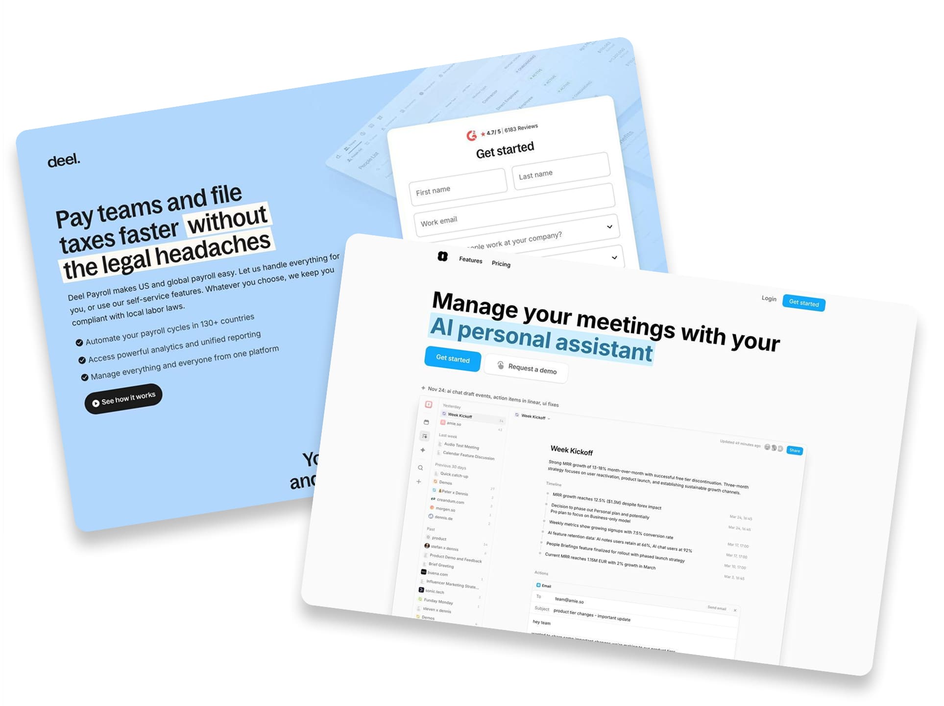
7. Amie AI Meetings

Caption: Amie’s landing page features a clean headline about its AI personal assistant. It showcases trusted logos like Canva and Spotify right below the hero image. The page promises to summarize meetings and update CRMs in just 47 seconds.
Industry & Purpose: This is a SaaS landing page for the AI productivity and automation industry. It’s meant to convert busy professionals into software users.
What Works: Here’s what I love: the headline is incredibly specific. It doesn’t just say “save time.” It says “Within 47 seconds: Share summary. Keep CRM updated.” You immediately know the exact payoff.
They tackle a major annoyance right away. The subhead “Summarize any meeting, without a bot” is smart. Most people hate having bot accounts join their calls. Amie promises to do the work without that awkward friction.
The “What you can achieve with Amie in just 7 days” section is brilliant. It breaks down the user journey into clear steps. Day 0 is “Start recording” and Day 7 is “Automate your workflows.” It sets realistic expectations for new users.
What can be Improved:
- The “Customize the summary with private notes” section has a wall of grey text. Breaking this into bullet points would make it much easier to scan.
- The “Request a demo” button disappears after the hero section. Adding this option to the bottom footer would capture enterprise leads who read the whole page.
Why it inspires: Amie uses specific numbers to build trust. Saying “Within 47 seconds” feels much more real than a generic promise. The “7 days” timeline shows they understand how users actually adopt new software.
8. Night Watch by Laravel

Caption: Nightwatch uses a sleek dark gradient theme for its monitoring tool page. The hero section features a clear dashboard preview. It highlights specific features like “Smart alerts” and “Detailed logs.”
Industry & Purpose: This is a product page for the software development industry. It’s meant to convert developers into paid subscribers or sales leads.
What Works: Here’s what I love: the headline is clever but clear. “Don’t be afraid of the dark” plays on the tool’s dark mode and its purpose. It promises to illuminate your application’s hidden issues.
The product shots are fantastic. They don’t use abstract illustrations. You see actual code snippets and dashboard graphs. This builds instant trust with technical users.
I also like the speed promise. “Start monitoring in under a minute” is a bold claim. It tells busy developers they won’t waste hours on setup. That removes a huge barrier to entry.
The social proof is highly specific. The testimonial from Mathias Hansen isn’t generic praise. He mentions getting value “within an hour of the first deployment.” Specificity sells.
What can be Improved:
- Pricing is missing from the main sections. Developers usually want to see costs before clicking “Start monitoring.”
- The “Contact sales” button in the hero feels premature. A “View Live Demo” button might convert better for this audience.
- The FAQ section is very long. Grouping these questions into categories would make scanning much easier.
Why it inspires: Nightwatch knows its audience perfectly. The dark mode aesthetic fits the developer vibe exactly. It doesn’t try to be a generic tool for everyone.
The copy speaks the right language. Words like “routes,” “exceptions,” and “trillions of events” signal technical competence. It proves they understand the problems developers face.
9. Freshdesk

Caption: Freshdesk promotes its customer service software with a clear “Start free trial” button. The page displays pricing tiers starting at ₹999 along with trusted logos like Decathlon. It creates trust by showing exactly what the dashboard looks like.
Industry & Purpose: This is a product landing page for the customer service software industry. It’s meant to convert support teams and businesses into trial users.
What Works: Here’s what I love: the social proof hits you early. “Trusted by 74,000+ businesses worldwide” sits right above recognized logos like Decathlon and Pearson. It builds immediate credibility before you even scroll down.
The pricing table is incredibly transparent. It lists specific costs like “₹999/agent/month” without hiding behind a “Contact Sales” button. The “Pro + AI Copilot” column uses a purple background to guide you toward their preferred plan.
I also appreciate the “Free plan” section at the very bottom. It clearly states “$0 for up to two agents” and “No credit card required.” This captures smaller teams who aren’t ready to pay yet.
What can be Improved:
- The screenshot in the “Provide omnichannel support” section is too small. You cannot read the dashboard text to see the actual interface details.
- The pricing table on mobile requires horizontal scrolling. Users might miss the higher-tier plans or the detailed comparison features hidden off-screen.
- The hero headline “Delight your customers” is vague. A more specific benefit about saving time or unifying channels would hit harder.
Why it inspires: Freshdesk shows how to target multiple audiences on one page. They catch the big fish with enterprise features and the small fish with a free plan.
The detailed feature comparison builds confidence. They don’t just say “we have AI.” They list specific items like “Freddy AI Agent” so you know exactly what you pay for.
10. Era App

Caption: Era is an AI-powered personal finance app. The page shows how it tracks spending and gives advice. It highlights features like automated savings and investment updates. You can see clear pricing options at the bottom.
Industry & Purpose: This is a landing page for a fintech mobile application. It’s meant to convert tech-savvy savers into app users.
What Works: Here’s what I love: the headline “It’s AI, but for your money” is brilliant. It tells you exactly what the product does in six words. It feels modern and helpful at the same time.
The mockups show the actual product in action. You see chat bubbles asking “how can i optimize my emergency fund?” and the AI responding. It makes the tech feel real instead of just a vague promise.
The pricing table is very clean. It clearly labels the free tier with “No hidden fees, no strings attached.” The paid plan at “$8.99/month” lists “Our most powerful AI model” as a key benefit. This gives people a clear reason to upgrade.
What can be Improved:
- The QR code on the desktop version is a bit lonely. Adding “Download on App Store” buttons would help people who are not ready to scan their screens.
- The mobile version has a lot of scrolling. The “Frequently asked questions” section takes up a lot of space. A tighter layout would keep users engaged for longer.
Why it inspires: Era uses a very clean design that builds trust in a sensitive industry. They use screenshots to prove the AI actually understands money. It is a great example of showing the product instead of just talking about it.
11. Deel

Caption: Deel’s landing page promises fast global payroll without legal stress. It features a lead capture form right at the top. The page shows off big client logos like Reddit and Shopify. It also highlights specific ROI data from a Forrester study.
Industry & Purpose: This is a lead generation page for a global payroll platform. It’s meant to convert business owners and HR managers into booking a demo.
What Works: Here’s what I love: the hero section is very clear. “Pay teams and file taxes faster without the legal headaches” hits a huge pain point. It tells you exactly what they do in ten words.
The social proof is everywhere. They show a “4.7/5” rating from over 6,000 reviews. Then they list massive brands like Reddit and Klarna. You feel safe before you even scroll.
The ROI stats are the star of the show. Mentioning a “67% ROI” from a Forrester study is a power move. It turns a vague promise into a business case.
The support section provides great peace of mind. It promises a “2 minutes or less” response time for chat. This removes the fear of being stuck with a payroll error.
What can be Improved:
- The lead form on mobile takes up a lot of space. It might be better to use a multi-step form to keep the top of the page less cluttered.
- The “How we stand out” section uses very thin icons. These are hard to see clearly on a small phone screen. Bolder graphics would make those benefits pop more.
Why it Inspires: Deel makes a scary topic like taxes feel easy. They use specific data instead of generic marketing fluff. The focus on “2 minutes or less” for support shows they truly value the customer’s time.
12. Woodpecker

Caption: Woodpecker uses a high-contrast dark theme in hero section to highlight their cold email tool. They offer a 7-day trial with “No credit card required” right at the top. Hand-drawn sketches just below the hero section explain how the email sequences work. The page also lists trusted integrations like Gmail and Office 365.
Industry & Purpose: This is a lead generation page for the B2B SaaS industry. It’s meant to convert sales professionals into free trial users.
What Works: Here’s what I love: the headline cuts straight to the point. “AUTOMATE YOUR COLD EMAIL SEQUENCES” tells you exactly what the tool does. There is no fluff or clever marketing jargon here.
The hand-drawn illustrations are fantastic. Look at the “Improve deliverability” section. It visually shows emails landing in the “Primary” folder instead of “Promotions”. That explains a complex technical benefit instantly without boring text.
I also appreciate the specific social proof. The header says “15,000+ B2B professionals automate their email outreach”. That specific number makes the service feel established and safe to try.
What can be Improved:
- The testimonials are dense blocks of text and no distinct formating for Reviewer’s name, Salespeople scan content quickly. Highlighting key results in bold or shortening the quotes would make them much easier to read.
- The hero section is very dark and lacks product visuals. Showing a screenshot of the actual dashboard here would help users understand the interface faster.
Why it inspires: Woodpecker proves you don’t need polished stock photos to look professional. The sketches explain the “Primary” inbox feature better than paragraphs of text could. It creates a friendly and accessible vibe for a technical tool.
Final Thoughts:
SaaS landing pages sell something different than most. They sell trust.
Your visitor needs to believe the tool will work. They need to believe it’s worth the monthly cost. And they need to trust you with their data and workflows before they ever log in.
If your page isn’t converting, check these three things first. Lead with specific outcomes. Remove every unnecessary form field. And stack trust signals so objections don’t stand a chance. Want more inspiration? Check out our full list of 40 best landing page examples across industries.