Wellness landing pages live and die on trust.
The best supplement and self-care landing pages prove safety, prove results, and prove the product fits real life — all before the first scroll. You’re asking someone to put your product inside their body, on their skin, or into their daily routine. A stock photo and a “buy now” button isn’t enough.
This list looks at 8 wellness, supplement, and self-care landing pages doing the heavy lifting. Liver shots, sleep gummies, nootropics, sparkling drinks, dental advertorials, and bath soaks. Different products. Same job. Turn a skeptical visitor into a confident buyer.
Here’s what makes them work.
Key Takeaways
Clinical Proof Beats Lifestyle Photos: Dose Daily shows a graph where AST levels drop 50% (per Dose Daily clinical study). Onnit cites Joe Rogan and brain-science studies. Lifestyle shots feel nice. But real numbers and study data are what close skeptical buyers on supplements they’ll actually swallow.
Specific Outcomes Convert Better Than Generic “Wellness”: Feals doesn’t say “feel better.” It says “buy sleep gummies.” Recess doesn’t say “relax.” It says “magnesium and adaptogens for stress relief.” The pages that specify the outcome outperform the ones selling vague vibes.
Quizzes and Interactive Tools Lower the Buying Risk: flewd’s “mystery soak” quiz turns choice paralysis into a fun reveal. Feals’ “find my dose” tool removes the fear of buying the wrong strength. Interactive elements make wellness products feel personalized, not one-size-fits-all.
Educational Format Sells What Pure Sales Pages Can’t: Autobrush uses a “5 reasons parents are switching” advertorial structure. It feels like reading a helpful article, not a sales pitch. For wellness products with explanation overhead, the advertorial format consistently outperforms a plain product page.
Once your proof and outcome story line up, the layout work is the easy part. You can build a fitness landing page by describing the product, the study data, and the bundle in one prompt, then editing the page like a doc.
Key Elements of High-Converting Wellness Landing Pages
Before the list, here’s what separates wellness pages that convert from the ones that don’t:
Lead with a clinical or quantified claim: “AST levels decreased by 50%” (Dose Daily clinical study), “350,000+ happy customers” (per Feals product page), “1 dose = 17 turmeric shots” (per Dose Daily). Numbers stand out in a category full of vague promises. If you have a study, lead with it. If you don’t, find the one specific outcome you can defend.
Show the ingredient list, not a proprietary blend: Modern wellness buyers are educated. They want to see the milligrams. IM8 puts ingredients front and center. Hiding behind “proprietary blend” reads as something to hide. Transparency is the new luxury.
Stack social proof beyond reviews: Onnit uses Joe Rogan. IM8 uses Ben Greenfield. Recess shows publication-style trust markers. Real names and real faces beat anonymous 5-star reviews. They tell the visitor “people I trust use this.”
Use comparison or anchoring on price: Dose Daily shows “$63 subscription vs $90 retail.” Anchor your price against an alternative. A competitor. A traditional product. A daily coffee. A doctor visit. Buyers need a frame for what your price means.
Reduce decision friction with quizzes or filters: flewd’s mystery soak. Feals’ “find my dose.” Autobrush’s age-based picker. When visitors don’t know which product they need, a guided tool converts higher than a category page that asks them to figure it out.
Make the routine concrete: Bath soaks (“once a week before bed”). Gummies (“two before sleep”). Nootropics (“with morning coffee”). Wellness products fail when the buyer can’t picture how it fits the day. Show the moment of use, not just the bottle.
Address safety upfront, don’t hide it in the FAQ: Especially for ingestibles. Dose explains liver-support science early. Feals clarifies CBD dosage on the hero. The earlier you handle “is this safe, is this legal, will this make me feel weird,” the higher your conversion.
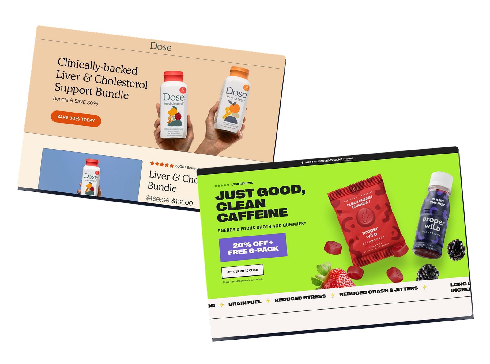
1. Dose Daily

Caption: Dose Daily sells a clinically-backed liver and cholesterol support bundle. The hero leans on a “SAVE 30% TODAY” badge and a 4.8-star rating from 1000+ reviews. The page anchors a $63 subscription against $90 retail. It closes with a clinical study graph showing AST levels dropping.
Industry & Purpose: This is a DTC subscription page for the wellness supplement industry. It’s meant to convert skeptical wellness buyers into monthly subscribers.
What Works: Here’s what I love: the page leads with the headline “Clinically-backed Liver & Cholesterol Support Bundle.” That word “clinically-backed” does heavy lifting in a category full of vague claims.
The dose math is brutal. They show “1 dose = 17 turmeric shots.” That single comparison turns a $3 shot into a steal. You stop thinking about price and start thinking about value.
The clinical graph is the closer. It shows AST levels dropping by 50%. That’s a specific, measurable health outcome. Not a feeling. Not a vibe. A number you can defend to your doctor.
The pricing anchor is also clean. $63 subscription versus $90 retail. The “SAVE 30% TODAY” badge ties the math together at a glance. Trust badges from real retailers like EREWHON and JIMBO’S confirm this isn’t some Instagram-only brand.
What can be Improved:
- The “ADD TO CART” button could pop more against the muted hero background.
- 1000+ reviews is solid, but a single named-customer quote near the hero would humanize the proof.
- The “Power of Two” and “What’s Inside” sections could use simple ingredient milligrams next to each icon.
Why it inspires: Dose proves you can sell a $60 supplement bundle without lifestyle photos or influencer hype. Lead with the clinical proof. Anchor the price against a familiar alternative. Let the data carry the close.
2. Feals

Caption: Feals sells CBD sleep gummies to wellness-curious buyers worried about prescription sleep aids. The page calls out “350,000+” happy customers in the hero. CTAs read “Try Feals” and “Shop Now.” The brand also runs a “find my dose” quiz on related pages to remove dosage anxiety.
Industry & Purpose: This is a DTC product page for the CBD wellness industry. It’s meant to convert sleep-deprived buyers into first-time gummy customers.
What Works: Here’s what I love: the page sells a specific outcome. Not “feel better.” Not “wellness.” It says “sleep gummies.” That single word change separates them from every other CBD brand chasing the same buyer.
The “350,000+” customer count is the safety blanket. CBD still feels new and a little scary to mainstream buyers. Seeing that many people already trust the brand cuts the fear in half.
The quiz funnel deserves a callout too. CBD dosage paralyzes first-time buyers. Should I take 10mg or 30mg? Feals’ “find my dose” tool turns a confusing decision into a guided one. Personalization beats a product grid every time.
The “lab-certified” badge sits where it needs to. Right next to the buy button. CBD shoppers worry about purity above almost anything else. Lab certification answers that fear before they ask.
What can be Improved:
- The hero CTA “Try Feals” is friendly, but a sleep-specific CTA like “Get Better Sleep Tonight” would tie back to the outcome promise.
- A single visible review quote near the hero (with a real first name) would make the 350,000 feel less anonymous.
- The dosage clarity could go further with a sleep-only “starting dose” recommendation right on the hero.
Why it inspires: Feals shows the power of naming the outcome instead of the category. Every CBD brand sells “wellness.” Feals sells “sleep.” That clarity is what makes a curious visitor click buy.
3. Proper Wild

Caption: Proper Wild sells plant-based energy gummies and shots to coffee-quitting buyers. The hero promotes “Just Good, Clean Caffeine” alongside “Energy & Focus Shots.” A “20% OFF + FREE 6-PACK” bundle anchors the offer. The page uses neon green and purple to stand out against pharmacy-aisle competitors.
Industry & Purpose: This is a DTC product page for the functional energy industry. It’s meant to convert coffee-dependent buyers into clean-caffeine subscribers.
What Works: Here’s what I love: the bundle math hooks fast. “20% OFF + FREE 6-PACK” doesn’t ask the buyer to do arithmetic. The savings are pre-calculated. The free pack feels like a gift on top of the discount.
The phrase “Just Good, Clean Caffeine” is short and surgical. Three words eliminate the entire objection set around synthetic energy drinks. No crash. No jitters. No mystery powders.
The brain-scan heatmaps are a clever proof play. Most energy products show people smiling. Proper Wild shows actual brain alertness data. Visual proof in a category drowning in stock photography stands out instantly.
Matcha as the lead ingredient ties the story together. Anyone trying to quit coffee already knows matcha. Familiarity reduces hesitation. The neon green and purple color contrast makes the page feel different from the brown-bottle competition.
What can be Improved:
- The actual caffeine milligram count should be visible above the fold so buyers can compare against their current coffee dose.
- “4.8 Stars” is good, but pair it with the actual review count to give it weight.
- A single “before/after coffee” customer quote would make the brain-scan data feel more human.
Why it inspires: Proper Wild owns the coffee-quitter category by being specific about what they aren’t. No synthetic stimulants. No crash. Just one familiar ingredient in a familiar form. The bundle math closes the deal.
4. Recess

Caption: Recess sells sparkling water with magnesium and adaptogens to stressed professionals. The hero reads “Unwind with a Recess this holiday” with sub-copy on de-stressing through “magnesium & adaptogens.” CTAs include “SHOP NOW FOR 15% OFF” and “GET 15% OFF THE SAMPLER.” Trust markers focus on “real ingredients,” “no added sugar,” and “only 20 calories.”
Industry & Purpose: This is a DTC product page for the functional beverage industry. It’s meant to convert stressed knowledge workers into a calm-drink habit.
What Works: Here’s what I love: the category gap is obvious. Recess isn’t competing with LaCroix or Liquid Death. It’s competing with chamomile tea and Xanax. Sparkling water that does something is a brand new shelf.
The ingredient list is precise without being scary. “Magnesium L-threonate, lemon balm, L-theanine.” Anyone who’s read a wellness blog recognizes these. The buyer feels smart, not pitched.
The trio of trust markers handles objections fast. “No added sugar” beats Coke. “Only 20 calories” beats most drinks. “Real ingredients” beats every artificial relaxation product. Three short phrases. Three locked-in buyer types.
The sampler offer is the gentle on-ramp. “GET 15% OFF THE SAMPLER” lets the buyer try multiple flavors without committing to a case. Smart for a category where flavor preference matters.
What can be Improved:
- A single use-case sentence (“the 3pm stress break drink”) near the hero would make the moment of use concrete.
- Publication logos like Vogue or GQ would lift social proof since the page currently has none visible.
- A specific magnesium milligram count would convert health-literate buyers faster.
Why it inspires: Recess shows that a beverage brand can win a wellness category by occupying a clear gap. Don’t sell relaxation. Sell sparkling water that contains magnesium. The specificity is what makes the calm-drink claim believable.
5. IM8

Caption: IM8 sells a high-performance daily wellness shot to optimization-focused buyers. The page leads with celebrity endorsement from Ben Greenfield, a known fitness personality in the biohacking world. CTAs read “Buy Now” and “Add to Cart.” The page shows a full ingredient breakdown rather than hiding behind a proprietary blend.
Industry & Purpose: This is a DTC product page for the premium wellness supplement industry. It’s meant to convert optimization-focused buyers into high-ticket subscribers.
What Works: Here’s what I love: the Ben Greenfield endorsement is the entire hero strategy. Greenfield is a name the IM8 buyer already trusts. That single celebrity placement does the work that ten paragraphs of marketing copy can’t.
The buy intent is direct. “Buy Now” sits right next to “Add to Cart” with no long pitch in between. The audience already knows they want a wellness stack. IM8 doesn’t waste their time with a 5-paragraph education funnel.
Full ingredient transparency is the trust play. Premium wellness buyers read labels. They know what a real B-vitamin dose looks like. IM8 shows the actual milligrams instead of hiding behind “proprietary blend.” That earns instant credibility.
The premium aesthetic justifies the premium price. Clean type. Lots of white space. Product photography that looks more like a perfume ad than a vitamin bottle. The visual language tells the buyer this is a $5/day product, not a $1/day product.
What can be Improved:
- A specific Ben Greenfield quote (not just his face) would push the endorsement from “appearance fee” to genuine recommendation.
- A single quantified claim like “92 nutrients in one shot” near the hero would beat “high performance wellness.”
- Customer testimonials with photo and first name would balance the celebrity proof.
Why it inspires: IM8 shows that for the optimization buyer, one credible expert beats one hundred 5-star reviews. Pick the authority your audience already trusts. Put their face above the fold. Let the rest of the page support that trust signal.
6. Autobrush

Caption: Autobrush sells a U-shaped sonic toothbrush to parents tired of nightly brushing battles. The page uses a “5 reasons parents are switching” advertorial structure. A bar chart claims “5.1x more plaque removed” versus a regular toothbrush. The page also features a “How We Compare” table to handle Amazon-knockoff objections and an ADA Accepted seal for third-party trust.
Industry & Purpose: This is an advertorial-style sales page for the children’s dental care industry. It’s meant to convert frustrated parents into first-time toothbrush buyers.
What Works: Here’s what I love: the advertorial format does the heavy lifting. “5 reasons parents are switching” feels like reading a parenting blog, not getting pitched. That format consistently outperforms a plain product page when the product needs explanation.
The “5.1x more plaque removed” stat is the conversion driver. Parents care about plaque, not features. A single bar chart with a clear multiplier number beats a paragraph about sonic vibrations any day.
The “How We Compare” table tackles the Amazon-knockoff problem head-on. Once a brand goes viral, copycats appear within weeks. The comparison table tells parents exactly why the cheap version on Amazon isn’t the same product. Saves the brand from the race-to-the-bottom trap.
The ADA Accepted seal is the third-party trust signal that matters in dental. Mom forums, pediatric dentists, and dental hygienists all check for it. One small badge opens an entire trust network the brand could never build on its own.
What can be Improved:
- A 30-second video of a real kid using the brush would beat the bar chart for emotional impact.
- A money-back guarantee or “try it for 30 nights” frame would lower first-purchase risk.
- A specific parent quote (“My 4-year-old now brushes alone”) near the comparison table would humanize the data.
Why it inspires: Autobrush proves the advertorial format still wins in 2026 for products that need a few minutes of explanation. Lead with reasons, not features. Show the comparison data. Stack the ADA seal. The buyer feels educated, not sold.
7. flewd

Caption: flewd sells therapeutic bath soaks to wellness-curious self-care buyers. The hero offers a “mystery soak” quiz with a hidden discount reveal. CTAs include “Take the Quiz” and “Shop Now.” A featured testimonial from “Samantha S.” anchors the social proof. The page uses “They Are Made With…” sections to walk buyers through ingredients.
Industry & Purpose: This is a quiz-funnel DTC page for the bath and body self-care industry. It’s meant to convert curious wellness buyers into first-time soak customers.
What Works: Here’s what I love: the quiz mechanic flips the buying experience. Most bath product pages dump 12 SKUs on a grid and ask the buyer to pick. flewd asks 3 questions and reveals the right product plus a discount. The buyer feels guided, not overwhelmed.
The “mystery discount” reveal taps the same psychology as a scratch ticket. Hidden rewards convert better than visible ones. The buyer takes the quiz to find out what they get, not just to find the right product. That curiosity loop drives quiz completion.
The self-care positioning is broader than “stress relief.” A stressed buyer might convert. A self-care-routine buyer converts every week. flewd builds for the latter. The bath soak becomes a Sunday night ritual instead of a panic-purchase.
The product photography sells the sensory experience. Steam rising off the bath. Dim lighting. Petals on the water. The visual language tells the buyer they’re not just buying salt. They’re buying a mood.
What can be Improved:
- The Samantha S. testimonial would land harder with a face photo and a sleep-specific outcome.
- A “what’s in the box” preview before the quiz would reduce drop-off from buyers who hate quiz funnels.
- The ingredient section needs specific actives (magnesium chloride, essential oil names) to match the wellness-literate audience.
Why it inspires: flewd shows that for impulse-purchase wellness products, the quiz funnel beats a product grid. Turn the buying decision into a personalized reveal. Hide the discount until the end. Make the page feel like a self-care experience, not a checkout.
Onnit

Caption: Onnit sells Alpha BRAIN to productivity-focused buyers and biohackers. The hero promises a “Productivity Pill That Works” with sub-copy on flow states and mental focus. A sticky “Get 10% Off” button follows you down the page. As-seen-in logos include Men’s Health, Forbes, Wall Street Journal, and GQ.
Industry & Purpose: This is a DTC product page for the cognitive supplement industry. It’s meant to convert skeptical knowledge workers into nootropic subscribers.
What Works: Here’s what I love: the headline picks a fight with reality. “Finally, a Productivity Pill That Works.” That single word “finally” tells the buyer you know they’ve tried everything else. It builds instant rapport with anyone who’s been burned by another nootropic.
The Joe Rogan endorsement is the conversion engine. For Onnit’s target buyer, Rogan is the trust signal that beats every clinical study. Lewis Howes adds a second authority layer for the entrepreneur crowd.
The sticky “Get 10% Off” CTA is smart. On desktop it lives on the right side. On mobile it pins to the bottom half of the screen. You’re never more than one tap from buying. Long-scroll pages need persistent CTAs. Onnit nails this.
The “as seen in” wall is the third layer of proof. Forbes, Men’s Health, GQ, and the Wall Street Journal aren’t paid endorsements. They’re earned editorial. That kind of logo wall is hard to fake and easy to trust.
What can be Improved:
- The hero could quote one specific cognitive metric like “improved verbal memory” instead of generic “mental speed and focus.”
- The “Get 10% Off” sticky button competes with the main “ADD TO CART” CTA visually. Match the colors so the buyer doesn’t have to pick.
- The 100k+ followers stat would land harder paired with a customer count, not a social count.
Why it inspires: Onnit shows how to stack trust signals for a category most people don’t understand. Celebrity, media, and a persistent low-friction discount. Each layer covers a different objection. Together they pull the skeptic across the line.
Frequently Asked Questions
What makes a wellness landing page convert?
Wellness landing pages convert when they prove safety, prove results, and name a specific outcome before the first scroll. The pages above all lead with one quantified claim (a clinical stat, a customer count, an ingredient milligram) plus one trust signal (a celebrity, a publication, a third-party seal like ADA Accepted). Vague “feel better” copy loses to specific “buy sleep gummies” copy every time.
What’s the best landing page format for supplements?
For supplements, the highest-converting format leads with a clinical or quantified claim, shows the full ingredient list (not a proprietary blend), and stacks at least one expert endorsement. Dose Daily and IM8 are the cleanest examples in this list. For products that need explanation overhead (like Autobrush’s U-shaped toothbrush), the advertorial format (“5 reasons parents are switching”) consistently outperforms a plain product page.
How do CBD and supplement brands build trust on landing pages?
CBD and supplement brands build trust by stacking three layers: third-party seals (ADA Accepted, lab-certified badges), named expert endorsements (Joe Rogan for Onnit, Ben Greenfield for IM8), and visible customer counts (Feals shows 350,000+). Anonymous 5-star ratings do less work than one real name a buyer already trusts.
Should wellness landing pages use quizzes?
Yes, when the buyer faces a decision they can’t make alone. flewd’s mystery-soak quiz hides a discount until the end, turning curiosity into completed purchases. Feals’ “find my dose” tool removes CBD dosage anxiety. Quizzes work best when the product line is broad (multiple flavors, strengths, or formats) and the buyer is overwhelmed by a category-page grid.
How long should a wellness landing page be?
Long enough to handle the safety question. Ingestibles (gummies, shots, supplements) need more page real estate than topical products (bath soaks, toothbrushes). Onnit’s nootropic page scrolls deep with study citations and media logos. flewd’s bath-soak page is shorter because the buying decision is lower-risk. Match length to the objection load, not a word count.
Final Thoughts
Wellness landing pages sell something different than most.
They sell belief. Belief that the product is safe. Belief that the product works. Belief that the product fits the buyer’s actual day, not a fantasy version. The 8 pages above earn that belief by showing study data, by being specific about outcomes, and by treating the buyer like an educated adult who can read an ingredient list.
If your wellness page isn’t converting, check three things. Lead with one specific outcome (not “wellness”). Show the proof (clinical study, ingredient list, real names). And make the buying decision easy with a quiz, dosage tool, or filter.
If layout is the blocker, an AI landing page builder writes a wellness page from your prompt and gives you a styled draft you can edit straight away.
For ecommerce-adjacent inspiration, see our 12 best ecommerce landing page examples. Want more across categories? Check our full list of 40 best landing page examples.