Personal brand pages don’t sell a product. They sell a person and a promise.
Your visitor already follows the creator, or they just clicked an ad. Either way, they’re weighing one question. Can this person actually change my money, my body, or my business? The page has to answer that fast. It has to turn a fan or a cold click into a lead, a buyer, or a booked call.
This list looks at 9 personal brand and coach funnels doing exactly that. Free masterclasses, free-book funnels, VIP waitlists, lead-magnet blueprints, and consult-call pages. Different offers. Same job. Move a stranger one step deeper into the funnel.
Here’s what makes them work.
Key Takeaways
The Offer Is Free, the Page Still Sells Hard: Free isn’t just a low price. It’s a different decision in the buyer’s head, which is why a $0 offer needs more proof, not less. Vishen Lakhiani gives away a 41-minute masterclass and still stacks a 4.94/5 rating from 25,227 students. Russell Brunson mails a physical book for free and frames it against $97 and $197 bonuses. The real ask isn’t money. It’s attention and an email, and that still has to be earned.
Authority Borrowed Beats Authority Claimed: Brendon Burchard puts Oprah Winfrey Network, Jay Shetty, and Mel Robbins on his page as fellow mentors. Lewis Howes cites the White House and President Obama in his bio. Codie Sanchez stacks Fox Business, Forbes, and CNBC. When a name your audience already trusts sits next to the creator, skepticism drops before the pitch starts.
One Clear Next Step, Repeated: Iman Gadhzi’s whole page is one promise and one yellow “Get My Free Ticket” button. Marie Forleo repeats “Join the Waitlist” down the entire page. These funnels don’t offer five choices. They offer one action and ask for it again and again. Decision friction is the enemy of a funnel.
Specific Numbers Make the Dream Believable: Jeff Walker promises a method built on “a BILLION dollars in sales.” Codie Sanchez shows members stuck at “$2.9M for years” who broke through. Vague “transform your life” copy loses to a real figure every time. A number gives the visitor something to picture and something to trust.
Key Elements of High-Converting Personal Brand & Coach Funnel Landing Pages
Lead with the transformation, not the format: Lewis Howes doesn’t say “read my book.” He says “Your Path to Peace, Freedom, and Financial Abundance.” The format is the vehicle. The outcome is the sale. Name the change the visitor wants before you name the thing you’re handing them.
Anchor the free offer against a real price: Russell Brunson assigns a dollar value to every bonus ($97, $197) so the free book feels like a steal. Lewis Howes tags his masterclass at “Value: $497 FREE.” That first number sets the anchor. Free without a price next to it feels cheap. Free anchored against $497 feels like a gift you’d be silly to skip.
Stack proof your audience already trusts: Marie Forleo shows Forbes, The New York Times, and Oprah. Vishen Lakhiani shows 25,227 success stories and a 4.94 rating. Match the proof to the buyer. A coach audience trusts named mentors and media logos more than anonymous five-star counts.
Use one CTA and repeat it: Iman Gadhzi runs a single “Get My Free Ticket” button with almost no other copy. Marie Forleo repeats “Join the Waitlist” at every scroll depth. One action, stated often, converts better than a page full of competing links.
Disqualify the wrong people on purpose: Codie Sanchez targets owners “stuck at $2.9M for years.” Jeff Walker speaks only to people who already have a following. Calling out who the offer is for makes the right visitor feel seen and the wrong one self-select out. That protects your sales calls and your close rate.
Reduce form friction at the point of capture: Lewis Howes asks only for first name, email, and order number. Vishen Lakhiani keeps the box short with a clear “Reserve My Free Spot.” Every extra field costs you leads. Ask for the minimum the next step needs.
Show the creator as a real, relatable person: Jenna Kutcher calls herself “a former podcast skeptic.” Codie Sanchez admits members were “stuck in the exact same spot.” The creator who admits a struggle builds more trust than the one who only flexes wins. Relatability is the bridge between a follower and a buyer.
Most of these funnels are built around one free asset and one form. You can build an ebook landing page by describing your lead magnet and your audience in one prompt, then editing the headline and capture form like a doc.
1. Vishen Lakhiani

Caption: This is a registration page for a free Mindvalley personal-growth masterclass. The hero promises to “Tap Into Limitless Potential & Create Your Extraordinary Life.” A short form box reads “Reserve Your Free Spot” with a “100% Free – No Credit Card Required” note. A stats bar shows 1.6M+ participants, a 41-minute runtime, a 4.94/5 rating, and 25,227 success stories.
Industry & Purpose: This is a registration page for the personal-growth education industry. It’s meant to convert curious followers into free masterclass attendees.
What Works: Here’s what I love: the stats bar carries the whole page. The 1.6M+ participant count and a 4.94/5 rating from 25,227 students sit right under the hero. That much proof removes the “is this legit” question fast.
The form is short and the friction dies in one line. “100% Free – No Credit Card Required” sits right inside the box. Nothing else competes for the click.
The “What You’ll Discover” grid breaks the promise into four concrete outcomes. The masterclass runs 41 minutes, so the visitor knows the time cost before they commit.
That runtime is doing quiet conversion work. A vague “free training” feels open-ended and risky. A 41-minute class feels like a single sitting you can finish tonight. Naming the exact length lowers the activation cost of clicking. It tells the brain this is small, not a homework assignment.
What can be Improved:
- A single named student quote near the form would humanize the 25,227 count.
- The 41-minute runtime deserves to sit next to the CTA, not only in the stats bar.
Why it inspires: Vishen shows a free registration page can convert on proof alone. Stack the participant count, the rating, and the success stories above the fold. Keep the form short. Let the numbers do the persuading.
2. Jenna Kutcher

Caption: This is a free class registration page titled “PODCASTING 101: How to Start, Record, and Profit from Your Show.” The hero offers three live session dates to pick from. CTAs read “SAVE YOUR SEAT.” A “YOU’RE INVITED!” banner sets a warm tone. The page builds authority with a logo wall (Forbes, Women’s Health, Target, Inc., Glamour, Entrepreneur) and a personal “HI! I’M JENNA KUTCHER” story block.
Industry & Purpose: This is a registration page for the creator-education industry. It’s meant to convert podcast-curious followers into free masterclass attendees.
What Works: Here’s what I love: the headline names the exact outcome. “How to Start, Record, and Profit from Your Show” tells you precisely what one hour will teach. No vague “grow your brand” filler.
The page reads like an invitation, not a pitch. “YOU’RE INVITED!” speaks to the fear that stops most beginners. The warmth lowers the guard before any ask.
The “IN JUST ONE HOUR, YOU’LL LEARN HOW TO” block sets a clear time cost and four payoffs. The logo wall under Jenna’s story answers “who is this person” without a single bio sentence.
The personal story block earns trust the logos can’t. Jenna calls herself “a former podcast skeptic” who figured it out anyway. That admission of doubt makes her relatable. A beginner reads it and thinks, if she started unsure, maybe I can too. Warmth and proof working as a pair.
What can be Improved:
- Three session dates are good, but the page could highlight one recommended time to cut choice paralysis.
- The free equipment guide is mentioned but could be shown as a visual to raise perceived value.
- The CTA “SAVE YOUR SEAT” could test against an outcome-led version like “Save My Seat to Launch My Show.”
Why it inspires: Jenna proves a warm, personal voice can out-convert a hard pitch. Name the exact result. Frame the page as an invitation. Pair the friendly tone with a serious logo wall so trust and warmth land together.
3. Lewis Howes

Caption: This is a free-book funnel for “MAKE MONEY EASY: Your Path to Peace, Freedom, and Financial Abundance.” Ordering the book unlocks an “Exclusive Money Mindset Masterclass” valued at $497 free. CTAs read “ORDER NOW.” A two-step flow asks buyers to order the book, then enter their order number to claim the masterclass. The bio cites the White House, President Obama, and a top-100 entrepreneur list.
Industry & Purpose: This is a book-funnel lead generation page for the personal-development industry. It’s meant to convert followers into book buyers and masterclass leads.
What Works: Here’s what I love: the headline sells the outcome, not the object. “Your Path to Peace, Freedom, and Financial Abundance” is the transformation. The book is just the vehicle that gets you there.
The bonus framing is sharp. The “Money Mindset Masterclass” carries a “Value: $497 FREE” tag. That anchor makes a low-cost book feel like a windfall.
The two-step capture is clean. Step 1 is “Order Your Copy.” Step 2 is a short form for first name, email, and order number. The bio borrows heavy authority, naming the White House and President Obama.
There’s a commitment trick buried in that flow. Once a reader buys the cheap book, claiming the free masterclass feels like finishing what they started. The small first yes makes the second yes automatic. That’s why the masterclass sits behind the order, not next to it. The purchase is the hook for the lead.
What can be Improved:
- The two-step order-number flow adds friction. Some buyers will drop before pasting a receipt number.
- “What You’ll Discover” is text-heavy and could use icons to scan faster.
- A real reader testimonial near the order button would lift trust before the click.
Why it inspires: Lewis shows how to turn a cheap book into a lead engine. Sell the transformation in the headline. Anchor a free bonus against a real dollar value. Borrow authority your audience already respects.
4. Jeff Walker

Caption: This is a lead-magnet page offering a free “From Followers to Buyers Blueprint.” The hero reads “Stop Wasting Your Audience” with sub-copy “Your Following’s Worth More Than You Think.” CTAs read “GRAB YOUR COPY OF THE ‘FROM FOLLOWERS TO BUYERS BLUEPRINT’ (FREE).” The page promises a method behind “a BILLION dollars in sales” and a “WHO IS JEFF WALKER?” bio citing his New York Times bestseller and Product Launch Formula.
Industry & Purpose: This is a lead generation page for the creator-monetization industry. It’s meant to convert creators with an audience into free-blueprint leads.
What Works: Here’s what I love: the headline picks a fight with the reader’s status quo. “Stop Wasting Your Audience” implies they’re already leaving money on the table. That sting drives the click.
The page disqualifies on purpose. It speaks only to people who “have already done the hardest part” and built a following. That focus makes the right creator feel seen.
The proof is specific. The method is tied to “a BILLION dollars in sales” and the bio names a real New York Times bestseller. The “Here’s what’s included” list gives five concrete things the blueprint teaches.
What can be Improved:
- The free CTA copy is long. A shorter button like “Get the Free Blueprint” would read faster.
- The page is mostly dark blue. A lighter section would break up the wall of text.
- A cover image of the blueprint near the hero would make the free asset feel tangible.
Why it inspires: Jeff shows the power of a sharp disqualifier. Speak to the people who already did the hard part. Tie the method to a real number. Make the free download feel earned, not desperate.
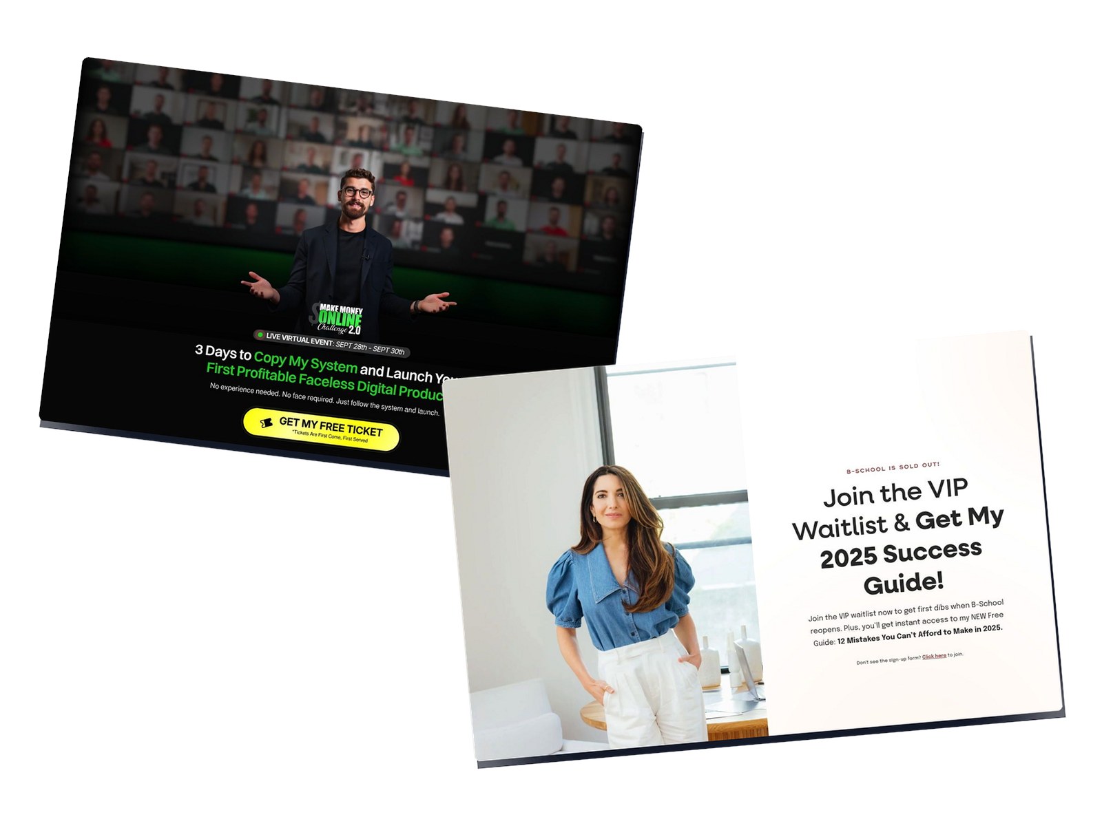
5. Iman Gadhzi

Caption: This is a minimalist registration page for a 3-day “Make Money Online Challenge 2.0.” The hero reads “3 Days to Copy My System and Launch Your First Profitable Faceless Digital Product.” Sub-copy promises “No experience needed. No face required.” One yellow CTA reads “GET MY FREE TICKET.” The background shows a wall of attendee video tiles to signal scale.
Industry & Purpose: This is an event registration page for the make-money-online education industry. It’s meant to convert cold traffic into free 3-day challenge attendees.
What Works: Here’s what I love: the page is single-minded. One promise, one button. “GET MY FREE TICKET” is the only action on the screen. Nothing distracts from the click.
The headline kills the two biggest objections in one line. “No experience needed. No face required” removes the fear of being a beginner and the fear of being on camera. That widens the audience instantly.
The video-tile background does quiet work. The wall of attendee faces signals that many people already joined. Social proof without a single testimonial sentence.
The bare layout is a choice, not laziness. A cold ad click has one job here: claim a ticket. Every extra section would give that visitor a reason to think twice and leave. By stripping the page to a promise and a button, Iman keeps the momentum from the ad alive. Fewer choices means faster action.
What can be Improved:
- The page is so bare that a skeptical visitor has little proof to lean on beyond the face wall.
- A date and time stamp near the CTA would add urgency for a live event.
- One line on what “faceless digital product” means would help cold visitors who don’t know the term.
Why it inspires: Iman shows the strength of a single-action page. Strip everything but the promise and the button. Kill the top objections in the headline. Let one CTA carry the whole funnel.
6. Russell Brunson

Caption: This is a free-plus-shipping book funnel for “Expert Secrets.” The page promises to help readers “Find Your Message, Build a Tribe, and Change The World.” The book is free; the reader covers shipping. CTAs read “YES! RESERVE MY FREE COPY NOW!” A bonus stack assigns dollar values to each extra (Expert Evolution $97, Hook Story Offer $97, Perfect Webinar slides $197). A “There is NO CATCH” section handles the free-offer objection.
Industry & Purpose: This is a book-funnel lead generation page for the online-marketing education industry. It’s meant to convert marketers into free-plus-shipping book buyers.
What Works: Here’s what I love: the free-plus-shipping mechanic is textbook. The book is free, so the yes feels easy. The reader pays shipping, which still captures a card and a buyer.
The bonus stack inflates the value of free. Each extra carries a price tag like $97 or $197. Against that math, a free book plus bonuses feels like winning, not buying.
The objection handling is direct. A “There is NO CATCH” section answers the suspicion every free offer triggers. The “Send Me Your Address” framing makes the next step feel physical and real.
That physical framing matters more than it looks. A free PDF feels disposable, so people grab it and forget it. A real book shipped to your door feels like an obligation to read. Asking for an address instead of just an email raises the perceived value of the offer. The reader treats it like a gift they ordered, not spam they ignored.
What can be Improved:
- The page is long and dense. Tighter sections would help mobile readers reach the CTA faster.
- The bonus stack could lead with the single strongest bonus instead of a long list.
- A clear shipping-cost number near the button would remove last-second hesitation.
Why it inspires: Russell shows the free-plus-shipping playbook at full strength. Make the yes feel free. Anchor the value with priced bonuses. Answer the “what’s the catch” fear before the visitor thinks it.
7. Codie Sanchez

Caption: This is a consult-call lead-gen page for “The Growth Boardroom.” The hero reads “You’re the Best Employee in Your Company. That’s the Problem.” A video block titled “What About Your Actual Day to Day” leads to “Book Your Free Growth Strategy Call (30 min).” Trust logos include Fox Business, Entrepreneur, Newsweek, Forbes, CNBC, and Good Morning America. The page shows members stuck at “$2.9M for years” who broke through.
Industry & Purpose: This is a lead generation page for the business-coaching industry. It’s meant to convert established business owners into free strategy-call leads.
What Works: Here’s what I love: the headline reframes a strength as a trap. “You’re the Best Employee in Your Company. That’s the Problem.” Every owner-operator feels that pain. It hooks the exact buyer.
The proof is concrete and relatable. Member stories show people “Stuck at $2.9M for years” who then grew. The named member profiles with real photos make the results feel earned, not staged.
The media wall builds credibility fast. Fox Business, Forbes, and CNBC sit near the top. The CTA is honest about the time cost too. “Book Your Free Growth Strategy Call (30 min)” sets the exact commitment.
Naming “30 min” on the button is a small detail that lifts bookings. A “free call” with no length feels like a trap that could eat an hour. A 30-minute call feels bounded and safe. The reader knows exactly what they’re agreeing to. Shrinking the perceived time cost makes the yes easier, even when the call is identical either way.
What can be Improved:
- The page leans on the call as the only action, so a softer lead magnet could catch the not-ready buyers.
- “No commitment required” appears late and could sit right under the first CTA.
- The video block needs a stronger play-button overlay to pull more views.
Why it inspires: Codie shows how to sell a call by naming a hidden problem. Reframe the buyer’s strength as the thing holding them back. Stack relatable member numbers. State the exact length of the free call so the ask feels small.
8. Marie Forleo

Caption: This is a VIP waitlist page for B-School. The hero reads “Join the VIP Waitlist & Get My 2025 Success Guide!” Early-bird framing promises first dibs and bonus material. CTAs repeat “Join the Waitlist” down the page. Trust logos include Forbes, The New York Times, Oprah, and People. A wall of star-rated student reviews and a “B-School Works. Here’s Proof.” section build the case.
ndustry & Purpose: This is a waitlist lead generation page for the online-business education industry. It’s meant to convert interested followers into early-access waitlist subscribers.
What Works: Here’s what I love: the waitlist reframes “not open yet” as a perk. “Join the VIP Waitlist & Get My 2025 Success Guide” turns a closed cart into early access plus a free guide. The visitor signs up to be first, not to wait.
The proof section goes deep on purpose. A wall of star-rated reviews sits under a “B-School Works. Here’s Proof.” header. Real student quotes back every claim.
The single CTA repeats at every scroll depth. “Join the Waitlist” is the only action, stated again and again. The Forbes, New York Times, and Oprah logos answer authority without a bio.
The waitlist itself creates pull through exclusivity. People want what feels limited or early. By gating the program behind a list, Marie turns a closed cart into a velvet rope. Signing up feels like getting on the inside before everyone else. The free guide is the bonus, but the real hook is the fear of missing the next open enrollment.
What can be Improved:
- The free “Success Guide” bonus could be shown as a visual to raise its perceived value.
- The review wall is dense and could use a slider on mobile to cut the scroll.
- The early-bird bonuses are mentioned but could carry a clearer deadline to add urgency.
Why it inspires: Marie shows how to make a closed cart work for you. Reframe the waitlist as VIP early access. Bundle a free guide for signing up now. Repeat one CTA and back it with a deep review wall.
9. Brendon Burchard

Caption: This is a registration page for a free 4-day virtual training to become a Certified High Performance Coach. The page promises to help you “charge more and confidently charge them” as a coach. CTAs read “Register now for our next Certification Week.” A mentor wall shows Oprah Winfrey Network, Jay Shetty, Tom Bilyeu, Ed Mylett, Mel Robbins, and Jamie Kern Lima. The page promises 12 months of ongoing support and a “100% Day Satisfaction Guarantee.”
Industry & Purpose: This is a registration page for the professional coaching industry. It’s meant to convert aspiring coaches into free certification-training attendees.
What Works: Here’s what I love: the mentor wall is the strongest trust play on this list. Oprah Winfrey Network, Jay Shetty, and Mel Robbins appear as fellow mentors. Their faces borrow more authority than any line of copy could.
The offer sells a business outcome, not a feeling. The training shows coaches how to “charge more and confidently charge them.” That ties the free class straight to income.
The risk reversal is strong. A “100% Day Satisfaction Guarantee” plus 12 months of ongoing support makes the next step feel safe. The “What is high performance coaching” block educates cold visitors before the ask.
That guarantee matters most because the ticket price is high. A free webinar needs little reassurance. A paid certification triggers real fear of wasted money. The guarantee removes that fear and makes the buyer feel they can’t lose. Pair it with a year of support, and the offer stops looking like a gamble. It starts looking like a safe bet on themselves.
What can be Improved:
- The page is long and text-heavy, so mobile readers face a lot of scrolling to the CTA.
- The mentor wall could name one specific result each mentor’s coaching produced.
- A clear date for “Certification Week” near the top would add urgency.
Why it inspires: Brendon shows how borrowed authority closes a high-ticket funnel. Put names your audience already trusts beside your own. Tie the free training to a money outcome. Reverse the risk with a guarantee and ongoing support.
Frequently Asked Questions
What makes a personal brand or coach funnel landing page convert?
These pages convert when they sell the person and the transformation before the offer. The pages above all lead with a clear outcome (Lewis Howes promises “Peace, Freedom, and Financial Abundance”), then back it with borrowed authority and one repeated action. Vague “change your life” copy loses to a real number like Vishen Lakhiani’s 4.94/5 rating from 25,227 students every time.
What’s the best funnel format for a personal brand offer?
It depends on the price and the goal. For a free lead capture, a short registration page like Vishen Lakhiani’s works best, with proof above the fold and a tiny form. For a low-cost entry, a free-book funnel like Russell Brunson’s “Expert Secrets” captures a card with free-plus-shipping. For a high-ticket coaching sale, a long page like Brendon Burchard’s stacks mentors, a guarantee, and ongoing support to earn the commitment.
How do coaches build trust on a landing page?
Coaches build trust by borrowing authority their audience already respects. Brendon Burchard places Oprah Winfrey Network, Jay Shetty, and Mel Robbins on his page as mentors. Codie Sanchez shows Fox Business, Forbes, and CNBC logos. A named mentor or a recognizable media logo does more work than a wall of anonymous five-star reviews.
Should a free offer page still be this detailed?
Yes. A free offer raises a different objection: “what’s the catch?” Russell Brunson answers it with a “There is NO CATCH” section and priced bonuses that make free feel valuable. The price of a free offer is the visitor’s attention and email, so the page still has to earn the yes.
How many calls to action should a coach funnel use?
One, repeated. Iman Gadhzi runs a single “Get My Free Ticket” button with almost no other copy. Marie Forleo repeats “Join the Waitlist” at every scroll depth. A page with one action stated often beats a page full of competing links and choices.
Final Thoughts
Personal brand funnels sell belief before they sell anything else.
Your visitor needs to believe the creator can deliver. They need to believe the free offer is worth their email. And they need to believe the next step is small and safe. The 9 pages above earn that belief with borrowed authority, specific numbers, and one clear action repeated until it sticks.
If your funnel isn’t converting, check three things. Lead with the transformation. Frame the free offer against a real value. And cut the page down to one next step.
If layout is the blocker between your offer and your next launch, an AI landing page builder writes a funnel page from your prompt and hands you a styled draft you can edit before you go live.
For creator-economy inspiration, see our 12 best landing page examples for creators. Want more across categories? Check our full list of 40 best landing page examples