University and executive-education landing pages sell something most marketers never have to. A 6-month to 3-year commitment. A five-figure cheque. The buyer’s professional identity.
Nobody clicks “Apply Now” on impulse. The visitor wants the brochure. The syllabus. The faculty list. The placement record. Proof the credential is worth their time. A weak hero or a generic “world-class learning” headline isn’t going to move them.
This list looks at 9 university and exec-ed landing pages doing the heavy lifting. IIM cohorts. Harvard-branded certs. Online doctorates. K-12 admissions. Law-entrance prep. Clinical CME platforms. Different price points. Different audiences. Same job. Turn high-intent research into a brochure download or admission application.
Here’s what makes them work.
Key Takeaways
Brochure-First Beats Apply-Now for Long-Cycle Programmes: ISB’s “DOWNLOAD BROCHURE” CTA appears three times before the application form. Execonline’s hero is a Harvard-crested brochure form. EIMT puts a sticky “Apply Now” next to a 36-month commitment. The pages that lead with brochure download convert higher because senior buyers read first and apply later.
Stack Rankings, Accreditations, or Founder Credentials Above the Fold: ISB stacks four global rankings (“#1 in India”, “#27 globally”). Execonline opens with the Harvard Medical School crest. EIMT shows eight named accreditation bodies. BoomerangFX leads with “Co-Creator of Morpheus8 & Co-Founder of Inmode”. For a high-ticket education buyer, the credential layer beats every adjective.
Lay Out Every Fee, Every Tier, Every EMI Option Inline: IIM Ranchi shows “Total Fees ₹60,000” upfront vs “₹66,718” EMI side by side. EIMT lists “₹6,50,000” tuition with three financing paths. AND Academy compares 4 course tiers (3 to 14 months). The pages that respect the buyer’s math get the application.
Replace Generic Faculty Photos With Named Credentials: Execonline names “Andrew Beam, PhD, Chief Technology Officer at Lila Sciences” plus a Harvard chair. BoomerangFX shows four named MDs with photos. IIM Ranchi puts two professors with “Read More” bios. Anonymous “renowned faculty” claims kill conversion in this category.
Key Elements of High-Converting University & Executive Education Landing Pages
Before the list, here’s what separates exec-ed and university pages that convert from the ones that don’t:
Lead with one stat or one credential, not three paragraphs of “world-class”: ISB opens with “#1 Premier business school in India”. Execonline opens with the HMS crest. RostrumLegal opens with “Most CLAT PG Aspirants Will Fail in 2027”. One signal. Not five. The buyer’s eye should land on a single trust marker before the brochure form.
Make the brochure the primary conversion event: Six-month and three-year commitments don’t close on first scroll. ISB has three brochure CTAs. Execonline has two. EIMT has a sticky “Apply Now” plus a brochure download. The brochure is the lead magnet that lets the buyer evaluate at home.
Show the price like an invoice, not a sales pitch: IIM Ranchi lays out “Application Fee ₹100”, “Registration ₹4,000”, “Program ₹56,000”, “Total ₹60,000”. EIMT shows “Fees: 6,50,000”. AND Academy stacks four course tiers with month counts. Hiding the price kills the working-professional buyer.
Stack accreditations, rankings, or media logos high on the page: EIMT shows eight accreditation badges (“ACBSP, ATHEA, AQS, DRPI, EURASHE, OTHM, QAHE, USDLA”). ISB cites the Financial Times rankings four times. AND Academy puts “Forbes”, “Education Awards 2025”, and “siliconindia” award logos near the hero. For unfamiliar brands, the third-party trust wall does the work.
Cite real faculty with named photos and credentials: Execonline’s “Andrew Beam, PhD” block. BoomerangFX’s “Dr. Stephen Mulholland”. IIM Ranchi’s two professor cards. The PhD Coach’s “Dr. Tripti Chopra”. Faces and full credentials beat a generic “led by industry experts.”
Run a comparison table for high-consideration purchases: IIM Ranchi compares “This Programme vs Other programmes” across five rows. RostrumLegal compares “Random Prep vs Crowded Coaching vs RostrumLegal.” A three-column comparison table handles the implicit objection (“why not the cheaper alternative”) without naming competitors.
Match search intent in the hero question: GIIS asks “Moving to Singapore and Looking for a High-Quality International school?”. RostrumLegal calls out “Most CLAT PG Aspirants Will Fail in 2027”. The hero copy should match the literal Google query the buyer typed. Generic “world-class learning” headlines lose to specific intent matches every time.
Once your rankings, faculty, and fee structure are mapped out, the page itself shouldn’t take a quarter to ship. You can build a B2B landing page by describing the programme and the brochure offer in one prompt, then editing the credentials block like a doc.
1. EIMT — Online DBA Program

Caption: EIMT sells a “Doctorate In Business Administration” to working executives. The hero shows a Lucerne campus shot and a sticky “Apply Now” button. The trust strip cites “Accredited by major accrediting bodies,” “A strong network of 500+ alumni worldwide,” “Up to 30% of the total tuition fees waived,” and “From 20+ Countries.” Tuition is delivered fully online over “36 Months.”
Industry & Purpose: This is a long-cycle doctorate enrolment funnel. It’s meant to convert mid-career executives into application leads.
What Works: Here’s what I love: the page leads with “No GMAT/GRE required” as Program Highlight #1. That single line kills the biggest mid-career objection in five words. Most working executives haven’t sat a standardized test in fifteen years.
The Why Choose EIMT grid runs ten reasons deep. A doctorate is a three-year commitment, and ten objections handled inline beats one fat brochure. Each reason gets its own card, not a buried bullet.
The accreditation wall is heavy and confident. Eight named bodies on a dedicated strip, not a vague “fully accredited” line. For an online doctorate from a less-known institution, accreditation skepticism is the conversion killer. EIMT answers it before the buyer has to ask.
The admission path is gentle. Native English speakers OR an IELTS 6 score, plus an EQF Level 7 qualification option. Dual paths convert the international audience without an essay-only filter.
What can be Improved:
- The hero copy “The DBA program is designed for experienced professionals…” is dense and could compress to one specific outcome line.
- The “Fees: ₹6,50,000” rupee fee and “Eligibility: Masters” get buried in the right-rail. These need to sit above the fold near the application CTA.
- The page has no faculty photos visible in the desktop scroll. “Industry Experience Faculty” is the third-most-cited reason but lacks a face.
Why it inspires: EIMT proves an online doctorate can be sold without ranking prestige if you handle every objection inline. Eight accreditations. Ten reasons. Two language pathways. The accreditation wall does the trust work that a Harvard or IIM crest does for a branded programme.
2. RostrumLegal — CLAT PG Rank Optimizer
Caption: RostrumLegal sells a CLAT PG 2027 rank optimization course to law-entrance aspirants. The hero breaks the standard coaching-course frame with the line “Most CLAT PG Aspirants Will Fail in 2027.” Pricing is ₹13,000 for early access, and the page leans on 13 years of receipts plus 10,000+ aspirants trained.
Industry & Purpose: This is a results-led prep-course sales page. It’s meant to convert serious CLAT PG aspirants into early-access enrolments.
What Works: Here’s what I love: the headline picks a fight with reality. “Most CLAT PG Aspirants Will Fail in 2027. Not because they are incapable. Because they prepare randomly.” That’s a positioning hammer. It separates RostrumLegal from generic coaching in one breath.
The product framing is precise. “This Is Not Another Coaching Course. This Is a Rank Optimization System.” That single re-frame stops buyers comparing it to Unacademy or BYJU’s. A system has no obvious price ceiling.
The results poster is the real closer. A grid of student faces with their AIRs printed underneath, from CLAT PG 2026. All India Ranks are the only metric that matters in this category. The grid sells without a single line of marketing copy.
The countdown sits below it, honest. A real clock for the early-access price, anchored to a real exam date. No fake “only 3 spots left.”
What can be Improved:
- The brutal-honesty headline could lose nervous parents who read first. A subhead that softens for parent co-deciders would broaden the funnel.
- The “₹13,000” price reveal sits at the bottom of the page. A second pricing card mid-scroll would catch the visitor who skims to testimonials.
- The student-rank poster is powerful but unnamed. Adding 1-2 named ranker quotes would convert the “is this real?” skeptic.
Why it inspires: RostrumLegal shows the rank-led prep playbook. Don’t sell the course. Sell the system. Anchor every claim to a specific All India Rank. Stack 13 years of receipts. Then put the price card under a real countdown.
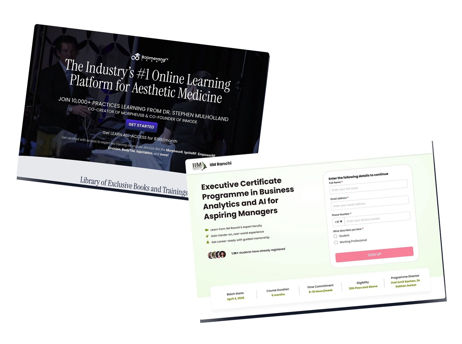
3. IIM Ranchi — Executive Programme in Business Analytics

Caption: IIM Ranchi sells an “Executive Certificate Programme in Business Analytics and AI for Aspiring Managers.” The hero pairs an “Apply Now” form with a batch-start date and four eligibility chips. Tuition: “Total Fees ₹60,000” upfront or “EMI ₹66,718” over six months. The page leads with the IIM Ranchi crest and a 5-step admission process.
Industry & Purpose: This is an IIM-branded executive certificate funnel. It’s meant to convert working professionals into application leads via institutional credibility.
What Works: Here’s what I love: the fee block reads like a spreadsheet, not a sales pitch. Application fee, registration, program fee, total. All visible inline. The struck-through ₹500 application fee dropped to ₹100 is a tiny commitment device that pulls the buyer one click further.
The “How is this course different from others?” comparison table is the real conversion driver. Five rows of “This Programme vs Other programmes.” Direct comparison closes the door on generic coaching alternatives without naming a single competitor.
The capstone framing is concrete. The page names actual tools the buyer will use, like Amazon Bedrock Agents for enterprise workflows. Specific outcomes beat the generic “learn analytics” pitch every other LP runs.
The market-context block earns the on-fence prospect’s attention. Deloitte cited. Markets and Markets cited. Even an Elon Musk quote sits there as a finishing flourish. Stats with sources travel further than stats alone.
The NBFC partner row kills the financing objection. Six named lenders, not a generic “EMI available” line.
What can be Improved:
- The hero says “Aspiring Managers” but the buyer-profile filter offers four segments (Tech, Non-Tech, Owners, Students). The hero should match the four-segment funnel.
- The “Live Mentor Sessions” and “Career Support” benefits live deep in the page. Both belong in the hero benefit-strip.
- Mobile stacks the buyer-profile filter as a horizontal scroll which is easy to miss.
Why it inspires: IIM Ranchi shows that an institutional brand can still earn the click with concrete details. Lay out the fees like an invoice. Run a real comparison table. Cite Deloitte and Markets and Markets. The buyer feels respected, not pitched.
4. BoomerangFX — Clinical Masterclass

Caption: BoomerangFX sells “The Industry’s #1 Online Learning Platform for Aesthetic Medicine.” The hero promises “JOIN 10,000+ PRACTICES LEARNING FROM DR. STEPHEN MULHOLLAND, CO-CREATOR OF MORPHEUS8 & CO-FOUNDER OF INMODE.” CTAs: “GET STARTED” and “PURCHASE OUR BOOKS.” The page features a “Library of Exclusive Books and Trainings,” “Live Clinical Trainings,” and “7+ Years Education Healthcare Professionals” plus “372+ Hours of Live Demonstrations.”
Industry & Purpose: This is a B2B subscription page for aesthetic-medicine continuing education. It’s meant to convert practicing clinicians into masterclass subscribers.
What Works: Here’s what I love: the founder credential carries the entire hero. “Dr. Stephen Mulholland, Co-Creator of Morpheus8 & Co-Founder of Inmode.” Aesthetic-medicine practitioners already know Morpheus8 and have used Inmode equipment. That existing trust is the buyer’s mental shortcut to “this is real CME.”
The product stack is shrewd. The buyer gets a library of on-demand books and trainings plus live clinical sessions, all in one subscription. Two product types under one price builds higher perceived value than a single course.
The instructor wall earns trust the way a CME platform should. Four named MDs with real photos, plus seven-plus years of healthcare education and 372 hours of live demonstrations on record. CME platforms live or die on teacher credentials and content volume.
The certificate block closes the “what do I get” question fast. A real cert mockup with the BoomerangFX seal sits next to the offer. Aesthetic medicine is a credentials-driven category, and visible credentials sell.
What can be Improved:
- The hero treats the platform offer (“GET STARTED”) and the book offer (“PURCHASE OUR BOOKS”) as equally weighted. Pick one primary action so the buyer doesn’t bounce between two paths.
- No pricing visible above the fold. CME buyers compare per-CE-credit cost. An “starting at $X/month” line in the hero would lift conversion.
- The training thumbnails (“Injectables,” “QuantumMT,” “Morpheus Face”) lack hover or modal previews. A 30-second sample clip per category would boost free-trial signups.
Why it inspires: BoomerangFX shows how to sell professional CME with founder credibility. Pick the inventor of a procedure your buyers already use. Stack the named instructors. Show the certificate. Quantify the hours. Let the buyer’s existing trust in your founder do the closing.
5. The PhD Coach — Thesis AI Workshop

Caption: The PhD Coach sells a “LIVE 2 Hours Workshop of practical demonstration of AI tools and techniques with Dr Tripti Chopra revealing R.A.P.I.D. framework for the first time.” The page targets PhD candidates with “5000+ academics and researchers already trained.” CTAs: “YES! I WANT TO JOIN THE LIVE SESSION,” “Book Your Seat Now,” “JOIN THE WEBINAR NOW FOR ₹99.” Bonuses worth “₹12,500” are stacked free with registration.
Industry & Purpose: This is a paid-webinar lead-magnet page for academic professional development. It’s meant to convert PhD researchers into ₹99 workshop registrants.
What Works: Here’s what I love: the pricing trick is brilliant. ₹99 launch seat, ₹299 for the first 100 early-birds, ₹599 after. Three tiers in plain text. The visitor sees the urgency without a fake countdown timer.
The R.A.P.I.D. framework is the curiosity hook. The page reveals it “for the first time” to an audience of 5000+ already-trained academics. That “first time” phrasing creates a one-shot urgency that most webinar pages fake.
The audience filter handles the relevance question in three seconds. Six tiles with photos: researchers, professors, research scholars, academic writers, PhDs, master’s students. The visitor sees themselves on the page before they read a single sentence.
The bonus stack is classic webinar-funnel gold. Five bonuses with rupee values, totalling ₹12,500 free with a ₹99 ticket. The buyer’s brain registers the math instantly.
The money-back seal is the final close. For a ₹99 ticket the guarantee is mostly a trust signal. But it removes the last “what if I don’t like it” hesitation.
What can be Improved:
- The page has no Dr. Tripti Chopra credentials block above the fold beyond “Founder of The PhD Coach.” A line like “Trained 5000+ PhD candidates” near the hero would strengthen the close.
- The R.A.P.I.D. framework name reveals on the bonus card but never gets explained. A 2-line teaser would make the framework feel real, not gimmick.
- The mobile chunk shows a WhatsApp client testimonial but the desktop hero doesn’t lead with it. A single visible WhatsApp screenshot near the hero would humanize the 5000+ count.
Why it inspires: The PhD Coach shows the academic-webinar funnel done well. Tease a named framework. Stack five real bonuses with rupee values. Layer a real countdown with a tiered price ladder. Add a money-back seal at the close. The format works for any niche where the audience is research-curious and money-cautious.
6. AND Academy — Graphic Design Courses

Caption: AND Academy sells graphic design courses across four tiers, from a 3-month bootcamp to a 14-month PG Diploma. The hero pairs a “Request A Call Back” form with a video-call booking badge. Trust markers: 4,300+ teaching hours, 1,500+ learner community, 200+ hiring partners, 4.5 Google reviews.
Industry & Purpose: This is a creative-skills course funnel. It’s meant to convert career-changers into a discovery call or demo class booking.
What Works: Here’s what I love: the four-tier course ladder is laid out as a comparison grid. Bootcamp at 3 months, Certificate at 5, Diploma at 9, PG Diploma at 14. Each tier shows the same module groups so a career-changer can map their full learning path before booking a call.
The brand wall earns industry credibility. Hiring-partner logos from squareboat, SCALER, arm, and Lucid sit next to named press awards from Forbes India, Education Awards 2025, and siliconindia. Two trust layers in one block.
The Job Guarantee chip on the Diploma and PG Diploma is the high-ticket closer. For a ₹50k+ commitment, one badge removes the “will I get a job” risk that kills most creative-skills LPs.
The proof section pairs real student work with named placements at real companies. No stock-photo testimonials.
What can be Improved:
- The hero copy is dense. A single H1 like “Become a hireable graphic designer in 9 months” would beat the four-product description.
- The four-tier comparison table doesn’t show price. A “Starting from ₹X” anchor on each tier would convert the price-sensitive visitor.
- The countdown timer for the “Apply by 4th Feb” deadline gets visually crushed by surrounding course descriptions.
Why it inspires: AND Academy shows how to sell a four-tier creative-skills programme without a single hero hype line. Stack the brand logos. Show the awards. Lay out every module. Add a Job Guarantee on the high-ticket tier. Let the curriculum depth do the persuasion.
7. Global Indian International School — Admissions

Caption: GIIS Singapore sells admission to its international K-12 schools. The hero asks “Moving to Singapore and Looking for a High-Quality International school?” and pairs an “Apply now” form with a video testimonial reel. The “Explore your child’s options at GIIS” CTA repeats five times down the page. Trust stats: “IB Diploma 2025 Results: 17 World Toppers, School average 37.4” and “CBSE 12 2025 Results: Highest Score 98%, School average 85.2%.”
Industry & Purpose: This is a K-12 admissions enquiry page. It’s meant to convert relocating-to-Singapore parents into admission enquiry leads.
What Works: Here’s what I love: the hero question speaks to the exact buyer moment. “Moving to Singapore and Looking for a High-Quality International school?” That’s the literal Google query a relocating parent types. The page matches their intent in one sentence.
The dual-curriculum offer handles the K-12 parent’s biggest worry. Three age tiers. Six curriculum options between IB, CBSE, and IGCSE pathways. The page solves “which board” before the parent has to ask.
The results block is doctor-level specific. 17 IB World Toppers from 2025. A school average of 37.4 on IB Diploma. A 98% top score on CBSE 12. International-school parents compare board results obsessively, and this block answers the comparison in thirty seconds.
The video testimonials close the deal. Real quotes from named parents like Ms Manjusha K. about the school feeling like “our school,” paired with real photos of the actual classrooms and boarding rooms. Not stock images. Parents can see what they’re sending their child to before they book the tour.
What can be Improved:
- The five-times-repeated “Explore your child’s options at GIIS” CTA reads as the same button. Two of those should swap to specific actions like “Book a Campus Tour” or “Talk to Admissions.”
- The boarding facilities photo block lacks a price or fee anchor. A “Day school vs boarding pricing” line would help the parent budget faster.
- The page mentions “64 campuses in 11 countries” but doesn’t surface the Singapore-specific campus count or address near the hero.
Why it inspires: GIIS shows how to convert a high-intent K-12 buyer with curriculum specificity. Match the search intent verbatim. Show the IB and CBSE results side by side. Run real parent video testimonials. Specify the age-band curricula. The K-12 lessons translate to any high-consideration education funnel.
8. Execonline — Harvard Medical School AI in Healthcare

Caption: Execonline partners with Harvard Medical School to sell an “AI in Health Care: From Strategies to Implementation” certificate. The hero pairs the HMS crest with a sticky brochure form and a “Download Brochure” CTA. Two stat cards anchor the why. Financing options run from a 4% upfront discount at $2,976 to a 3-installment plan at $1,152 each.
Industry & Purpose: This is a branded-university certificate funnel. It’s meant to convert healthcare leaders into brochure leads via the Harvard halo.
What Works: Here’s what I love: the Harvard logo sits quiet in the top-left, no shouting. The brand does the trust work for the page. Healthcare leaders already know what HMS means.
The stat anchor is sharp. 50% of healthcare orgs deploying AI. 40% average accuracy gain. $187.9B market size. Three numbers tell the buyer this is a real wave, not a fad.
The capstone framing closes busy executives. “Develop a Solution for Your Organization.” The buyer doesn’t just learn theory. They walk out with something their CEO can use on Monday.
The financing block handles the price objection openly. Three pay paths visible: upfront discount, three-installment plan, or team-based purchase for the employer. No hidden tiers, no enquiry-form gating.
Faculty credibility lands with a real face and a real title. Not “renowned faculty” but Andrew Beam, PhD, the chief technology officer at Lila Sciences plus a Harvard chair. Specificity sells.
What can be Improved:
- The “Key Takeaways: AI in Health Care” block sits below the fold and reads dense. Two lines per bullet would scan better than four.
- The hero cohort start date and time commitment (“10 weeks, Online + Live, 4-6 hours/week”) deserve a louder visual treatment near the brochure CTA.
- The “Maximize Your Learning — Benefit from over 14% Savings” employer-sponsorship card is buried. It could power a B2B funnel if surfaced higher.
Why it inspires: Execonline shows the brand-licensing exec-ed playbook. Lead with the partner crest. Anchor with two big-number stats. Lay the full financing menu on the page. Let the prospect decide if this is for them or their team.
9. ISB — Venture Capital Programme

Caption: ISB sells a 22-week executive certificate in Venture Capital and Private Equity. The hero stacks four ranking badges plus a “DOWNLOAD BROCHURE” CTA. The page targets working professionals with 5+ years of experience. Tuition is “₹4,91,000.”
Industry & Purpose: This is a brochure-funnel page for premium executive education. It’s meant to convert senior professionals into application leads.
What Works: Here’s what I love: ISB doesn’t waste the first scroll on adjectives. The hero just stacks four global rankings, each with a named source. For a senior buyer evaluating a six-figure programme, four cited numbers beat four paragraphs of “world-class learning.”
The cohort math sits upfront. 22 weeks. ₹4.91 lakh tuition. 5 years of experience minimum. No “request a quote” runaround. Senior buyers don’t fill forms to learn the price.
The brochure CTA is the smartest move on the page. “DOWNLOAD BROCHURE” repeats three times before the application form even shows up. A six-month exec-ed commitment doesn’t close on the first scroll. ISB knows that, so the brochure becomes the actual conversion event.
The Programme Highlights section earns its space with numbers, not adjectives. 100+ video lectures, 2 live faculty sessions, 6+ masterclasses, 1 capstone. Specificity replaces puff.
What can be Improved:
- The hero feels copy-heavy on desktop with two stacked badge rows, the rank counts, and the brochure form competing for attention.
- The “Past Participant Profile” chart shows mostly senior alumni (32.8% with 18+ years experience), but the page doesn’t lead with that.
- Faculty bios show only two professors above the carousel. A third visible bio would reduce the “is this thin” worry.
Why it inspires: ISB shows that for a six-figure exec-ed programme, ranked credibility plus a brochure-first CTA does more than a hard-sell hero. Stack the rankings. Cite the source. Give the prospect something to read before they apply.
Frequently Asked Questions
What makes a university or executive education landing page convert?
University and exec-ed pages convert when they prove credibility before they ask for the application. The pages above all lead with one of three signals: a ranking (ISB stacks four FT rankings), a partner crest (Execonline shows the Harvard Medical School logo), or a named expert (BoomerangFX leads with the Co-Creator of Morpheus8). They then lay the fee structure inline and offer a brochure download as the primary CTA. Generic “world-class learning” pages lose to specific credential-led pages every time.
What’s the best landing page format for executive education programmes?
For exec-ed certificates and degrees, the highest-converting format is a brochure-funnel page. Hero with one credential signal plus a brochure form. Programme highlights with quantified specs (“100+ video lectures,” “2 live sessions”). Faculty bios with named photos. Fee structure with EMI options. Then a comparison table for high-consideration buyers. ISB, IIM Ranchi, and Execonline all run this pattern. EIMT runs the same template for an online doctorate with an accreditation wall doing the trust work in place of a ranking.
How should an online education programme handle accreditation skepticism?
Show the accreditation bodies by name and logo. Don’t say “fully accredited.” EIMT shows eight accreditation badges (“ACBSP,” “ATHEA,” “AQS,” “DRPI,” “EURASHE,” “OTHM,” “QAHE,” “USDLA”) on a dedicated strip. For online doctorates and certificates from less-known institutions, the visible third-party trust wall is the conversion driver. One missing badge a buyer recognizes can kill the application.
Should education landing pages show the price?
Yes. Working professionals don’t fill brochure forms to find out the cost. IIM Ranchi shows “Total Fees ₹60,000” upfront vs “₹66,718” EMI side by side. ISB shows “₹4,91,000.” Execonline shows three financing tiers. EIMT shows “Fees: ₹6,50,000.” Hidden pricing kills the senior buyer who’s evaluating four programmes and shortlisting on cost. The exception: if you run an enquiry-led admissions funnel (like GIIS for K-12), price comes after the campus tour.
How long should a university or exec-ed landing page be?
Long enough to handle every objection. A 36-month doctorate (EIMT) needs 10 reasons-why bullets, eight accreditation logos, and a dual-language admission table. A ₹99 webinar (The PhD Coach) needs a hero, six bonus stacks, a countdown, and a money-back seal. The longer the commitment, the deeper the page. Match your scroll length to the price tag and the buying-cycle length, not a generic word count.
Do university landing pages still need a brochure download?
For long-cycle programmes, yes. Six-month executive certificates and three-year doctorates rarely close on first scroll. The brochure download lets the buyer evaluate at home, share with a partner, or pitch to an employer who’s funding the course. ISB has three brochure CTAs. Execonline has two. The brochure is the primary conversion event for the programmes above ₹2 lakh. For shorter prep courses (RostrumLegal, AND Academy, The PhD Coach), the direct CTA replaces the brochure.
Final Thoughts
University and executive education landing pages sell something different than most.
They sell a long-cycle commitment of time, money, and professional identity. The 9 pages above earn that commitment by showing rankings, citing accreditations, naming faculty, and laying out every fee inline. They treat the buyer like an educated adult evaluating a five-figure decision, not a casual visitor browsing.
If your education page isn’t converting, the fix usually sits in one place. Lead with one specific credential, whether that’s a ranking, a partner crest, or a named expert. Make the brochure the primary CTA for any commitment over six months. Show the price like an invoice, not a sales pitch.
If layout is the blocker between your programme and the next cohort, an AI landing page builder writes a brochure-led page from your prompt and gives you a styled draft you can edit before the next intake.
For shorter education funnels (creator-style courses and masterclasses), see our 11 best education landing page examples. Want more across categories? Check our full list of 40 best landing page examples.