Most landing pages don’t fail because the product is weak. They fail because a piece is missing, or the pieces show up in the wrong order. A visitor lands, can’t tell in three seconds what this is or why they should care, and leaves.
A high-converting landing page is the same handful of elements, arranged the way a buyer actually makes a decision. First they check it’s relevant. Then they take in the offer. Then they decide whether to trust you. Then they act. Get that order right and a page converts. Skip a step and it leaks.
This guide walks through every element a page needs, why each one earns its place, and the one-line prompt that gets the Swipe Pages AI to build it for you. It’s the companion to our prompt library: that one teaches you how to brief the AI, this one tells you what to ask for.
Key Takeaways
- A landing page converts because of the right elements in the right order (relevance, offer, proof, action), not because it looks pretty.
- Match your message: the page headline has to echo the ad or email that sent the visitor, or you lose the scent and they bounce.
- Make one promise above the fold, describe what you actually sell, and skip the clever slogan. One promise beats three.
- Use one call to action, repeated top, middle, and bottom, and kill the nav menu. Every extra link is an exit. Aim for a 1:1 attention ratio.
- Let other people sell for you. Named testimonials and real reviews convince better than anything you write about yourself.
- Sell what the customer gets, not what the product has. Benefits move people; feature lists don’t.
- Answer the biggest objection before the form and add a guarantee, so the last doubt is gone before they’re asked to act.
- Keep the form short (3 to 5 fields) and the page fast on mobile. Fewer fields mean more leads, and a slow page leaks them.
What makes a landing page convert?
A landing page converts when it matches the promise that brought the visitor there, states one clear offer, backs it with proof, and points to a single obvious action. Everything else (the design, the photos, the copy you sweated over) only matters if those four are in place. The median paid landing page converts around 6.96%, but pages that get this right regularly do much better (WordStream by LOCALiQ, Google Ads benchmarks across 17,998 campaigns, 2024).
The rest of this article breaks those four jobs into the actual elements that do them.
Why most pages leak
Here’s what usually happens: people build a page like a brochure. They list everything about the company, add a few stock photos, drop a “Contact Us” button at the bottom, and wonder why nobody converts. A landing page isn’t a brochure. It has one job and one action, and every element either moves the visitor toward that action or gets cut.
The leaks are almost always the same. No clear promise up top. Proof buried at the bottom where nobody reaches it. Five different things to click instead of one. A form asking for a phone number when all you needed was an email. None of these are hard to fix once you know to look for them.
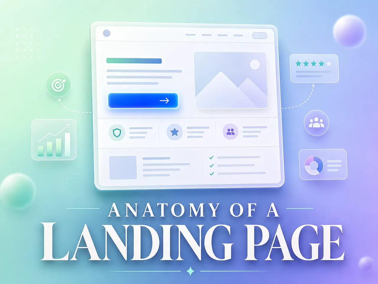
The elements, one by one
Here’s the full anatomy. For each element: what it is, why it converts, and the prompt that builds it in Swipe Pages. The prompts have [brackets] you swap for your own details.
1. Message match (the promise carries over)
The headline on your page has to echo the ad, email, or link that brought the visitor there. If your ad said “Free 14-day trial” and your page leads with “Welcome to our platform,” the scent is broken and people bounce. Message match is the first thing a visitor checks, usually without realizing it.
Peep Laja, who founded the CRO training company CXL, calls this keeping the “scent”: “The ad they see or the email they read needs to smell like the landing page they land on.” Break the scent and you lose the click you already paid for.
Prompt:
Make the hero headline echo this ad: "[paste your ad copy]". The visitor should land and instantly feel they're in the right place.2. The hero (one clear promise)
The hero is the top of the page: headline, a supporting line, and one visual. It has one job, which is to make the promise. Not three promises. One. The visitor should know what you’re offering and who it’s for before they scroll.
The trap is writing a slogan instead of a description. Julian Shapiro, who wrote one of the most-referenced landing page guides around, has a simple litmus test for the headline:

Julian Shapiro — Startup Handbook: Landing Page Copywriting (read it)
Harry Dry, who runs Marketing Examples, puts the same bar even more bluntly, borrowing a line from Donald Miller:

Harry Dry — Marketing Examples, “My step-by-step guide to landing pages” (read it)
And the reason the hero matters this much: people barely scroll past it. Nielsen Norman Group’s eye-tracking work found most attention never leaves the top of the page.

Nielsen Norman Group — Scrolling and Attention (read it)
Prompt:
Write a hero for [product/service]. One headline that states the single promise, a one-line subheadline that explains it, aimed at [who the customer is]. No fluff.3. One call to action, repeated
A converting page asks for one thing. Book a call. Buy now. Download the guide. Pick the single action and repeat its button near the hero, again mid-page after you’ve built some desire, and again at the bottom. Don’t scatter different actions across the page, and drop the navigation menu while you’re at it. Every extra link is a way out.
Oli Gardner built a whole concept around this, the “attention ratio,” and the target is as strict as it sounds:

Oli Gardner — “The Landing Page Manifesto,” SearchLove London / Distilled (view the deck)
Prompt:
Make the main call-to-action button impossible to miss. Reword it so it says exactly what happens when someone clicks, and repeat it near the top, the middle, and the bottom.4. Social proof and testimonials
People trust other people more than they trust you. Real reviews, named customers, and ratings do the convincing your own copy can’t. Robert Cialdini gave this its name decades ago, and it holds up because it describes how people actually behave:

Robert Cialdini — Influence: The Psychology of Persuasion, Ch. 4 (read the chapter)
The numbers back it. Northwestern’s Spiegel Research Center found reviews move the needle hard once a product has even a handful:

Spiegel Research Center, Northwestern University — How Online Reviews Influence Sales, 2017 (read it)
And put proof where the visitor is already looking. Julian Shapiro’s advice is to lead with it: “Your goal is to make it seem like everyone in the world already knows about you, and to make the visitor feel left out.”
Prompt:
Add a testimonials section with 3 short, believable reviews from people like [my customer type], focused on [the outcome that matters most]. Swap in real ones before publishing.5. Trust signals and stats
Trust rarely comes from one big badge. It builds from small signals scattered across the page at the moments a visitor starts to doubt. A stats strip under the hero (“10,000 customers, 4.9 stars, 12 years in business”) does a lot of quiet work before anyone reads a word of your pitch.
The fastest gut-check Harry Dry gives for any element on the page: “Examine each element and ask: Would this help me sell if I met the customer in person?” If a trust signal wouldn’t come up in a real sales conversation, it’s probably decoration.
Prompt:
Add a stats strip right under the hero with these proof points: [number 1], [number 2], [number 3].6. Benefits, not features
A feature is what your product has. A benefit is what the customer gets. “256-bit encryption” is a feature. “Your data stays yours” is the benefit. People buy the benefit. Lead with it, and let the feature be the reason it’s true.
David Ogilvy said it forty years ago and it hasn’t aged a day: “Advertising which promises no benefit to the consumer does not sell, yet the majority of campaigns contain no promise whatever.” Julian Shapiro makes the same point about a landing page: “It talks in terms of benefits to the visitor. It clarifies the specific outcome of using the product.”

Julian Shapiro — Startup Handbook: Landing Page Copywriting (read it)
Prompt:
Rewrite the [section name] to focus on the benefit, not the feature. The benefit the customer actually gets is: [what they get].. Objection handling and risk reversal
Every visitor has a reason not to buy. “Too expensive.” “Won’t work for me.” “What if I hate it?” The page that converts answers the biggest doubt before the visitor reaches the form, and softens the risk with a guarantee where it fits. Name the objection out loud and handle it. Silence reads as “they don’t have an answer.”
These doubts are emotional before they’re rational. Talia Wolf, who runs the CRO agency GetUplift, builds her whole method on that:

Talia Wolf — GetUplift, Emotional Targeting (read it)
Prompt:
Add a section right before the form that handles this objection: "[the exact doubt your customer has]". Make it reassuring and specific, and add a guarantee if I have one.8. Visuals and video
Images and video aren’t decoration. They show the thing, carry the story, and hold attention long enough for the copy to land. A short explainer video or a real photo of the product beats a stock image of a smiling stranger every time. Julian Shapiro frames the practical reason simply:

Julian Shapiro — Startup Handbook: Landing Page Copywriting (read it)
Prompt:
Show me the images in my media library, then use the best fit for the [hero / gallery]. If nothing fits, tell me what photo I should add.9. A friction-free form
The form is where intent turns into a lead, and it’s where pages lose people. Every extra field is a reason to quit. Ask only for what you’ll actually use. If email is enough, ask for email.
The hard data here is unambiguous. Baymard Institute, which has run usability research on checkout flows for years, found most sites ask for far more than they need:

Baymard Institute — Checkout Optimization: Minimize Form Fields, 2024 (read it)
HubSpot’s analysis of 40,000+ landing pages lands in the same place: “use as few form fields as you can on your landing pages.” Their data showed conversion rates dropping as fields piled up.

HubSpot — Which Types of Form Fields Lower Landing Page Conversions? (read it)
Prompt:
Build a lead-generation page for [offer]. Capture only [name, email, phone — pick what you need]. One offer, one action, minimal distraction.10. Speed and mobile
None of the above matters if the page is slow or breaks on a phone. Most web traffic is mobile now, so a page that loads slowly on mobile is leaking the majority of your visitors.

Contentsquare — 2024 Digital Experience Benchmark Report (read it)
And speed isn’t a nice-to-have, it’s measured in conversions. A Deloitte and Google study found a 0.1-second improvement in load time lifted retail conversions by 8.4% and average order value by 9.2%. Swipe Pages handles this for you: pages are mobile-responsive and hosted on fast infrastructure by default, so speed isn’t a thing you build, it’s a thing you get.
The order matters
You can have every element on this list and still lose if they’re in the wrong order. The eye follows a path: headline, then the supporting line, then the visual, then the proof, then the button. That’s the order a visitor reads and the order they decide in. Lead with the promise, prove it, then ask. Asking before you’ve earned it (a “Buy Now” button above any reason to buy) is the most common reason a good-looking page still doesn’t convert.
The fastest way to feel this is to study pages that already get it right. We pulled together 40 landing page examples across SaaS, e-commerce, courses, and services, and once you know the elements above, you start spotting the same moves on every good one: one promise up top, proof close behind, a single action you can’t miss.
Here’s the whole anatomy in one view:
| Element | Why it converts | Build it with |
|---|---|---|
| Message match | Keeps the promise that brought them in | “Make the hero echo this ad…” |
| Hero | States one clear promise up top | “Write a hero for [product]…” |
| One repeated CTA | One action, no exits | “Make the CTA impossible to miss…” |
| Social proof | Others convince better than you do | “Add 3 believable testimonials…” |
| Trust signals | Small confidence cues across the page | “Add a stats strip under the hero…” |
| Benefits | People buy what they get, not what it has | “Rewrite [section] for the benefit…” |
| Objection handling | Kills the doubt before the form | “Add a section before the form that handles…” |
| Visuals / video | Shows the thing, holds attention | “Use the best image from my library…” |
| Friction-free form | Fewer fields, more leads | “Capture only [the fields you need]…” |
| Speed + mobile | Most traffic is mobile; slow pages leak | Built in, hosted and mobile-ready |
How Swipe Pages builds all of this from one brief
You don’t assemble these elements by hand. With the Swipe Pages AI Landing Page Builder you describe your offer, and the AI researches it, writes the copy around these exact conversion principles, lays out the page, and pulls your logo, colors, and fonts from your URL. Then you edit by chat or drag-and-drop. You describe, the AI generates, you edit.
The honest catch: the page is only as good as the brief you give it. A lazy brief gets a lazy page. That’s why the prompts above matter, and why the prompt library exists, to show you how to hand the AI a real brief for every one of these elements.
There’s one more shortcut for the part most people get stuck on: knowing what each of these elements should actually look like.
Don’t know what a conversion block should look like? Don’t think about it.
Everything above is the what: the elements a page needs. The usual catch is the how. Even with a good AI builder, you still have to describe each block well enough to get something that fits your page. A testimonial wall, a pricing block, an objection-killer section: each has a layout and a way it should sit on the page. Most people don’t have that in their head, so they skip the element or get a generic version that looks bolted on.
Swipe Genie has a shortcut for exactly this. In the AI chat, type /conversion and a gallery of conversion-element blocks opens: pricing, testimonial, author, objection-handler, stats, CTA, and more. Each one shows up as a real picture of that section, not a name in a list, so you choose what you can already see. Pick one and it gets attached to the chat as an image plus a prompt that’s already written, and that prompt tells the AI to rebuild the block in your own page’s design and drop it where it belongs.

Type
/conversionin the Swipe Genie chat and pick a conversion block by sight: pricing, testimonials, objection-handlers, CTAs. Each one auto-adapts to your page’s design and copy when you drop it in.
So you never answer “how should this look?” You answer “which element do I need?”, the easy question, and the AI handles the layout, the styling, and the on-brand fit. Want to tweak the prompt first? Go ahead. You don’t have to; the default already matches your page.
Plenty of builders have an AI now. What they don’t have is this: you point at a picture of the conversion element you want, and it comes back built into your page like it was always there.
What you learned
A high-converting landing page isn’t a design trick. It’s a sequence. You earn the click by matching the visitor’s intent, make one clear promise, back it with proof, remove the doubts, then ask for one action. Run the buyer through relevance, offer, proof, and action in that order and the page does its job. Here’s the whole thing in ten lines.
- Message match – the headline echoes the ad or email that brought them, so the scent holds.
- One clear promise above the fold – one promise, described plainly, not a slogan.
- One repeated CTA, no nav – same action top to bottom, no links that leak visitors out.
- Social proof – named customers and real reviews sell harder than your own copy.
- Trust signals – small confidence cues placed where doubt creeps in.
- Benefits over features – sell what they get, not what the product has.
- Objection handling – answer the biggest doubt before the form, add a guarantee.
- Visuals and video – show the real thing; stock photos don’t hold attention.
- Friction-free form – 3 to 5 fields, ask only for what you’ll use.
- Speed and mobile – most traffic is mobile, and a slow page bleeds leads.
You don’t have to build these from scratch. Swipe Pages’ AI builder generates each element from one brief: describe the page, the AI generates it, you edit. And the /conversion slash command drops in pre-designed conversion blocks already matched to your page’s design.
Frequently asked questions
What makes a landing page convert?
A landing page converts when it matches the promise that brought the visitor in, states one clear offer, backs it with proof, and points to a single obvious action, in that order. The median paid landing page converts around 6.96%; pages that get this sequence right often do considerably better.
How many calls to action should a landing page have?
One. Pick a single action and repeat that same button near the top, the middle, and the bottom of the page. Multiple competing actions split attention and lower conversions, which is why removing the navigation menu helps too. Oli Gardner’s rule of thumb is a 1:1 “attention ratio”: one thing to do, one place to click.
Where should testimonials go on a landing page?
After you’ve introduced the offer but before the final call to action, so proof lands at the moment a visitor is deciding whether to trust you. Scatter a few smaller trust signals (ratings, customer counts) higher up as well. Reviews matter more than most people think: Northwestern’s Spiegel Research Center found a product with five reviews is 270% more likely to be bought than one with none.
How many fields should a landing page form have?
As few as you can get away with. Ask only for what you’ll actually use. Baymard Institute found most checkout flows need only about 8 fields yet average 11.3, and HubSpot’s analysis of 40,000+ pages reached the same conclusion: every extra field costs you conversions. For a lead-gen form, three to five fields is a good ceiling.
Do I need a long page or a short one?
Short pages suit warm traffic and simple, low-cost offers. Long pages suit cold traffic and higher-priced or complex offers that need more proof and objection handling. The elements are the same either way; longer pages just give each one more room.
Does the AI write the copy too?
Yes. You describe the offer and the AI writes the headline, the benefits, the testimonials’ framing, and the calls to action using conversion frameworks, then lays it out and matches your brand. You edit anything you want by chat or in the drag-and-drop editor.
Start here
Open the AI Landing Page Builder and describe your offer. When you want every element on this page built right, grab the matching prompt from the prompt library and brief the AI like you’d brief someone good you just hired.