Loading...
Loading...
Direct-to-consumer ecommerce landing pages optimized for product sales, subscription conversions, and building customer loyalty through compelling offers.
56 examples in this category

Recently Added

Recently Added

Recently Added

Recently Added

Recently Added

Recently Added

Recently Added

Recently Added

Recently Added

Recently Added

Recently Added

Recently Added

Recently Added

Recently Added

Recently Added

Recently Added

Recently Added

Recently Added

Recently Added

Recently Added

Recently Added

Recently Added

Recently Added

Recently Added

Recently Added

Recently Added

Recently Added

Recently Added

Recently Added

Recently Added

Recently Added

Recently Added
Recently Added
Recently Added
Recently Added
Recently Added
Recently Added
Recently Added
Recently Added
Recently Added
Recently Added
Recently Added
Recently Added
Recently Added
Recently Added
Recently Added
Recently Added
Recently Added
Recently Added
Recently Added
Recently Added
Recently Added
Recently Added
Recently Added
Recently Added
Recently Added
D2C landing pages sell products, but they sell identity first. Customers choose Huel because they want to be the person who optimizes nutrition. They buy from Jones Road Beauty because they want that natural, elevated look. The product is proof of the lifestyle.
These pages understand one thing: attention is expensive. Every visitor cost you ad dollars. The pages in this collection squeeze maximum value from that attention. Supply's trimmer page loads fast, shows the product immediately, and makes adding to cart simple. No wasted scrolls.
Notice how brands like Blissy and Dose Daily structure their pages. Bold claims backed by specifics. "X reasons why" your current product fails. Social proof from real customers. Clear pricing with urgency. These elements appear again and again because they work.
See our expert picks: Best Landing Page Examples of 2026 →
Pattern 1: The "X Reasons Why" Structure
Jones Road Beauty, Huel, and Autobrush all use numbered reason formats. "3 reasons why your diet keeps failing" hooks curiosity. Each reason addresses an objection. By the end, the product feels like the obvious solution. This format works because it educates while selling.
Pattern 2: Advertorial-Style Storytelling
Cometeer's coffee subscription page reads like a magazine article about coffee innovation. Blissy's pillowcase pages tell the story of silk benefits before showing the product. Supply's shaving pages explain the problem with cartridge razors. These brands sell through education, not just promotion.
Pattern 3: Quiz Funnels for Personalization
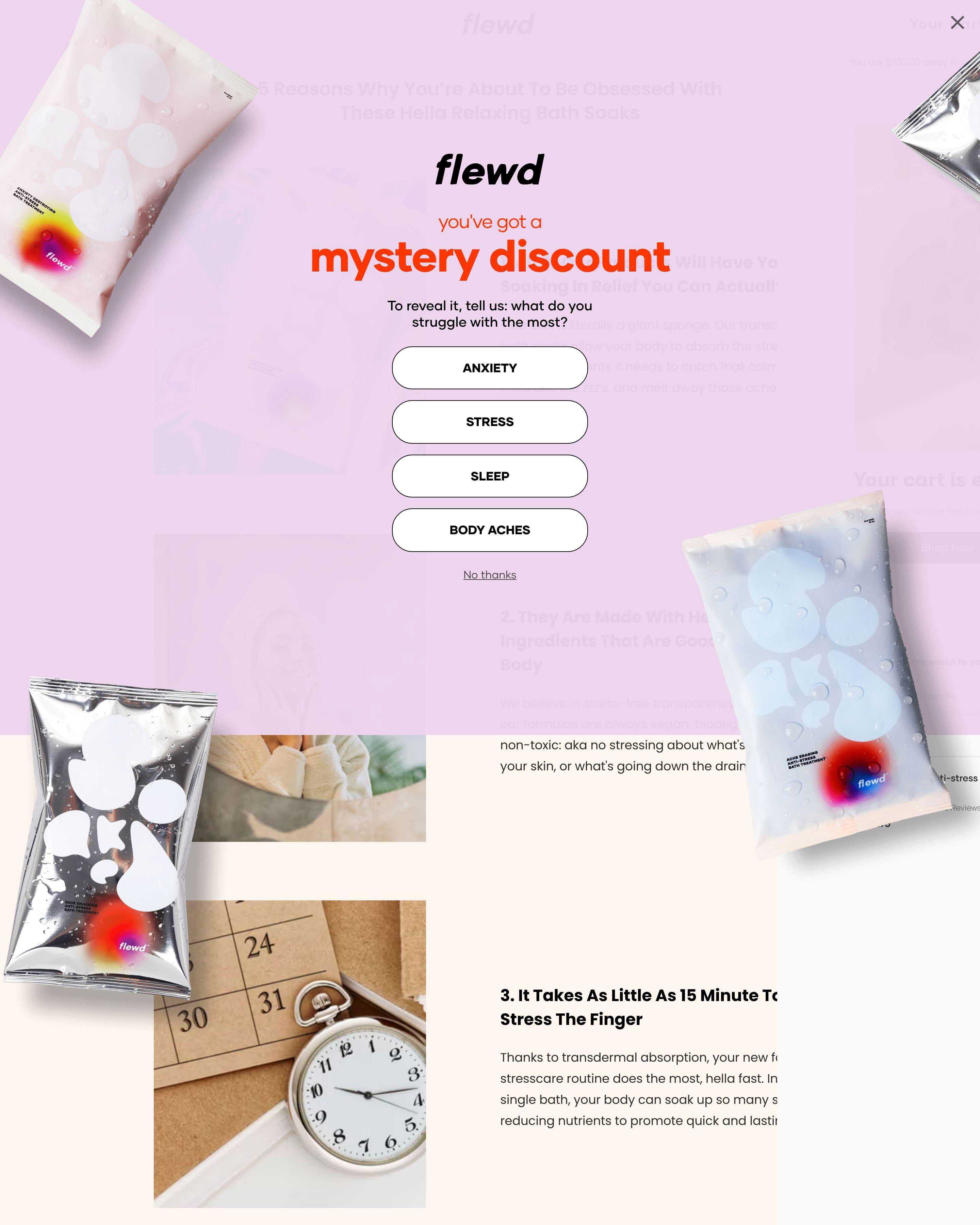
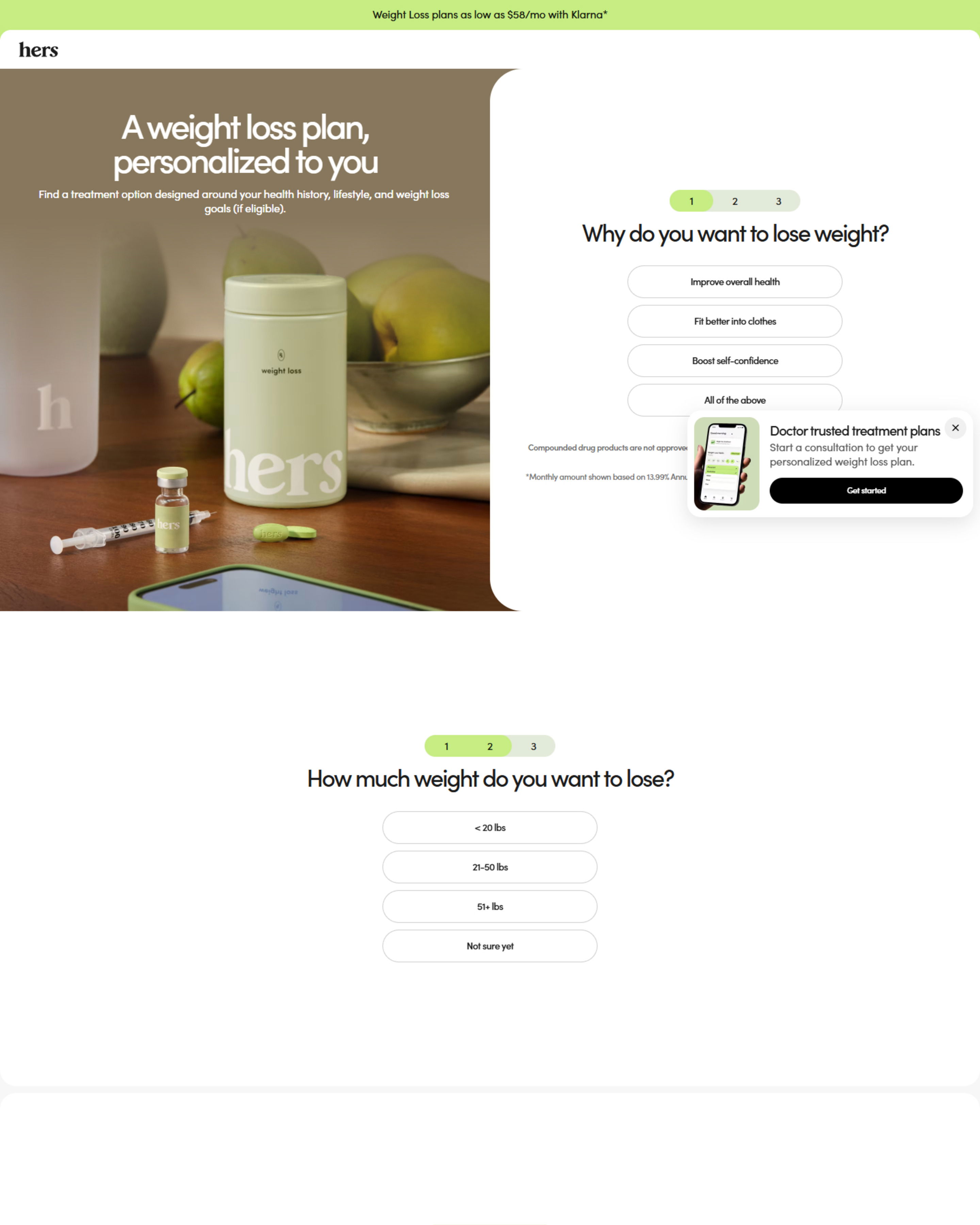
Feals uses a CBD quiz to match customers with products. Jones Road Beauty asks about skin type before recommending shades. Supply's razor quiz personalizes the subscription. Quizzes increase engagement, collect data, and make recommendations feel tailored. Higher relevance means higher conversion.
What makes a good D2C landing page?
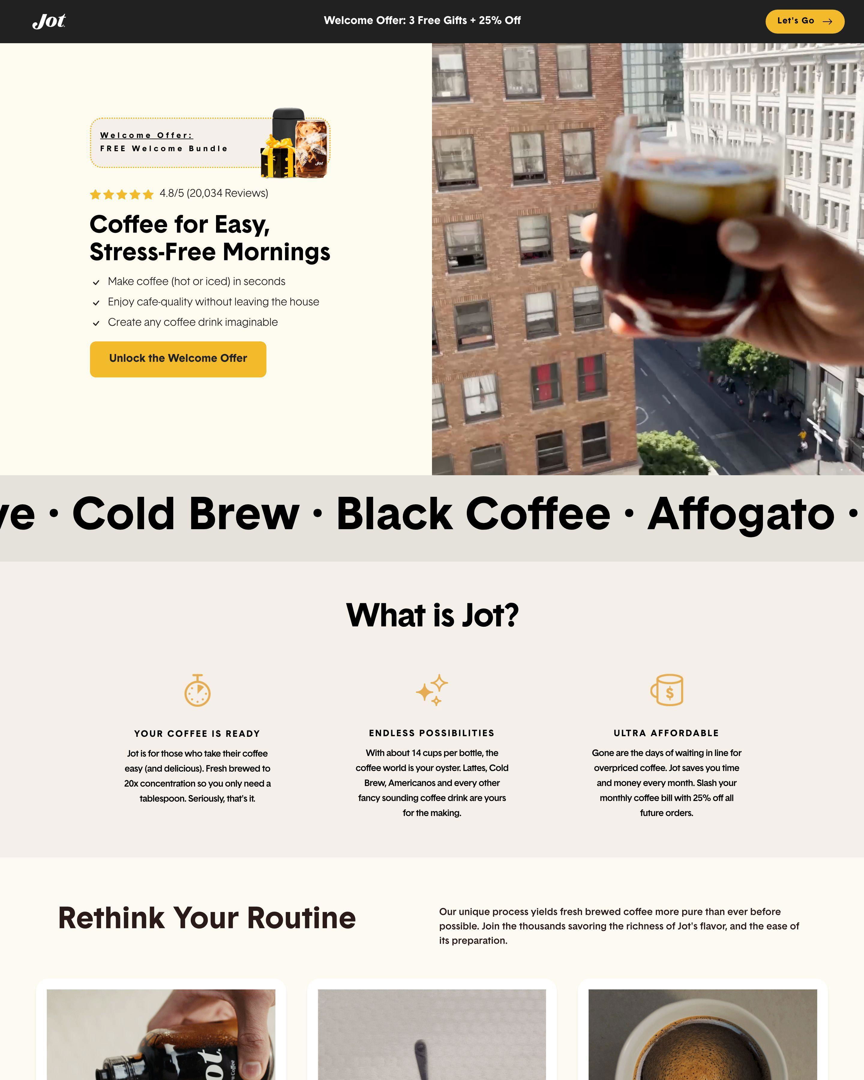
Speed and clarity. Visitors from paid ads have short attention spans. Ekster's product page shows the wallet within one second of landing. Pricing is visible without scrolling. The buy button is obvious. Remove anything that slows the path from interest to purchase.
What conversion rate should a D2C landing page achieve?
Paid traffic converts at 2-4% for cold audiences, 5-10% for retargeting. Huel and Supply optimize their pages constantly to hit these benchmarks. Higher price points convert lower. Subscription offers often beat one-time purchases because the commitment feels smaller upfront.
How long should a D2C landing page be?
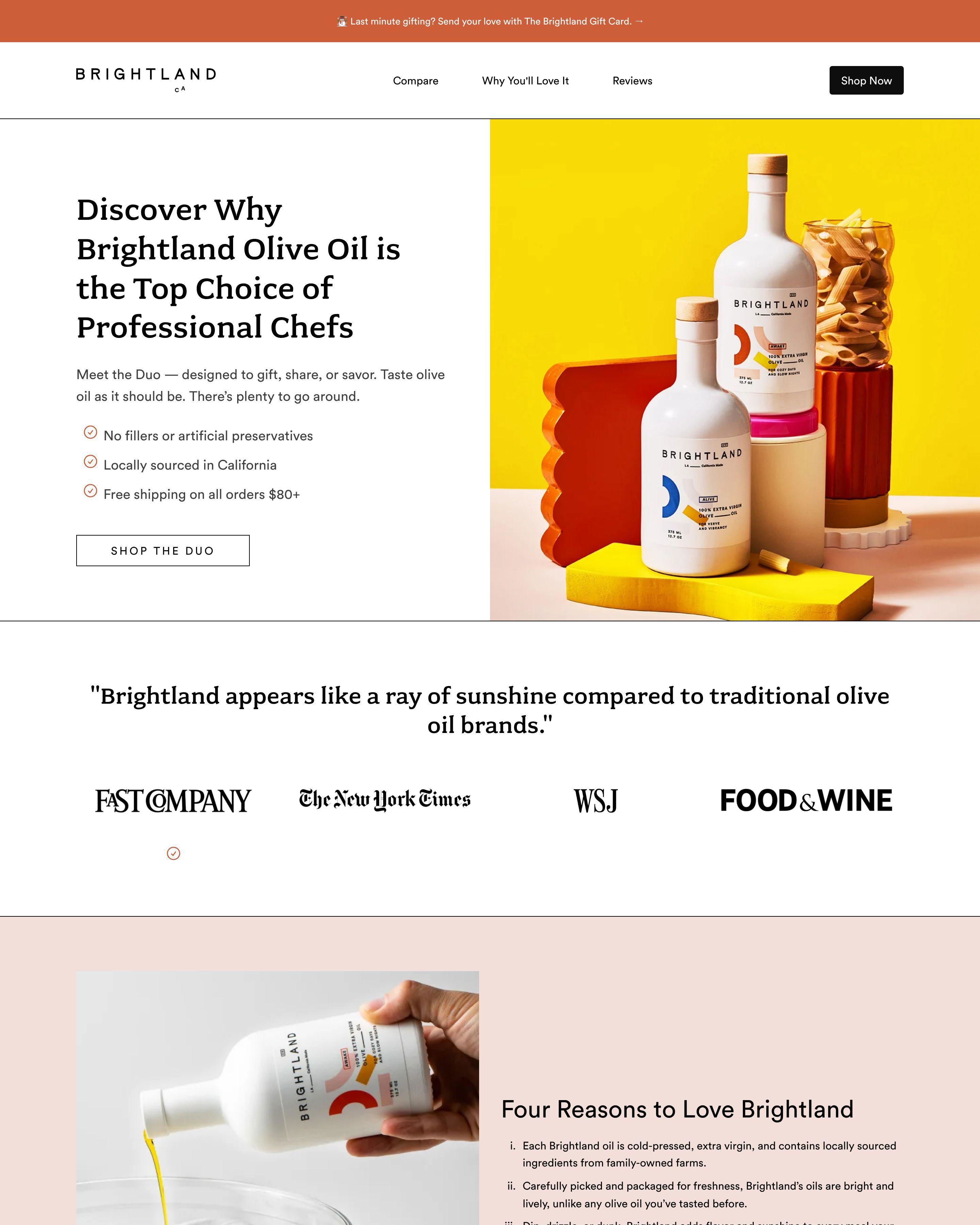
Longer for complex products, shorter for impulse buys. Autobrush needs space to explain why an automated toothbrush beats manual brushing. BrightLand olive oil can sell with beautiful photography and minimal copy. Match your page length to how much convincing your product requires.
What is the most important element on a D2C landing page?
Product photography and price visibility. Dose Daily shows their supplements in context: on countertops, next to morning routines. Jones Road Beauty displays swatches on real skin tones. Your product photos need to answer "what will this look like in my life?" Price should be clear, not hidden.