Webinar and event landing pages have one job. Get people to show up.
That sounds simple. But you’re asking someone to block time on their calendar, hand over their email, and trust that your event is worth an hour of their life. No product to touch. No demo to try. Just a promise that something valuable will happen on the other side of that registration button.
The 8 pages in this list promote everything from a two-day business summit to a free cancer workshop to a foam party franchise webinar. Wildly different topics. Different audiences. Different price points. But they all solve the same problem: turning a stranger’s scroll into a confirmed seat.
We broke each one down to pull out the webinar landing page best practices that actually move the needle. Here’s what makes them work.
Key Takeaways:
Specific Outcomes Beat Generic Agendas – Nobody registers for “a valuable learning experience.” They register for results they can picture. Epic Webinars Summit promises you’ll leave with a “finished 7 figure webinar” after two days. Foam Daddy’s headline says “How Families Are Earning An Extra $300 – $1,000 Per Event.” Yorkshire College Planning promises to “Cut Your Expected Family Contribution In HALF.” When the outcome is specific and measurable, the registration feels like a no-brainer.
The Host Is the Product – In webinars, people don’t sign up for topics. They sign up for people. Gene Wei’s cancer workshop leads with his training at Memorial Sloan Kettering. Atul Sharma’s cloud masterclass cites his background at Apple and Juniper Networks. Dow Janes shows co-founder photos front and center. The Women’s Conference makes Sadie Robertson Huff the centerpiece of the page. If your host doesn’t have visible, specific credentials, your registration rate will suffer.
“Free” Still Works, But Only With a Reason – Five of the eight pages promote free events. But they don’t just slap “FREE” on a button and hope for the best. ALGO Mexico tags “Gratuito” right in the headline to kill the price objection instantly. Atul Sharma crosses out “₹999” and shows “FREE” next to it, making people feel like they’re getting a deal even at zero cost. Foam Daddy pairs “free” with a clear income opportunity. Free without context feels cheap. Free with a reason feels like a steal.
Countdown Timers Create Urgency. When They’re Real. – Epic Webinars Summit uses a live countdown at the top of the page. ALGO Mexico builds a timer into the hero section. Gene Wei’s workshop shows minutes ticking away. These work because they trigger loss aversion. But there’s a catch. ALGO Mexico’s timer was stuck at zero. Gene Wei’s showed 14 minutes with no actual event date. Fake urgency breaks trust faster than no urgency at all. If you use a timer, tie it to a real deadline.
Key Elements of High-Converting Webinar & Event Registration Landing Pages
Before diving into the list, here are the elements that separate webinar and event pages that convert from those that don’t. Whether you’re using a dedicated webinar landing page builder or coding from scratch, these principles apply across the board:
Lead with a specific, measurable promise – “Join our webinar” is not a reason to register. “Leave with a finished 7 figure webinar in two days” (Epic Webinars Summit) is. “Cut your EFC in HALF for $100k+ families” (Yorkshire College Planning) is. Find the one outcome your audience actually wants and put it in the headline. The more specific the promise, the higher the signup rate.
Make the host the star of the page – Webinars live or die on the presenter’s credibility. Gene Wei lists “Doctor Of Oriental Medicine” and “Memorial Sloan Kettering” in his bio. Atul Sharma cites “6+ years of experience at Apple.” ALGO Mexico’s Santiago Tellez leads with “6+ años de experiencia en Amazon.” Don’t bury the host bio at the bottom. Put their face, name, and credentials where people can see them before they scroll.
Build a “Who Should Attend” section – Epic Webinars Summit lists specific groups like “Coaches/Consultants” and “SaaS Founders” with their pain points. Atul Sharma’s “Does This Sound Like You?” section uses relatable quotes like “my skills look basic” and “I’m scared my job will be automated.” When people see themselves on the page, they feel the event was built for them. That’s when they register.
Use media logos and social proof early – Foam Daddy shows Forbes, ABC, and NBC logos right away. Dow Janes displays Business Insider and The Washington Post in a “FEATURED IN” section. Epic Webinars Summit claims “Over $5 Million generated across all speakers.” These signals answer the trust question before the visitor even gets to the form. If you have media mentions or big numbers, put them above the fold.
Show the price clearly, even when it’s free – The Women’s Conference lists “$75 General Attendee” and “$65 Student” with zero ambiguity. Yorkshire College Planning calls out “$100k+ families” right in the headline so people know who the event is for. Atul Sharma shows the crossed-out ₹999 next to “FREE.” Whether your event costs money or not, be upfront about it. Ambiguity creates hesitation. Clarity creates clicks.
Keep the registration form short and visible – ALGO Mexico puts the form right in the hero section. Name, email, done. Dow Janes asks for an email and that’s it. The more fields you add, the more people you lose. ALGO Mexico’s form also asked for SMS and Facebook permissions upfront, which adds unnecessary friction before someone even hits submit. Ask for what you need to get them registered. Qualify them later.
Answer the skeptic’s questions before they ask – Yorkshire College Planning’s FAQ directly addresses “Are you going to try and sell me life insurance?” Atul Sharma’s “Not Suitable For” section tells people not to join if they expect overnight results. Dow Janes tackles money shame head-on with “No more budgeting guilt, no more money shame.” Every webinar visitor has a voice in their head asking “is this a waste of time?” Your page needs to answer that voice before it wins.
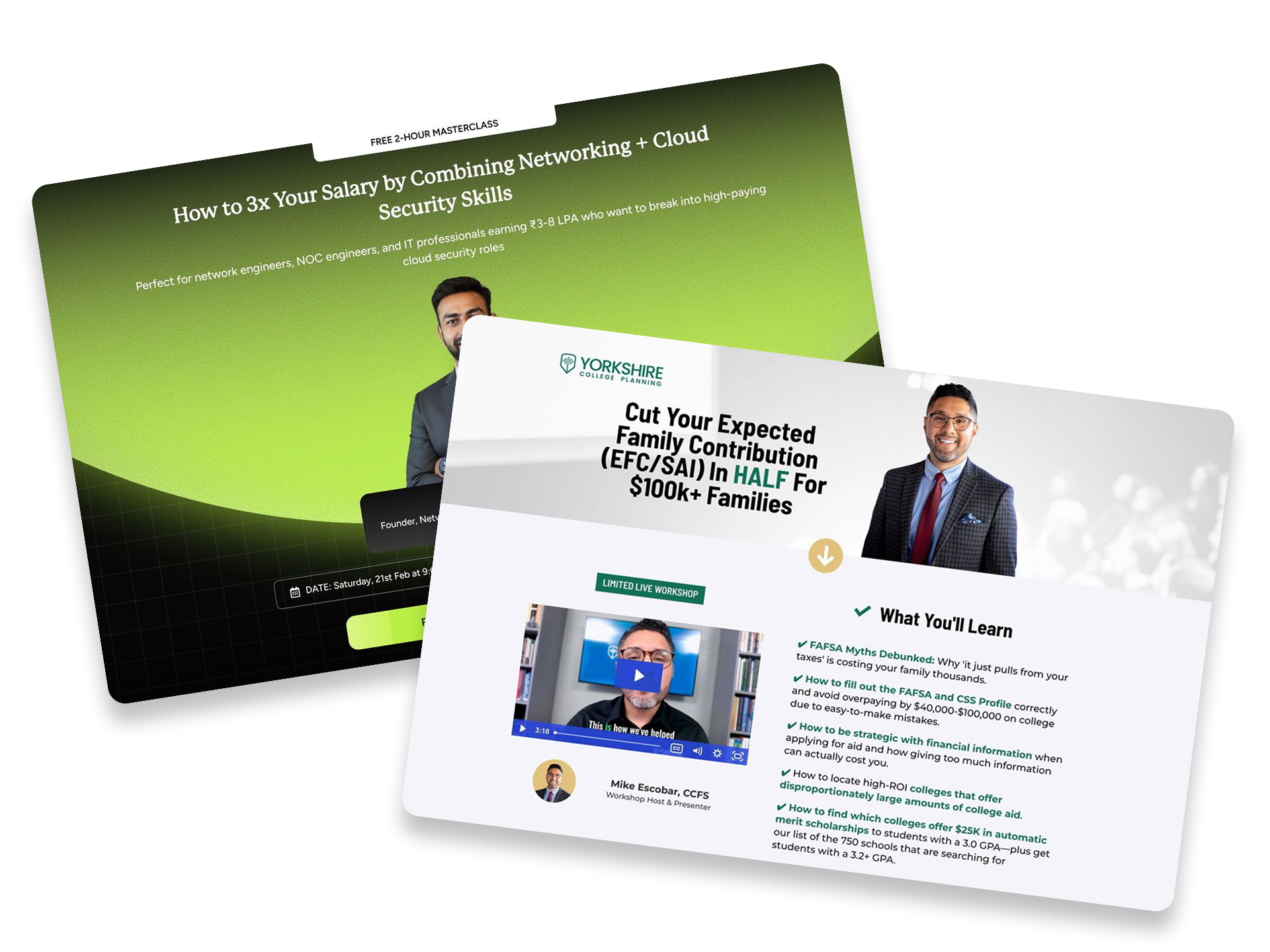
1. Cloud Masterclass

Caption: Atul Sharma’s landing page promotes a free masterclass for IT professionals. It promises to help users triple their salary by learning cloud security skills. The design uses a bold green and black theme to grab attention. Clear stats like “10,000+ Engineers Placed” build trust right from the start.
Industry & Purpose: This is a lead generation page for an online career coaching and education platform. It’s meant to convert IT professionals into attendees for a live masterclass.
What Works: Here’s what I love: the hero section targets a specific pain point. It calls out people earning “₹3-8 LPA” and offers a path to “3x Your Salary.” This specificity makes the promise feel more attainable for the right person.
The “Does This Sound Like You?” section is another winner. It uses relatable quotes like “my skills look basic” and “I’m scared my job will be automated.” These sentences reflect the real inner thoughts of the audience. It makes the visitor feel heard and understood.
The data comparison tables are very strong. One table shows “Pure Networking Roles” are declining. The other shows “Networking + Cloud Security Roles” are growing by “28.6% annually.” This uses logic and market data to drive the need for the course.
I also like the “Not Suitable For” section. It tells people not to join if they expect “overnight results.” This actually increases the value of the masterclass. It makes the offer feel like a serious professional program rather than a scam.
What can be Improved:
- The testimonial section has four large black boxes that look like empty placeholders. These should be replaced with clear video thumbnails or student faces. Right now it looks like the page is broken or unfinished.
- The sticky footer at the bottom says “FREE ₹999.” This is a bit confusing because the main button says “Register for Free.” It would be clearer if it just said “Free for a Limited Time” to create more urgency.
Why it inspires: This page is a masterclass in using data to sell a dream. It moves from emotional pain points to hard salary numbers very quickly. The instructor’s personal background at Apple and Juniper Networks proves he is a real expert in the field.
2. Webinars Summit

Caption : The Epic Webinars Summit page uses a uses a dark/black background with a green countdown bar at top. A live countdown timer at the top drives immediate urgency. It highlights a two-day schedule focused on AI and webinar growth. The page also features a long list of expert speakers and venue photos.
Industry & Purpose : This is an event registration page for the digital marketing industry. It’s meant to convert online business owners into summit attendees.
What Works : Here’s what I love: the page promises a very specific outcome. It says you will leave with a “finished 7 figure webinar” after two days. This makes the event feel like a productive workshop rather than just a series of speeches.
The “Who Should Attend” section is also excellent. It lists groups like “Coaches/Consultants” and “SaaS Founders” with their specific pain points. This helps people identify exactly why they need to be in the room.
The social proof is very strong throughout the page. It mentions “Over $5 Million generated across all speakers” to prove their authority. This huge number makes the claim of “”Finally Scale Your Business”” feel very believable.
What can be Improved :
- The speaker list is very long. It requires too much scrolling. A compact grid would make the page much easier to read.
Why it inspires : This page turns a standard conference into a solution for your business. It uses specific metrics and clear schedules to prove its value. It shows that you aren’t just buying a ticket but a system for growth.
3. Women’s Conference

Caption: The Sisterhood Conference page uses a soft blue and white cloud theme. It features a large envelope icon overflowing with colorful flowers. The main headline is “SINCERELY YOURS” in a bold blue font. It clearly states the date as April 18, 2026.
Industry & Purpose: This is an event registration page for a religious organization. It’s meant to convert women of various ages into conference attendees.
What Works: Here’s what I love: the guest speaker is a major selling point. Sadie Robertson Huff is a very popular figure. They label her as a “SPECIAL GUEST” alongside high-quality photos. This builds trust and interest immediately.
The pricing section is incredibly clear. “RATE” lists the “$75 GENERAL ATTENDEE” price and the “$65 STUDENT” option. You don’t have to search for the cost. This transparency helps users make a quick decision.
The visual theme is very consistent. The envelope and “AIR MAIL” stamp fit the “SINCERELY YOURS” title perfectly. It feels like a personal invitation. This makes the event feel intimate and welcoming.
What can be Improved:
- The main “What is Sisterhood Conferece?” header has a typo. It is missing the letter “n” in conference. Fixing this is vital for professional trust.
- The text inside the white envelope box is quite small. It uses a light font on a textured background. Some users might struggle to read the mission statement clearly.
- The “REGISTER NOW” button is a bit small on the red background. A larger or brighter button would help it stand out more. This would drive more clicks from excited visitors.
Why it inspires: This page feels like a high-end physical invitation rather than just a website. It uses clear pricing and guest information to remove any hesitation. The photo gallery showing real people laughing makes the event feel accessible and fun.
4. Yorkshire College

Caption : This page offers a workshop for parents of college students. It promises to cut family college costs in half. You can see a video, a host bio, and several success stories. The layout uses a clean white background with professional green accents.
Industry & Purpose : This is a lead generation page for a college planning service. It’s meant to convert high-income parents into workshop attendees.
What Works : Here’s what I love: the headline is extremely specific. “Cut Your Expected Family Contribution (EFC/SAI) In HALF For $100k+ Families” calls out the target audience. It also promises a massive and measurable benefit.
The proof section for Dr. Stephanie Manginelli is excellent. It shows a real screenshot of her “EFC BEFORE: $94k” and “EFC AFTER: $17k.” This makes the service feel real and effective. People trust numbers and screenshots more than words.
The “What Families Are Saying” section is another winner. It uses raw social media screenshots instead of typed text. These feel authentic because they have not been edited. It makes the praise feel much more believable.
What can be Improved :
- The gold “REGISTER” button is too pale. It blends into the white and light yellow background. Using a bold green or orange would make the call to action pop.
- The host video looks like a grainy Zoom recording. A higher-quality thumbnail would look more professional. It would help build more trust before a user even clicks play.
Why it inspires : This page doesn’t run from hard questions. The FAQ section directly asks, “Are you going to try and sell me life insurance?” Addressing common fears builds instant rapport with the reader.
5. Money Mastery

Caption: Dow Janes offers a free money class for women. The page uses a clean design with friendly co-founder photos. It highlights major media logos to build instant trust. Testimonials show how the class helps people feel empowered about their finances.
Industry & Purpose: This is a lead generation landing page for the financial education industry. It’s meant to convert women interested in personal finance into free masterclass registrants.
What Works: Here’s what I love: the hero section is very specific. It mentions that “over 20,000 women+” already use this system. Social proof like this makes the offer feel safe and proven.
The language hits on real pain points. Phrases like “No more budgeting guilt, no more money shame” speak to the heart. It focuses on feelings rather than just boring numbers.
I really like the “FEATURED IN” section. Seeing logos like Business Insider and The Washington Post builds instant trust. This is vital when you are asking for an email address.
The “Aligned Money Method” section breaks the process down. It uses a simple four-part diagram. This makes mastering money look easy instead of scary.
What can be Improved:
- The legal disclaimer at the bottom is very large. It creates a heavy vibe right after a friendly invitation. Moving this to a separate page could keep the mood light.
- The co-founder photo appears twice on the page. The exact same image of Britt and Laurie-Anne is in the hero and the middle. New photos would make the “Meet Your Hosts” section feel more personal.
Why it inspires: The page isn’t about dry spreadsheets. It’s about mindset and freedom. The founders lead with a clear mission. “We believe good things happen when women+ have money” is a powerful reason to join.
Streamline your marketing strategy with Swipe Pages, a robust landing page builder, that lets you launch effective sales funnels without needing a developer.
6. Foam Business

Caption : Foam Daddy’s page invites families to a free business webinar. It highlights the potential to earn $300 to $1,000 per event. The page uses a bright yellow button to grab your attention. It shows a happy child using the foam machine to prove the product’s appeal.
Industry & Purpose : This is a webinar registration page for the event rental industry. It’s meant to convert aspiring entrepreneurs into webinar attendees.
What Works : Here’s what I love: the headline is very specific. “How Families Are Earning An Extra $300 – $1,000 Per Event” gives you a clear goal. It talks right to the reader’s bank account.
The social proof is strong. You see logos for Forbes, ABC, and NBC immediately. This builds trust for a unique business model. It makes the “foam party” idea feel like a real professional choice.
I also like the clear details in the “When” and “Where” section. It says “When: Tomorrow @ 12:00 pm” and “Where: Live Online”. This removes any guesswork about how to join.
The testimonials from Google reviewers like Yuri and Heidi add another layer of proof. People are praising the product and the support. It makes the whole “zero experience” claim feel more believable.
What can be Improved :
- The text block below the first headline is a bit dense. It should be broken into small bullet points. This would make the “zero experience” and “low start up costs” benefits easier to scan.
- There is no image of the webinar host. People usually sign up for webinars when they can see who is teaching them. Adding a small headshot would make the page feel more personal and trustworthy.
Why it inspires : Foam Daddy turns a fun activity into a clear income stream. They use big media logos to make a niche business feel legitimate. The focus on “extra income” makes a new venture feel very reachable for regular families.
7. Cancer Workshop

Caption: This landing page offers a free workshop for people fighting terminal cancer. It features a simple headline and a large registration button. The design uses a blue banner with a countdown timer to show urgency. You also see a photo and bio of the host, Gene Wei.
Industry & Purpose: This is a lead generation page for the healthcare and alternative medicine industry. It’s meant to convert cancer patients and their families into webinar registrants.
What Works: Here’s what I love: the headline is very direct. “The Blueprint To Navigating Terminal Cancer” tells the visitor exactly what they will get. It addresses a very specific and difficult problem right away.
The “About your host” section builds a lot of trust. It mentions Gene Wei is a “Doctor Of Oriental Medicine” and trained at “Memorial Sloan Kettering Cancer Center.” These specific details make him look like a real expert. People need to trust the source when the topic is health.
The bullet points create a lot of curiosity. Phrases like “The Surprising Reason Why Some Cases Don’t Respond To Treatment” make you want to click. It promises secrets that conventional medicine might not share. This is a classic way to get signups.
What can be Improved:
- The countdown timer feels a bit generic. It shows 14 minutes remaining but does not give a specific start date. This can feel like a “fake” timer to some users.
- The text at the very bottom is almost impossible to read. It looks like a legal disclaimer about Facebook. If it is important, it should be a bit darker so people can actually see it.
Why it inspires: This page works because it stays focused on one goal. It doesn’t have a menu or extra links to distract you. It speaks directly to people who are “DETERMINED To Beat The Odds” and gives them a clear next step.
8. Amazon Masterclass

Caption : ALGO Mexico uses a webinar registration page to teach Amazon sales. The hero section features a countdown timer to create urgency. It also includes a clear form to capture names and emails. A background photo shows a real workshop taking place.
Industry & Purpose : This is a lead generation landing page for the e-commerce education industry. It’s meant to convert aspiring entrepreneurs into registered webinar attendees.
What Works : Here’s what I love: the hero section uses a very clear headline. “Este Taller Gratuito Revela… Los Secretos Para Vender En Amazon” (This Free Workshop Reveals… The Secrets to Sell on Amazon) tells you exactly what you get. The “Gratuito” tag removes the price barrier immediately.
The social proof is subtle but effective. You see a photo of a real classroom in the background. One student is even wearing a hat with the “ALGO” logo. This makes the brand feel established and real.
The benefit blocks at the bottom use simple icons. They promise “ESTRATEGIAS,” “COMUNIDAD,” and “CONTENIDO.” Highlighting “acceso GRATIS” for ebooks and videos adds extra value for the visitor.
The “Conoce a tu coach” section builds trust. Santiago Tellez lists specific credentials like “6+ años de experiencia en Amazon.” Putting a face to the name makes the offer feel more personal.
What can be Improved :
- The countdown timer is currently at zero for days and hours. This might look broken to a visitor. Setting a real future date would make the urgency feel more honest.
- The form asks for SMS and Facebook message permissions right away. This adds a lot of friction before someone even clicks “Enviar.” It might be better to ask for these on the thank you page instead.
Why it Inspires : ALGO Mexico focuses on a specific niche for Latino sellers. The page stays simple and doesn’t distract with too many external links. Every button leads back to one single goal.
Final Thoughts:
Webinar and event landing pages sell something that doesn’t exist yet. A future experience. A room full of people. A conversation that hasn’t happened.
That’s a hard sell. The visitor can’t preview the event. They can’t skim through it like a product page. All they have is your page and a decision to make: is this worth my time?
The pages that convert answer that question fast. They lead with a specific outcome instead of a vague topic. They put a credible face behind the event. They make registration feel effortless. And they handle objections before the visitor has a chance to talk themselves out of it.
If your registration page isn’t converting, start with those four things. Get specific about the outcome. Show who’s presenting and why they’re worth listening to. Shorten the form. And answer the “is this legit?” question before anyone has to ask it.
A good webinar registration page builder can handle the layout and forms. But no tool can fix weak messaging. Nail the strategy first. The design will follow.
Want more inspiration? Check out our full list of 40 best landing page examples across industries.