Loading...
Loading...
Landing pages focused on direct product or service sales, emphasizing conversion and purchase through strong CTAs, pricing, and product benefits.
73 examples in this category

Recently Added

Recently Added

Recently Added

Recently Added

Recently Added

Recently Added

Recently Added

Recently Added
Recently Added

Recently Added

Recently Added

Recently Added

Recently Added
Recently Added

Recently Added

Recently Added

Recently Added

Recently Added

Recently Added

Recently Added

Recently Added

Recently Added

Recently Added

Recently Added

Recently Added

Recently Added

Recently Added

Recently Added

Recently Added

Recently Added
Recently Added
Recently Added
Recently Added
Recently Added
Recently Added
Recently Added
Recently Added
Recently Added
Recently Added
Recently Added
Recently Added

Recently Added
Recently Added
Recently Added
Recently Added
Recently Added
Recently Added
Recently Added
Recently Added
Recently Added

Recently Added
Recently Added
Recently Added
Recently Added
Recently Added
Recently Added
Recently Added
Recently Added
Recently Added
Recently Added
Recently Added
Recently Added
Recently Added
Recently Added
Recently Added
Recently Added
Recently Added
Recently Added
Recently Added
Recently Added
Recently Added
Recently Added
Recently Added
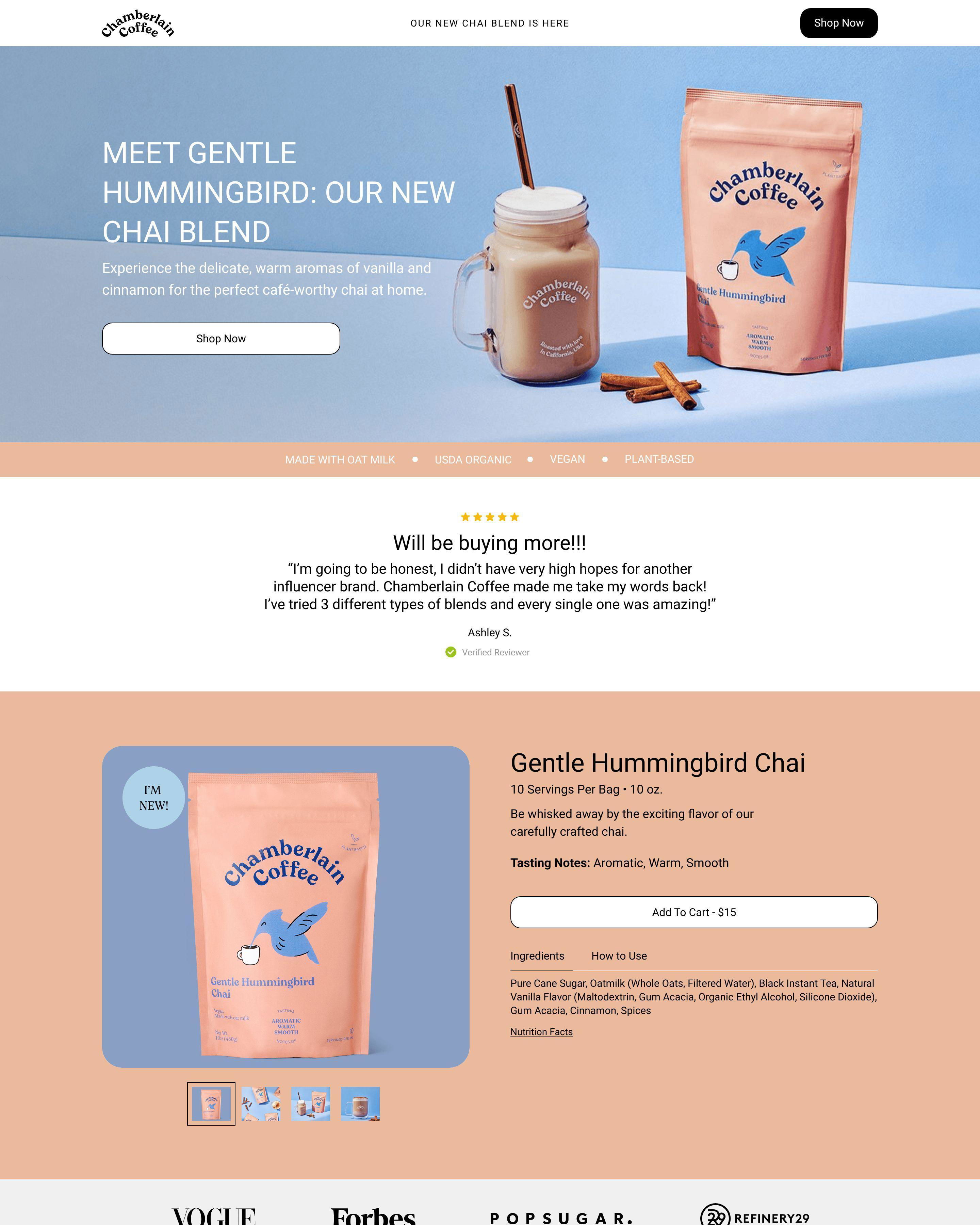
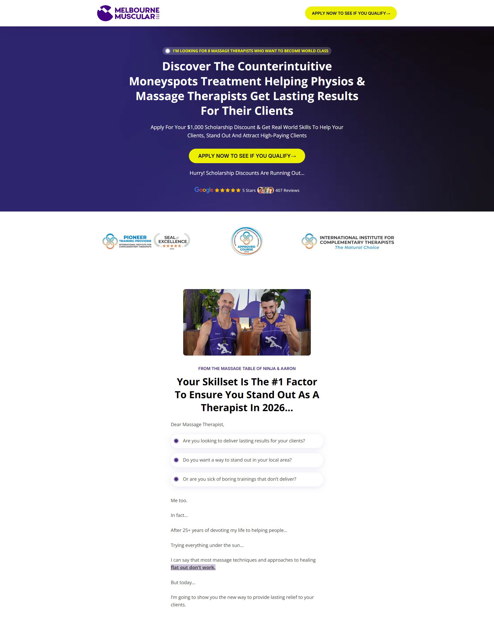
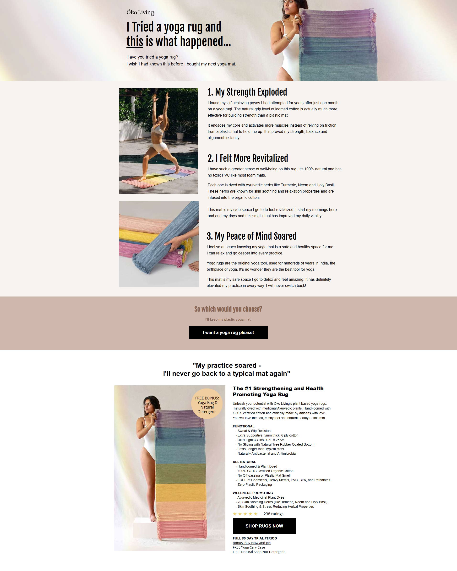
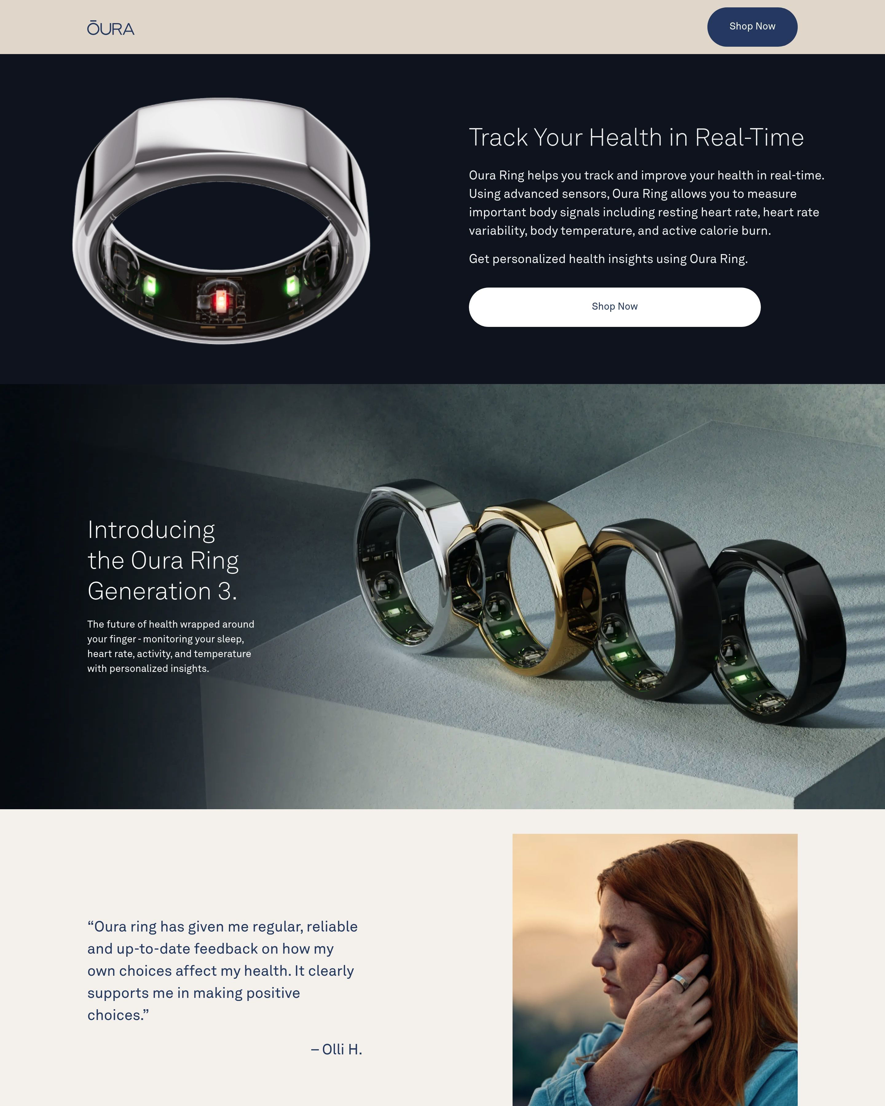
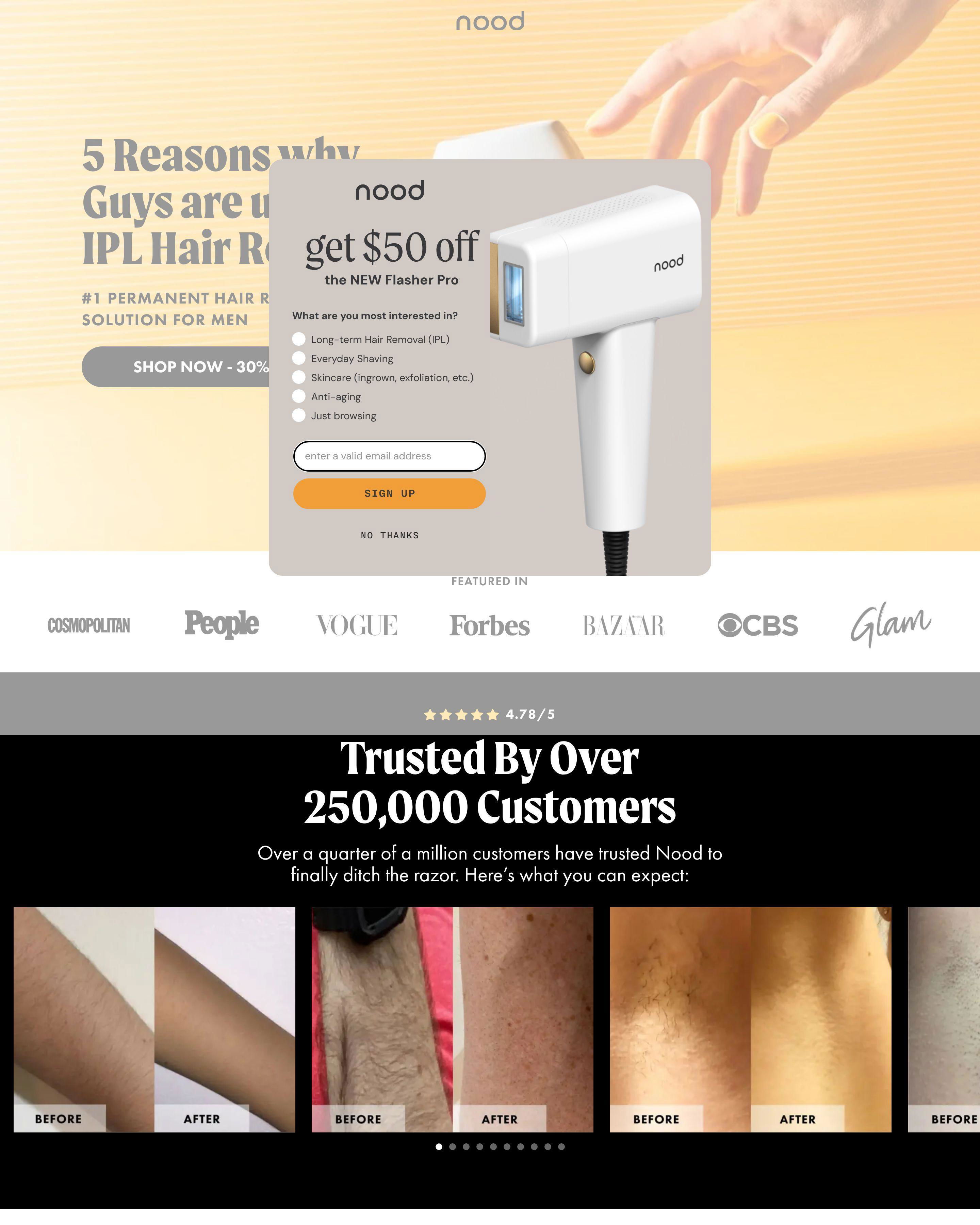
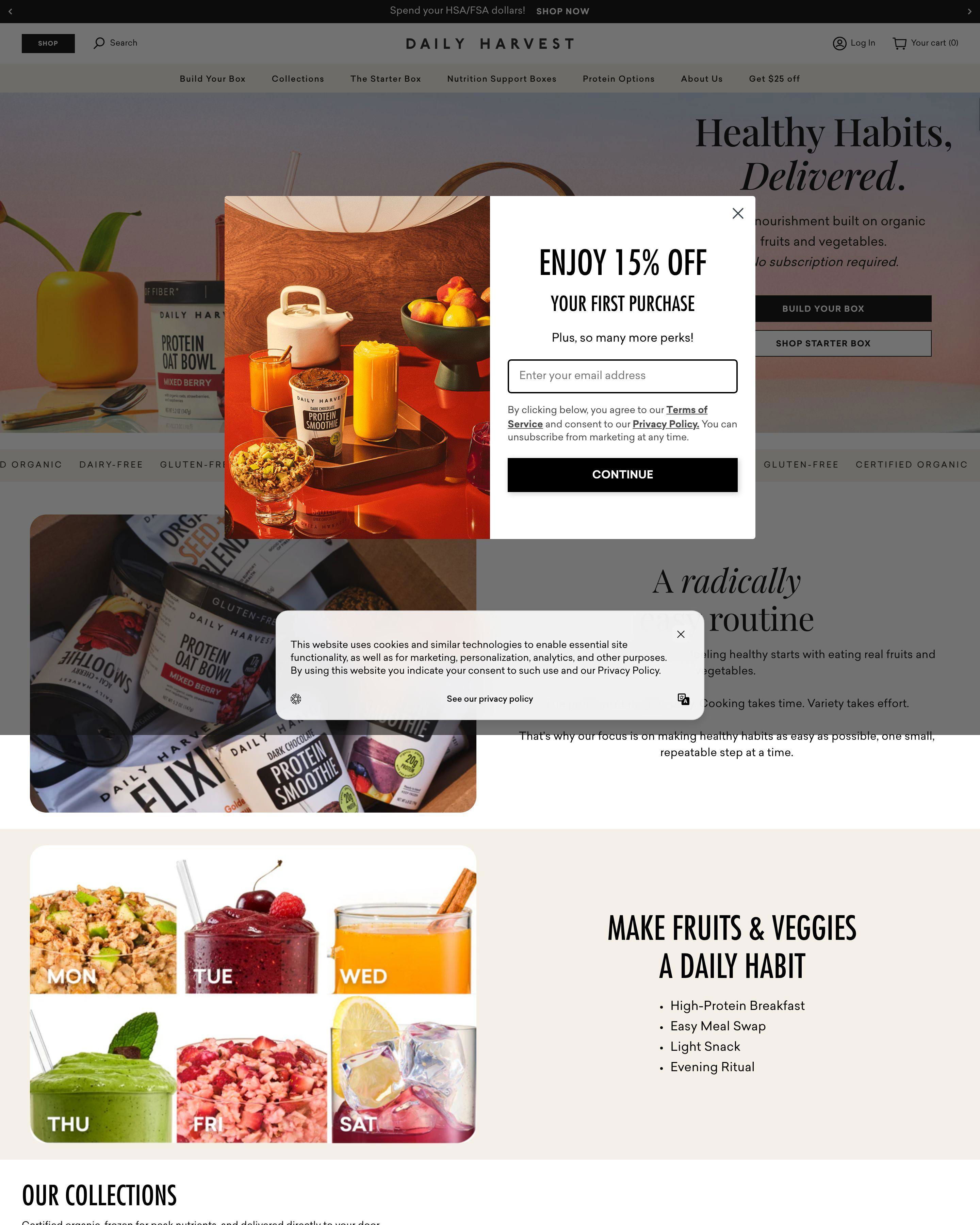
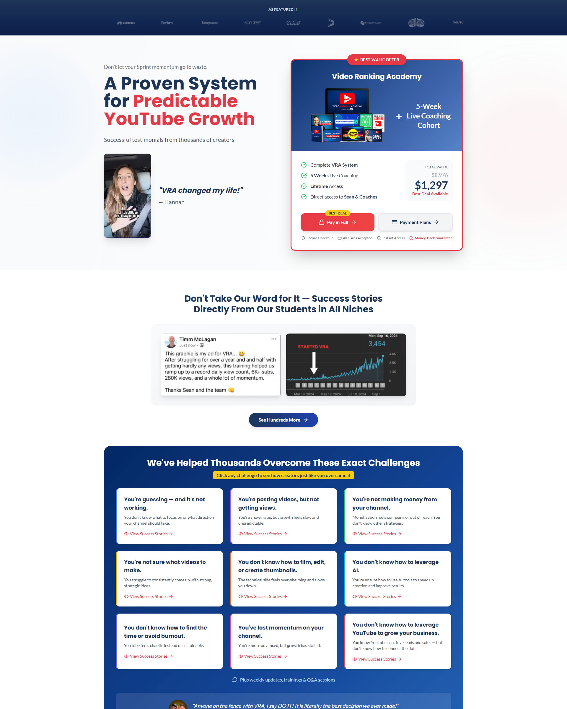
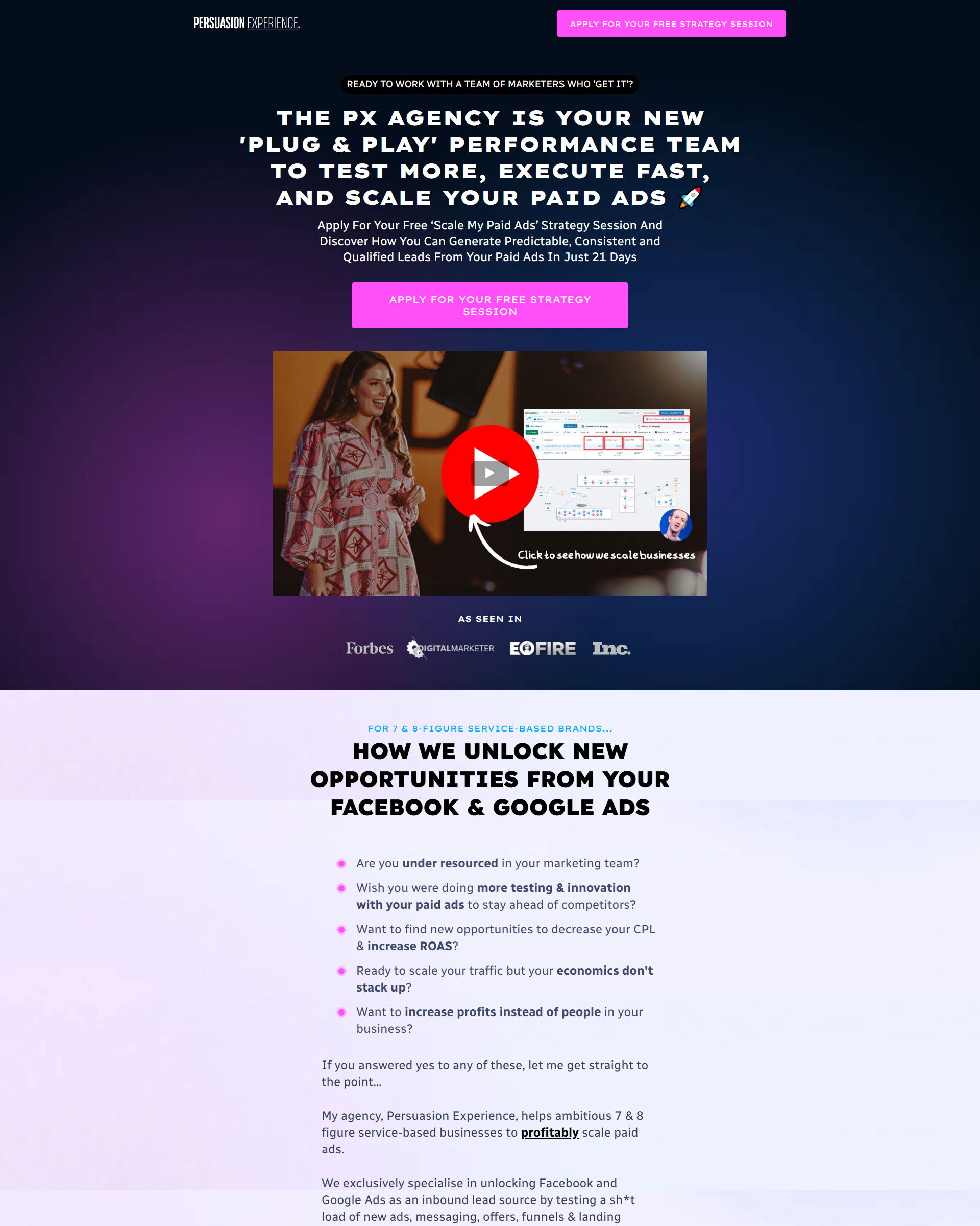
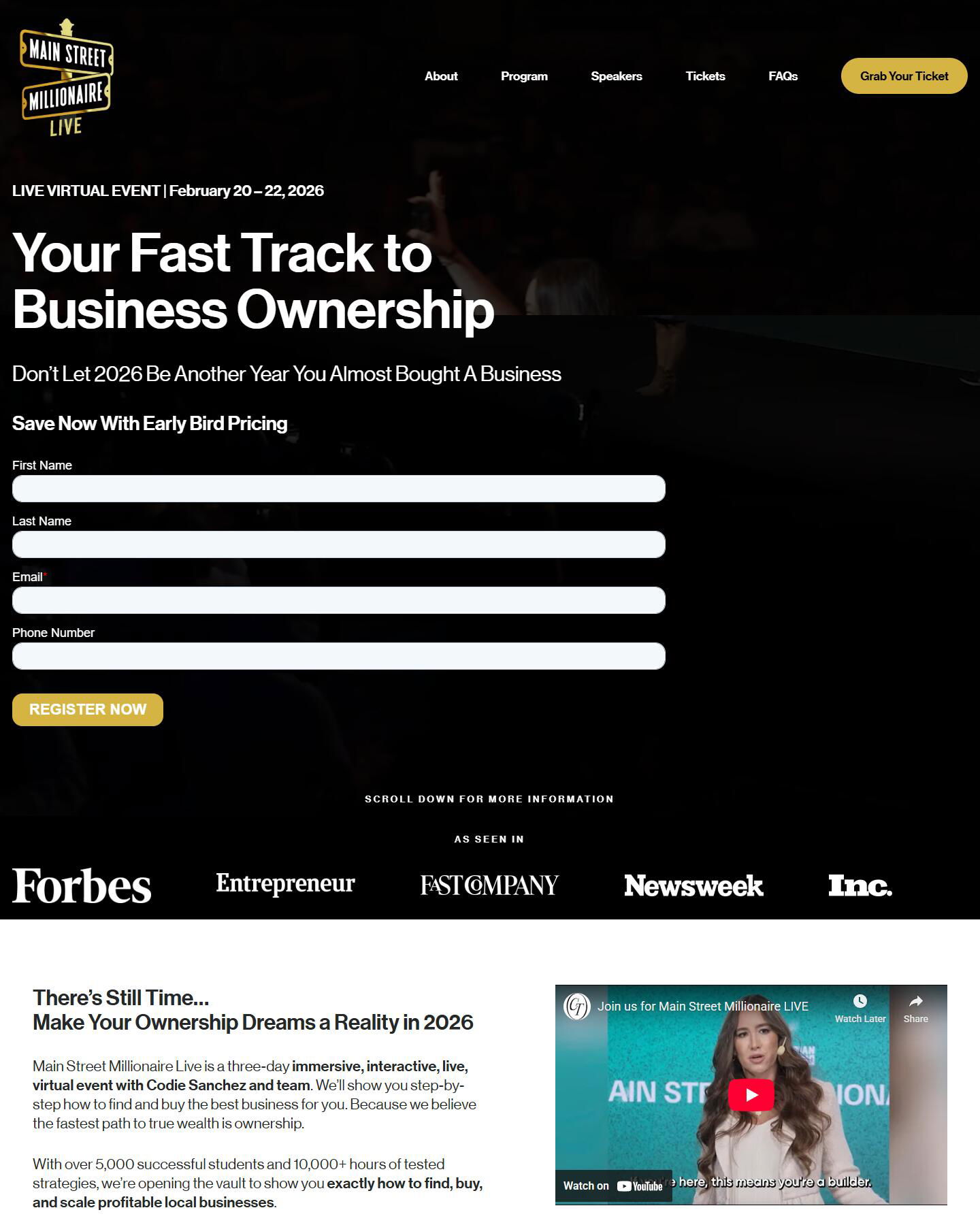
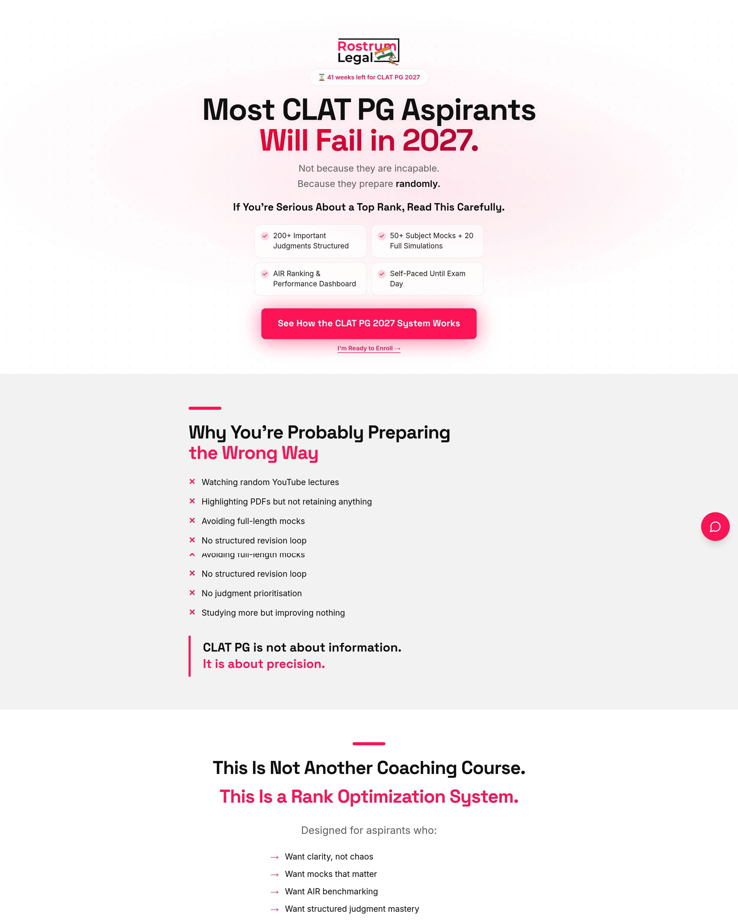
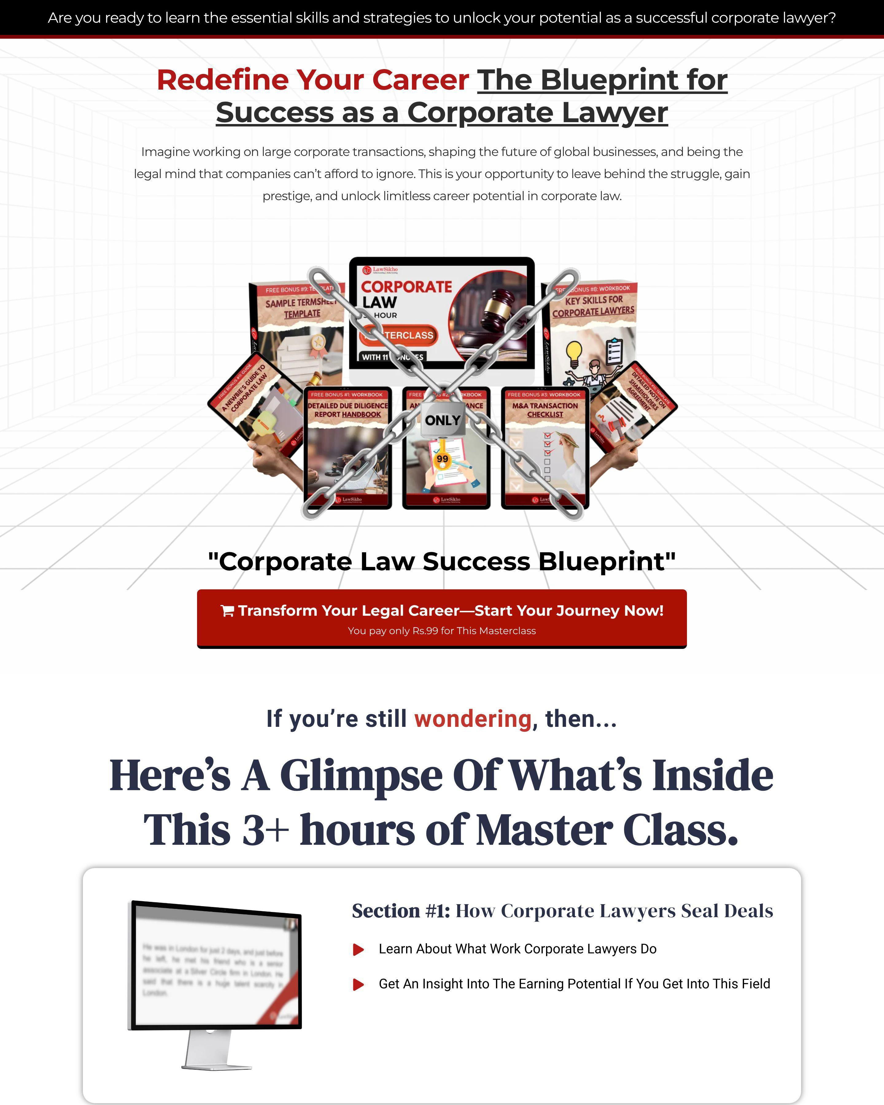
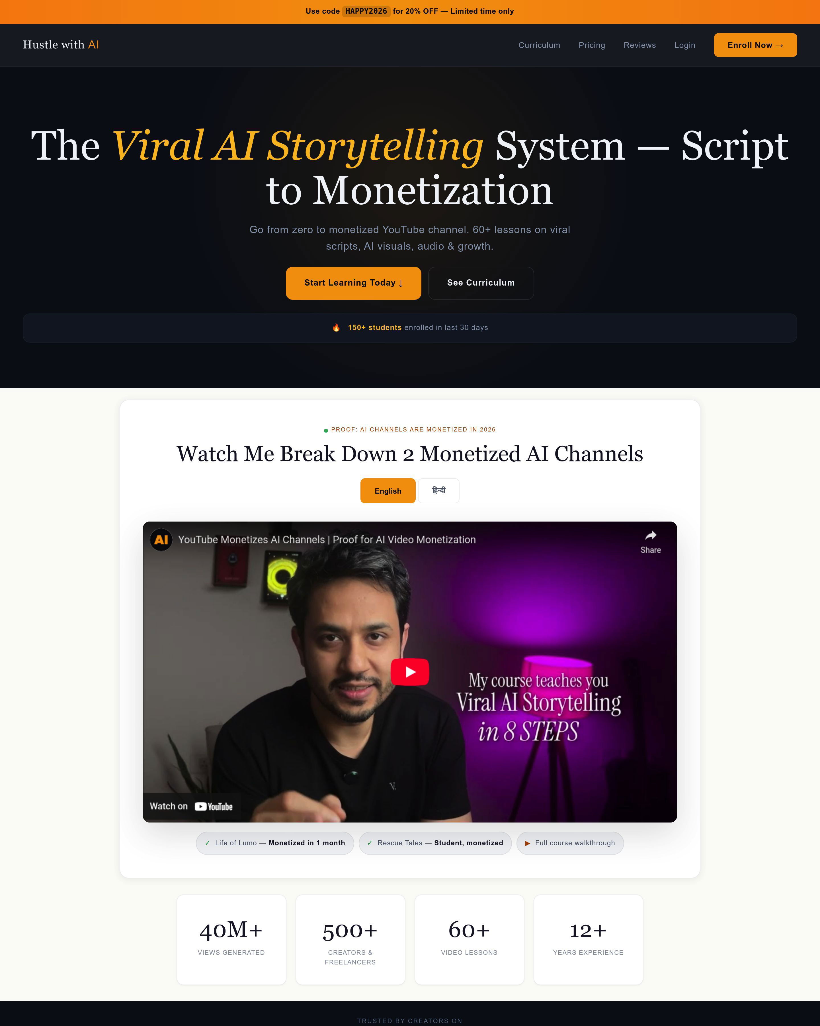
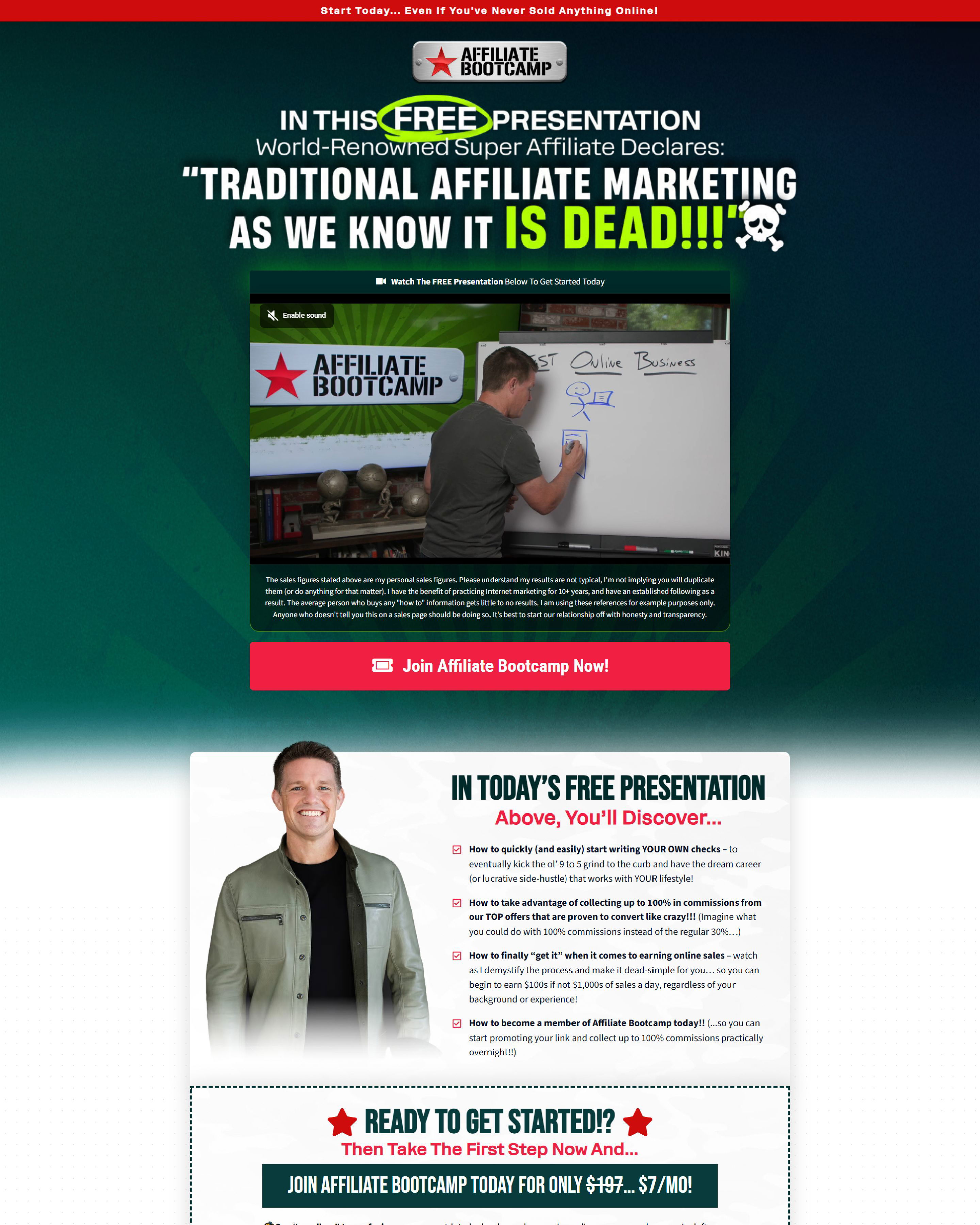
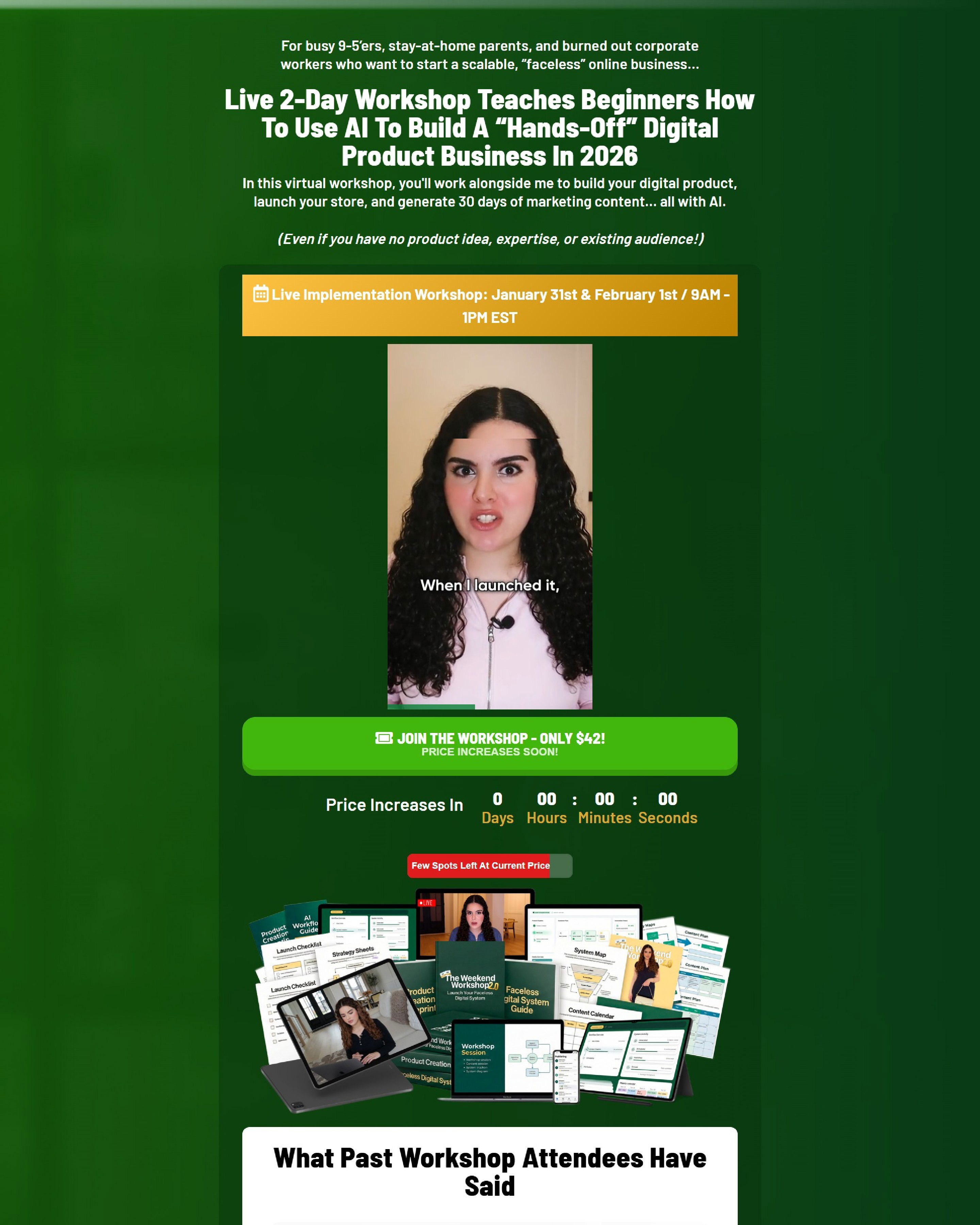
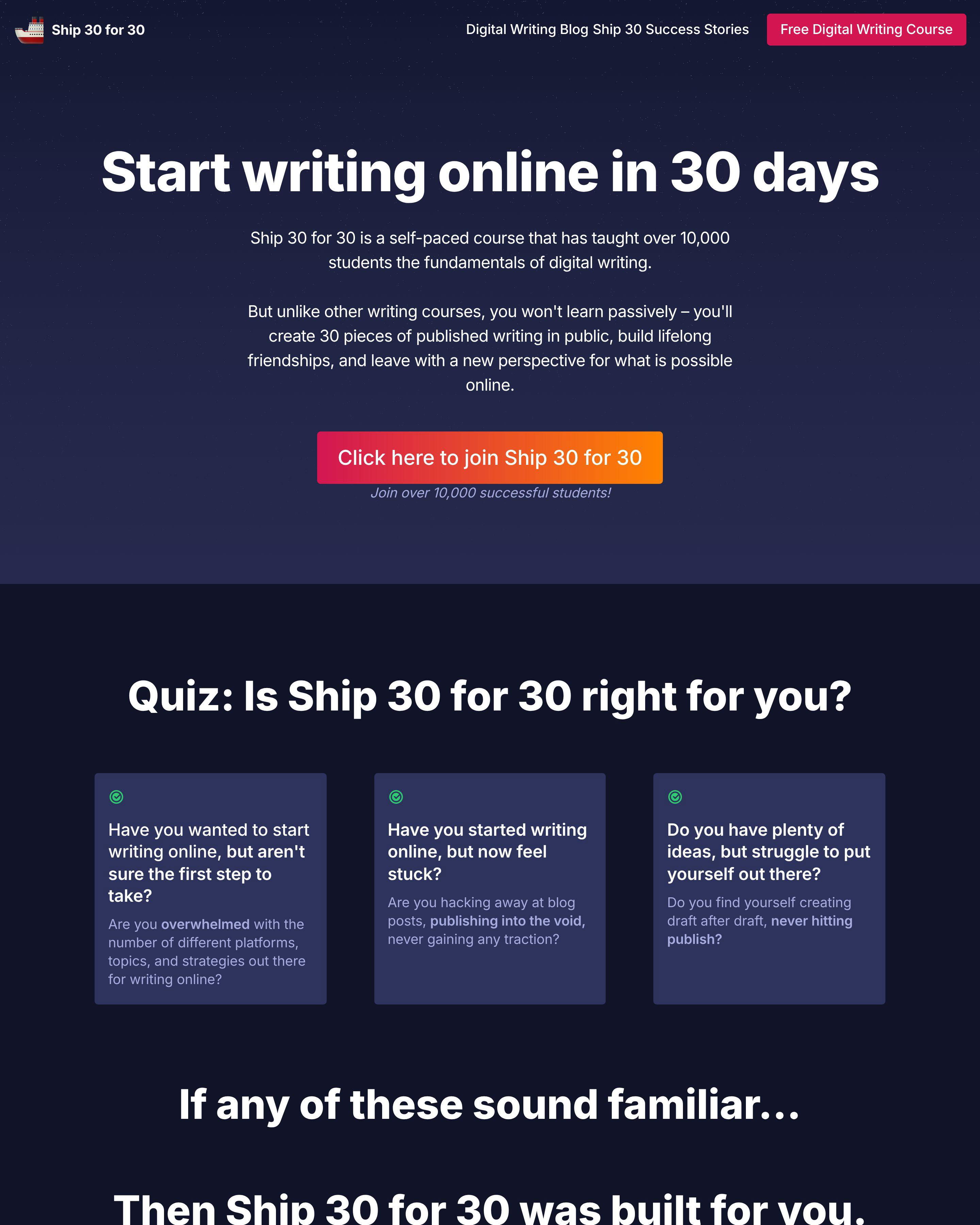
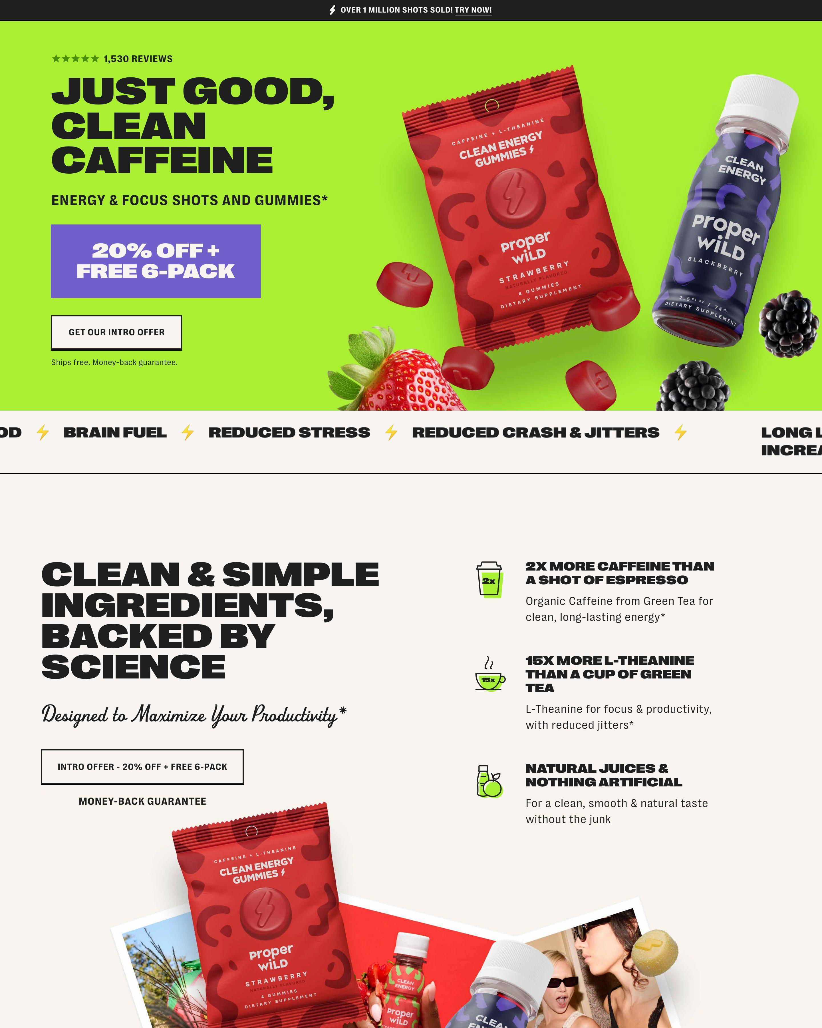
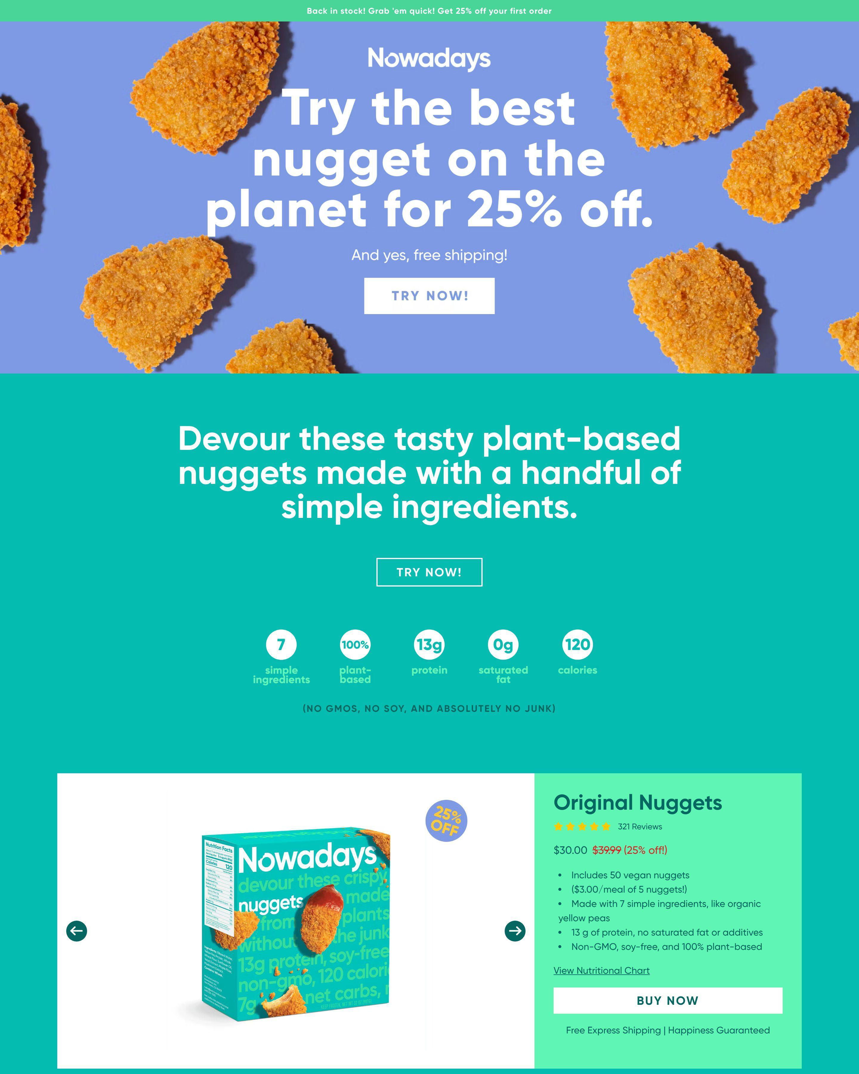
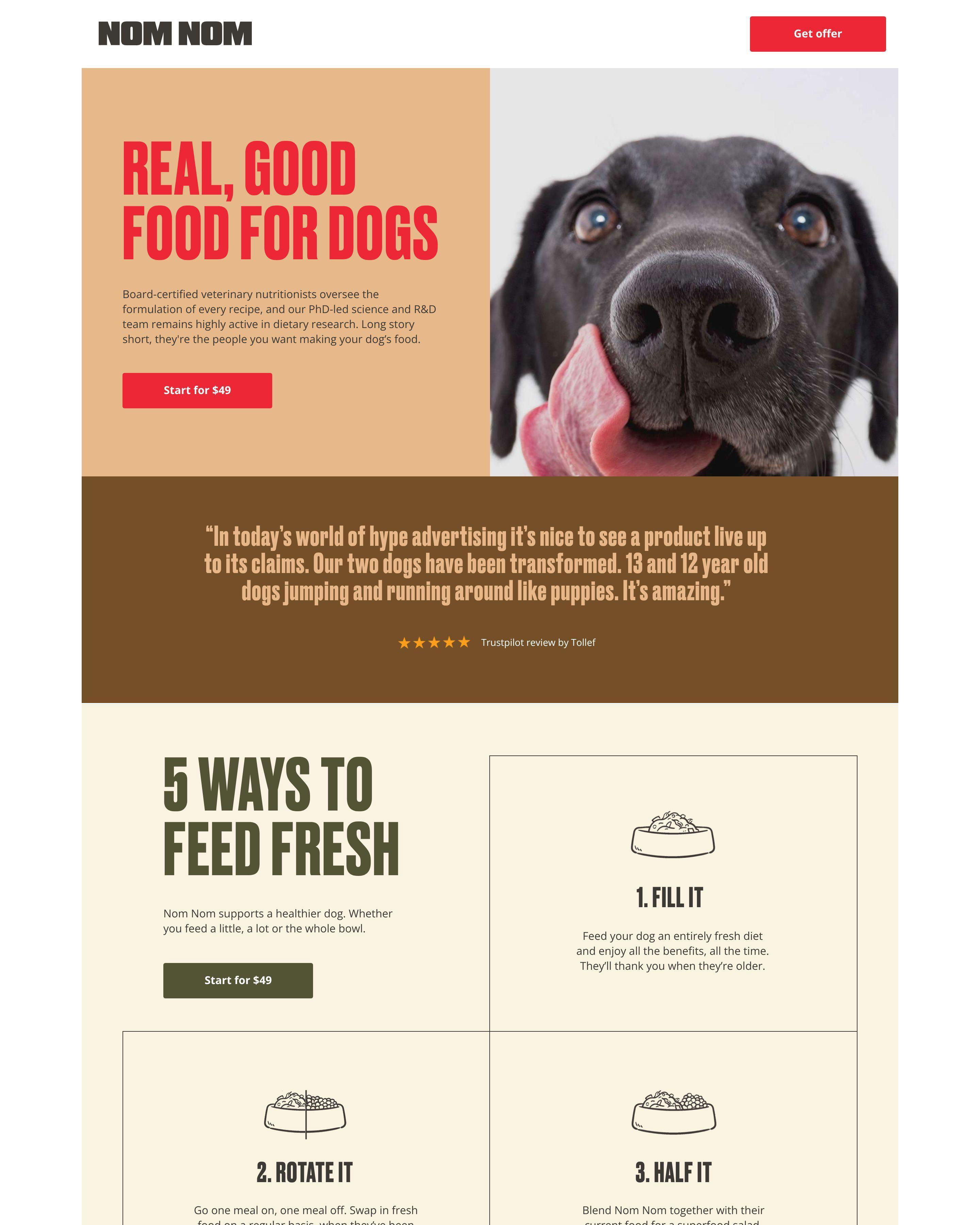
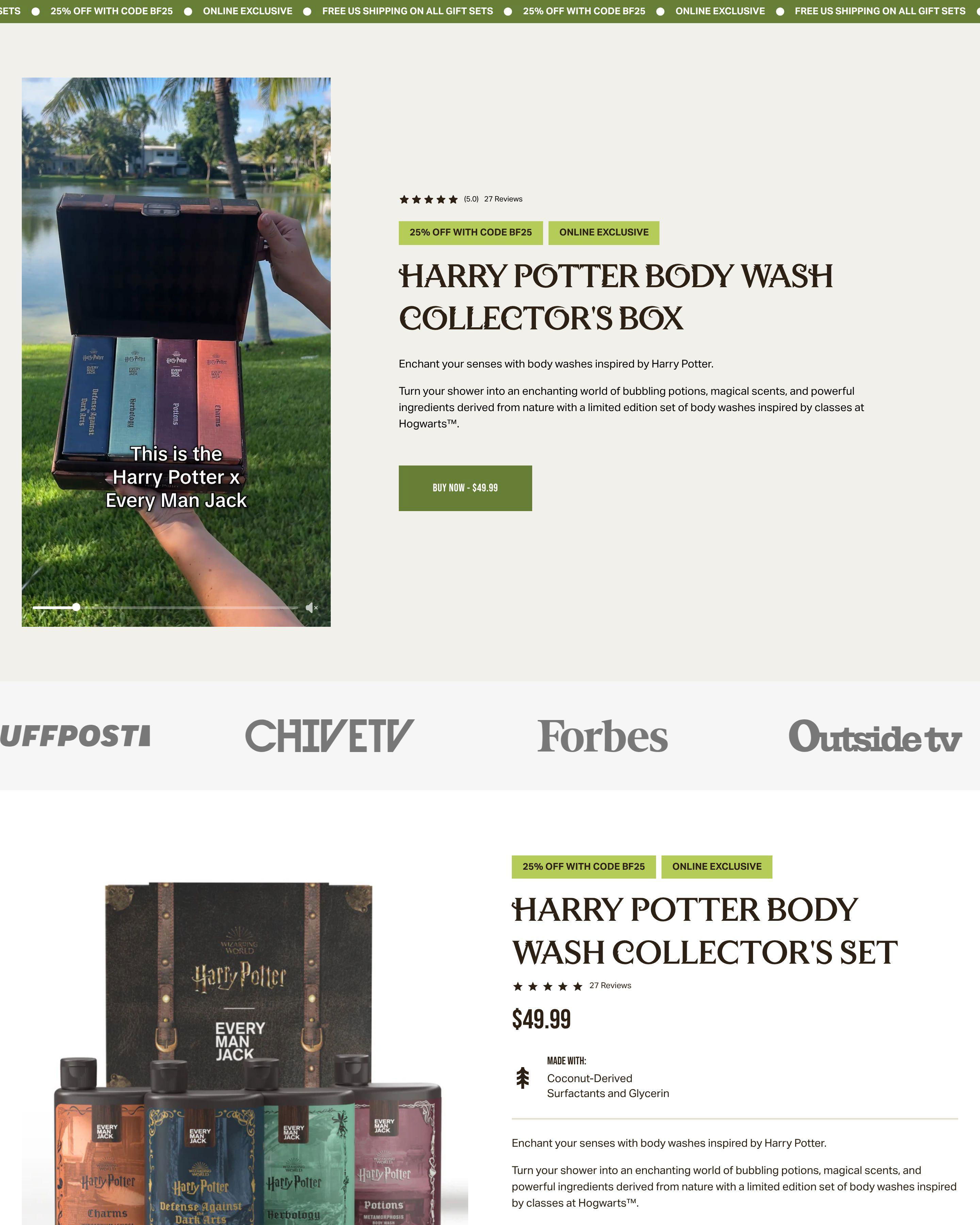
Sales pages have one job: close the transaction. Unlike lead generation or awareness pages, sales pages ask for money. Every element needs to justify the price and overcome purchase hesitation.
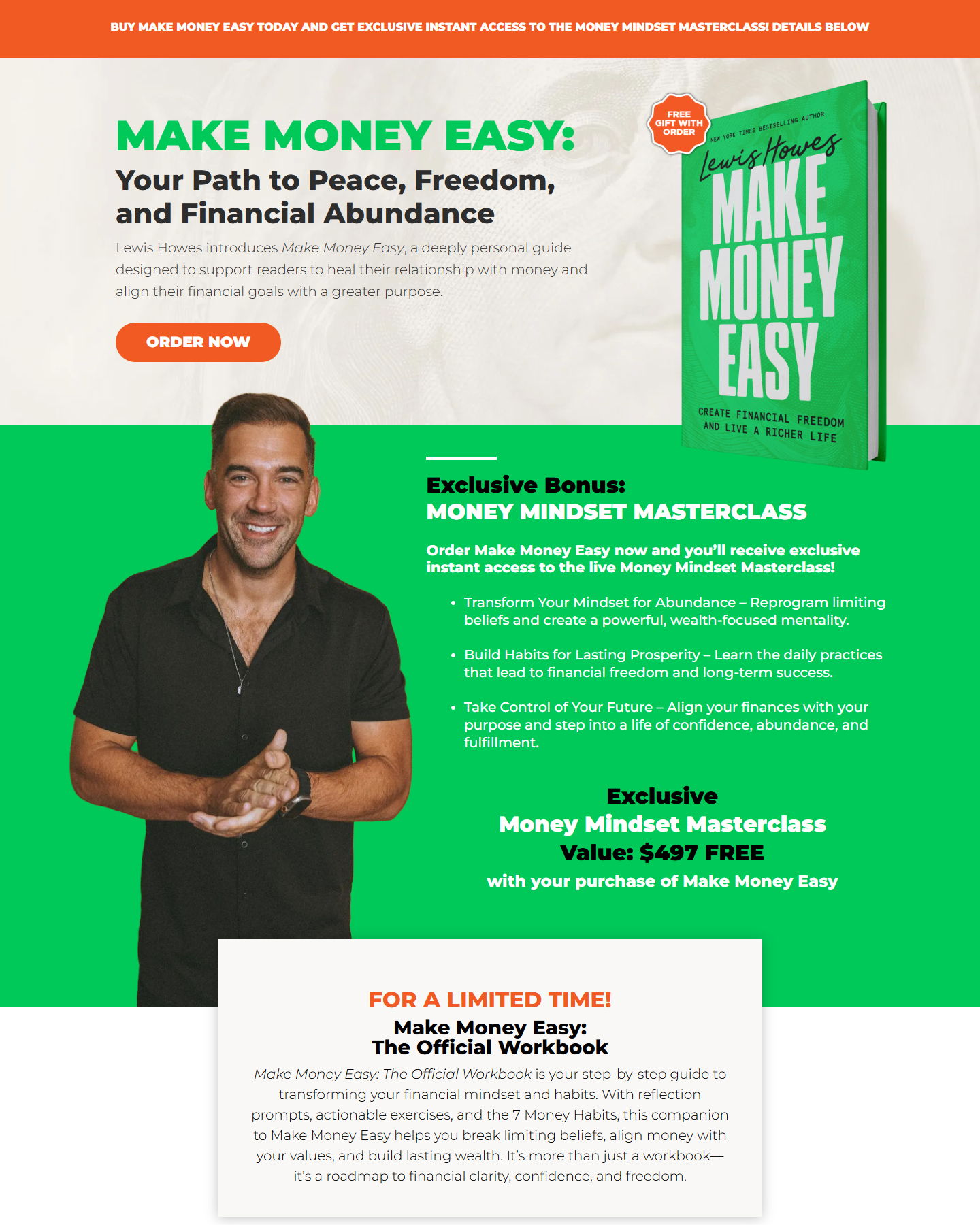
Robin Sharma's product pages sell books and courses directly. The pages establish credibility, communicate value, and make purchasing straightforward. Supply sells razors with clear pricing and immediate checkout options. Huel converts visitors into subscription customers with compelling offers and simple buying processes.
These pages share a common structure: hook the visitor, prove value, reduce risk, make buying easy. Skip any step and conversions drop.
See our expert picks: Best Landing Page Examples of 2026 →
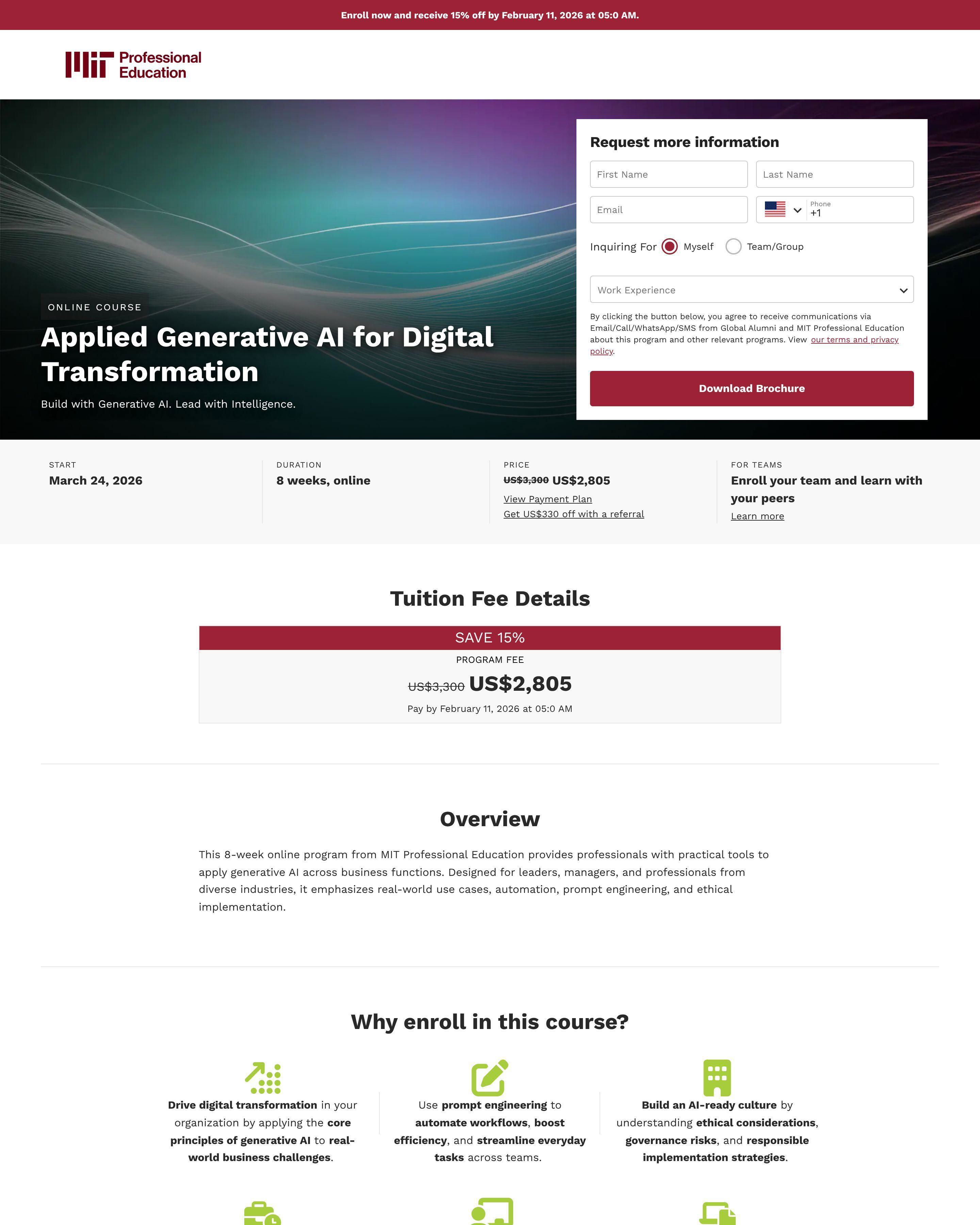
Pattern 1: Price Anchoring and Value Stacking
Blissy shows original price crossed out next to sale price. Marie Forleo's course pages list everything included to justify the investment. Kapable's leadership program demonstrates value through curriculum details. Visitors need to feel the price is fair relative to what they receive.
Pattern 2: Risk Reduction
Huel offers money-back guarantees. Supply includes satisfaction promises. Feals provides trial options for new customers. Sales pages need to address the question: "What if I do not like it?" Remove the risk and more people buy.
Pattern 3: Multiple CTA Placements
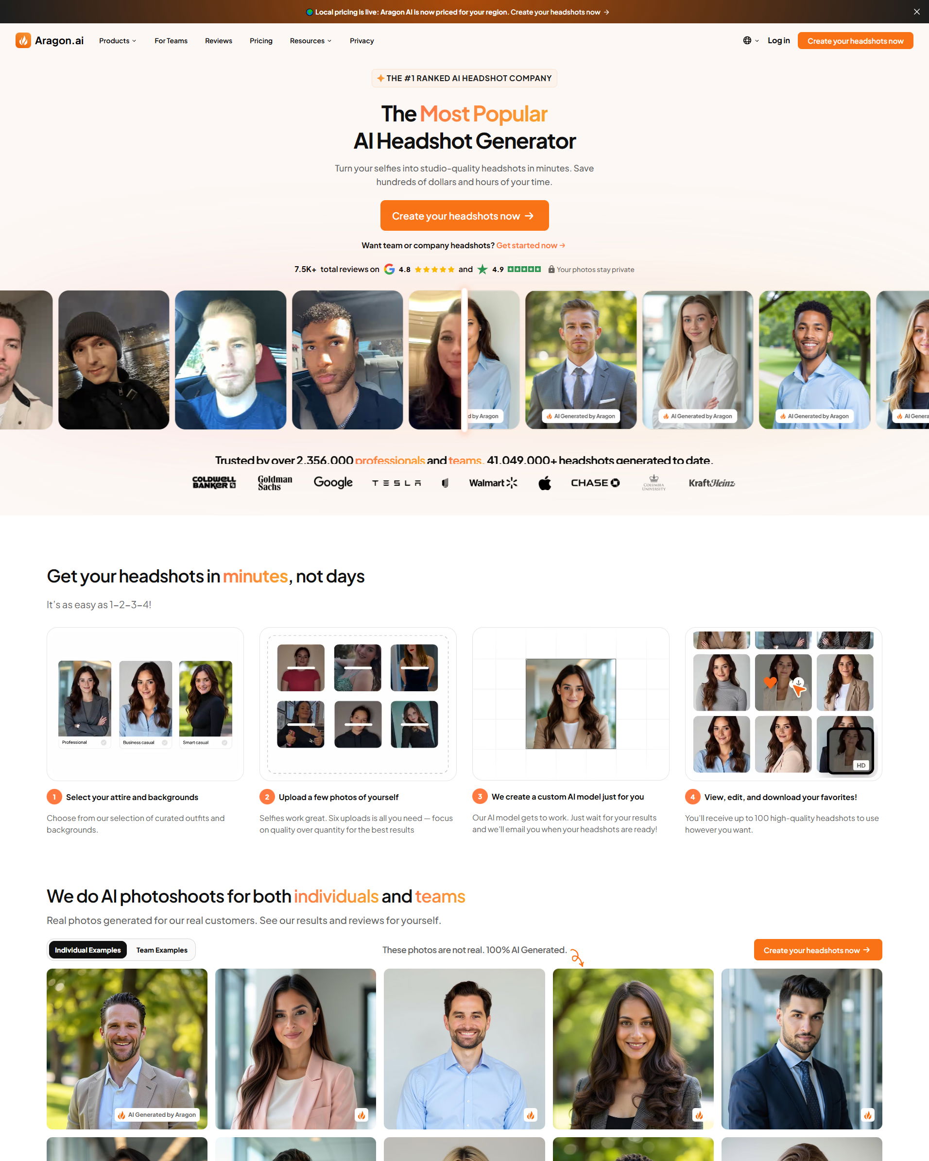
Jenna Kutcher's course pages place buy buttons at multiple scroll points. Robin Sharma's pages repeat the offer throughout longer content. Aragon AI makes purchasing accessible wherever visitors are on the page. Different people decide at different times. Be there when they are ready.
What makes a good sales landing page?
Clear value proposition with reduced risk. Supply succeeds because the product benefit is obvious and the guarantee removes hesitation. Truvani converts because the offer is compelling and purchasing is simple. Match your page intensity to your price point.
What conversion rate should a sales landing page achieve?
Direct purchase pages convert at 2-5% from qualified traffic. High-ticket courses like Marie Forleo's convert lower but generate more revenue per sale. Low-ticket products like Dose Daily supplements can convert higher. Judge success by revenue, not just conversion rate.
How long should a sales landing page be?
Proportional to price. Cometeer's coffee subscription page is moderate length. Brendon Burchard's high-ticket consulting pages are comprehensive. Low-price impulse purchases need short pages. High-price considered purchases need thorough justification.
What is the most important element on a sales landing page?
The offer and primary CTA. Huel makes the subscription value clear. Aragon AI shows pricing transparently. The page should communicate exactly what you get, what it costs, and how to buy within seconds of landing.