Landing Page Builder

Create a Thank You Page

The page that fires after the form submit, the checkout, the booking — that's where AOV, referrals, and show-up rates live. Generate one that does the work, in minutes.

No credit card required · 14-day free trial

Examples

Thank you pages built with one prompt

Eight post-conversion patterns, each tuned to a different funnel and audience. Pick the one that matches what just happened.

Post-Purchase OTO

"Create a thank-you page that fires after a Shopify checkout for a $48 vitamin C serum. Hero: a one-time-only bundle — 'Add the matching SPF moisturiser at 30% off — only on this page, expires in 15 minutes.'..."

DTC Skincare

Calendar-Book Second-Step

"Build a thank-you page for a B2B SaaS that just had a prospect download a 'Marketing Operations Audit Checklist' lead magnet. Hero: 'Skip the email back-and-forth — book your free 20-minute audit now.'..."

B2B SaaS Demo

Welcome Video + Activation

"Landing page that fires after a Stripe purchase for a $497 course on technical SEO. Hero: a 90-second founder welcome video, the buyer's name personalized in the headline, a 3-step activation checklist..."

Course Creator

Referral Queue

"Thank-you page after a newsletter waitlist signup. Hero shows the subscriber their queue position in a giant number ('You're #3,847 in line'), a unique referral URL with a copy button, and a tier reward ladder..."

Newsletter Pre-Launch

Community + Bonus

"Page that fires after a coaching client books a $2,400 12-week program. Hero: 'You're in. Here's everything that comes next.' Include the coach's welcome video, a Skool community invite button as the primary CTA..."

Coaching Program

Survey / Segmentation

"Build a thank-you page for a SaaS that just had a user start a 14-day trial. Hero: 'One quick question so we can show you the right onboarding.' One radio-group question with 4 options..."

SaaS Trial

App Download Bridge

"Landing page that fires after a user reserves their spot in a beta-app waitlist. Detect mobile vs desktop. On mobile: full-screen App Store + Google Play buttons sized for thumbs. On desktop: a giant QR code..."

Mobile-First Beta App

Webinar Reminder + SMS

"Thank-you page that fires after someone registers for a Thursday-7pm webinar on AI sales playbooks. Hero: confirmation banner with the date, time, and time-zone in 32px text. Three add-to-calendar buttons..."

Live Event

Build Your Thank You Page

No Credit Card Required | Try for Free

How It Works

How to create a thank you page

01

Decide What the Page Should Sell Next

The thank-you page is a second-step page, not a destination. Decide step two first: upsell, calendar booking, referral ask, welcome video. Get this right and the page does compound work — the AOV bump on Tuesday is still paying off in Friday's calendar bookings.

02

Gather the Assets the AI Needs

The headline, the upsell offer or calendar link, your referral mechanic, a 30–90 second welcome video, the destination CTA, and the downstream tool the page hands off to (Calendly, Stripe, ConvertKit, HubSpot, app store links).

03

Watch the AI Build Your Thank You Page

Paste your post-conversion brief into the prompt. The AI writes the confirmation headline, places the single primary CTA in the dominant slot, frames the supporting block around it, and adds the friction-reducer below — single-CTA discipline shipped by default.

04

Wire the Tracking and Publish

Point the form or trigger at your downstream tool. Add conversion tracking on the page URL — GA4, Meta Pixel, Google Ads, LinkedIn Insight all fire on URL match. Publish, drive traffic, and let the CRO agent flag what to test next.

Worth reading before you build

The page that fires after "yes"

important!

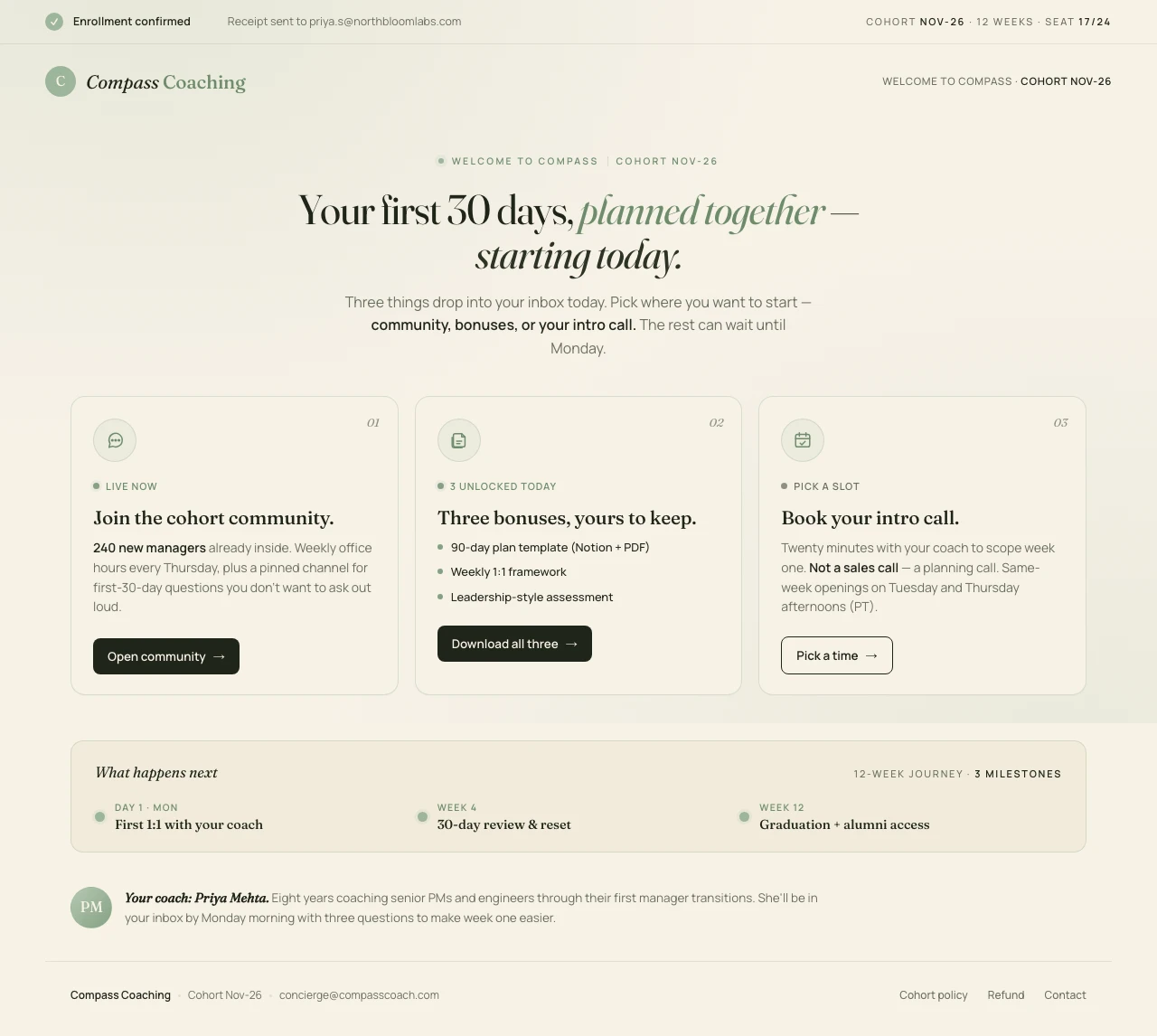
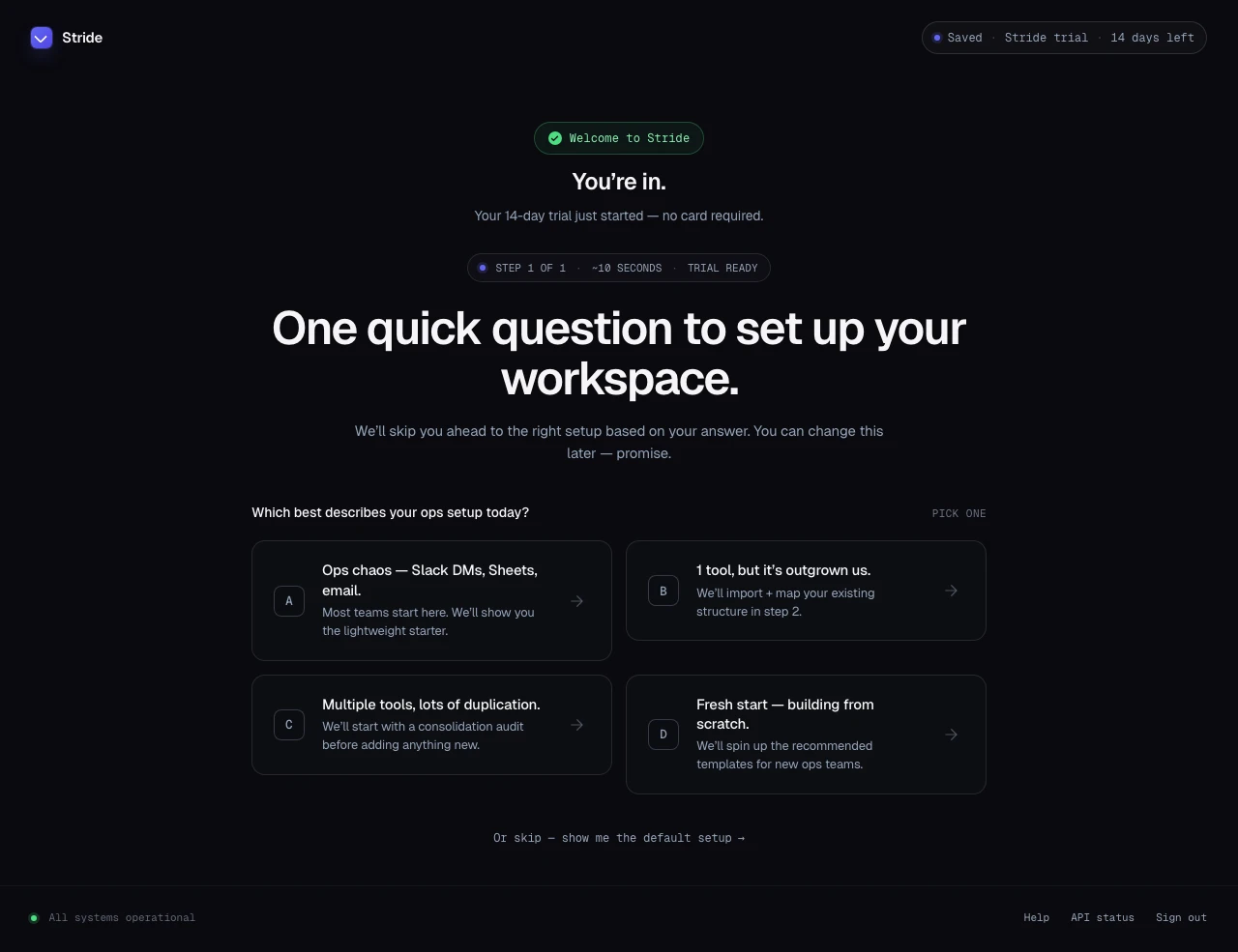
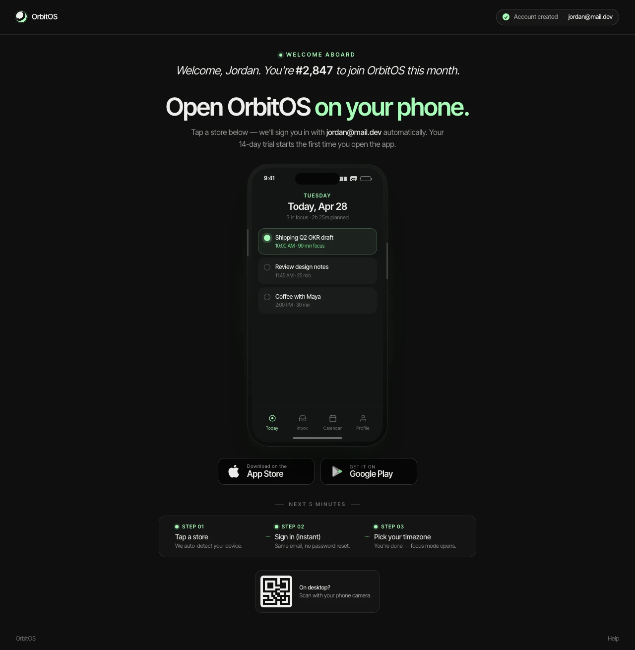
Most marketers are still shipping default thank-you pages. That's a quietly expensive mistake. The default page — the "Form submitted!" or "Order #1234 confirmed" screen that ships with every form tool, every checkout, every CRM — does one job: it confirms the action. Then it stops. The visitor's attention, trust, and willingness to take a second action are at peak in that exact moment, and the default page lets all three drain through the floor.

Stores that optimise their thank-you page see measurable lifts on three metrics simultaneously: average order value goes up 5–15%, referral traffic goes up 10–20%, and repeat-purchase rate goes up 8–12% (Convertcart 2026 benchmark). One page. Three lifts. No new traffic.

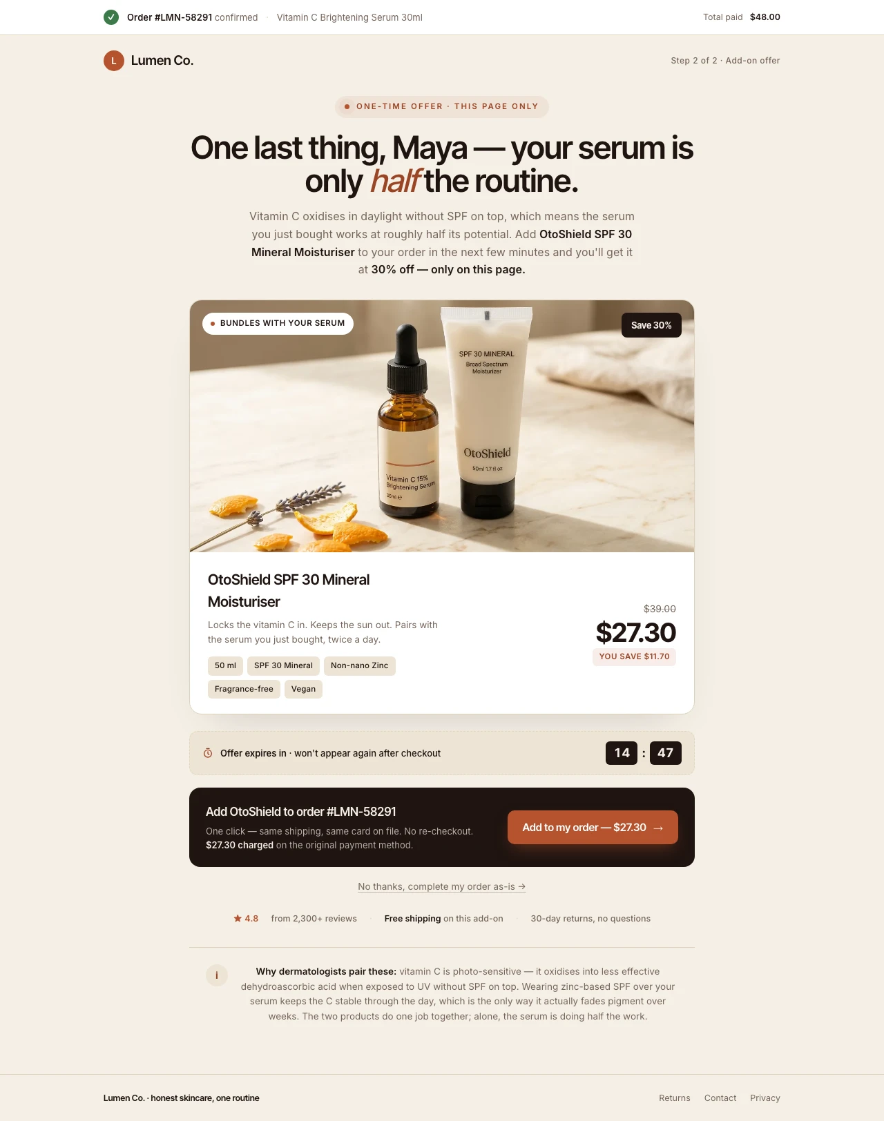
The post-purchase upsell is the cleanest example. One-click post-purchase upsells convert at ~4.7% on average; top performers hit 28%, and the average revenue from these offers represents 12.7% of total revenue at top stores (Focus Digital 2025 Upsell Report). Thank-you-page upsells (the slower-moving cousin where the buyer clicks an offer on a separate post-checkout page) sit lower at ~1.7% on the conservative side, but climb to 15% with focused implementations and 22% in the most aggressive mystery-offer tests. The math of running an upsell is one of the highest-margin moves in ecommerce — there's no acquisition cost, no ad spend, no new customer to convince. The buyer has already said yes; they're just being asked one more question.

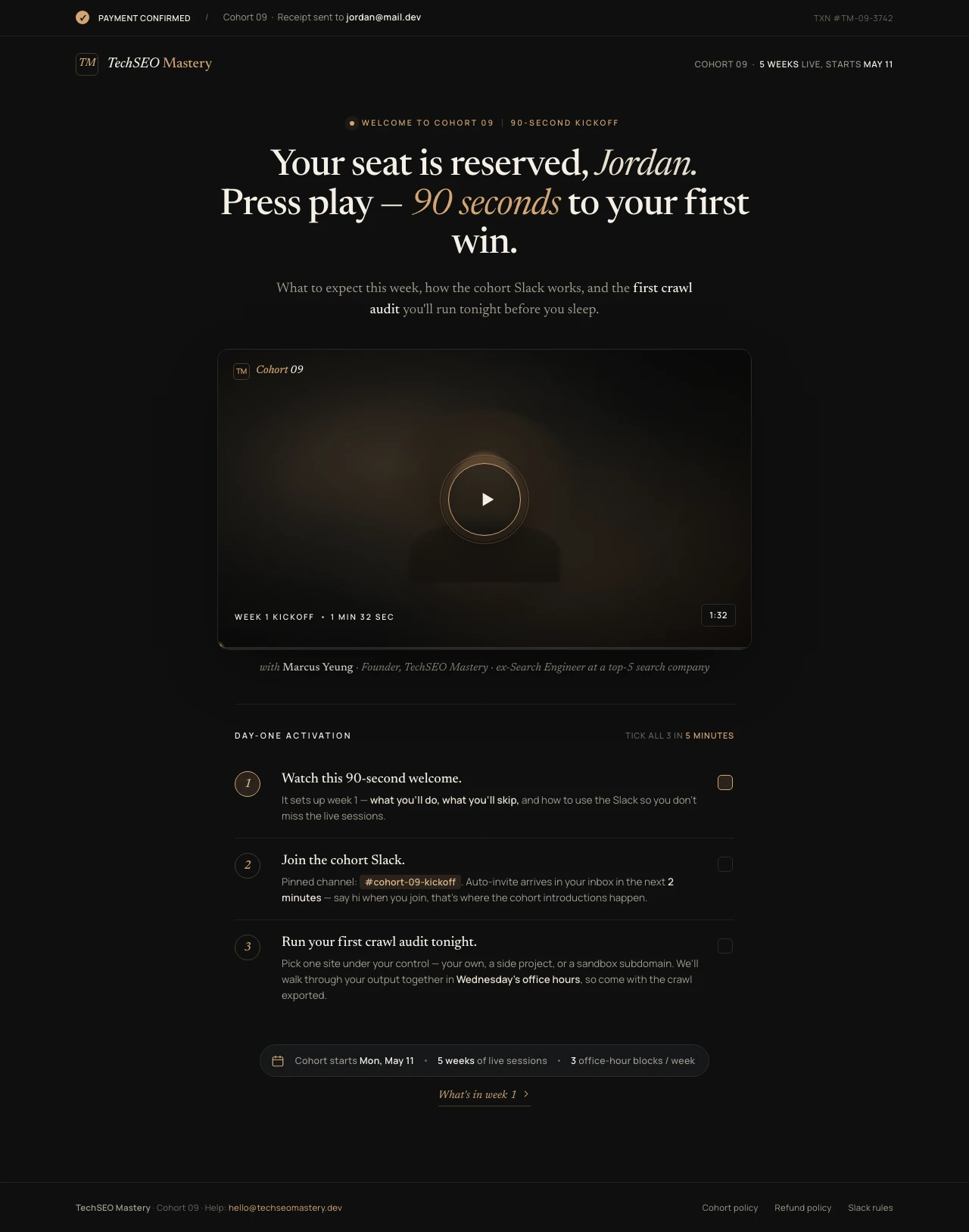
The referral mechanic is where the numbers get genuinely surprising. Robinhood's pre-launch waitlist hit 1 million users on the back of a thank-you page that showed each new signup their queue position and offered a share-to-jump-the-line mechanic. Harry's collected 100,000 emails in week one, with 77% from referrals triggered on the same kind of post-signup page. Morning Brew anchored its growth from zero to 1.5M+ subscribers on a give-X-get-X mechanic that fires the instant the new subscriber confirms. HexClad ran a similar play to drive $450,000 in referral revenue in the first 90 days at 92x ROI; Farm Hounds hit a 22.25% referral rate on $600K of referred sales. The pattern repeats because the principle is mechanical. The post-conversion moment is the only moment the buyer is standing inside the brand's promise — friction is at zero, advocacy is at peak, and a one-tap share button costs the user almost nothing in that emotional state. For a closer look at how a high-converting lead-gen page sets up the thank-you sequence that follows, the Anatomy of a High-Converting Lead Generation Landing Page is worth a read.

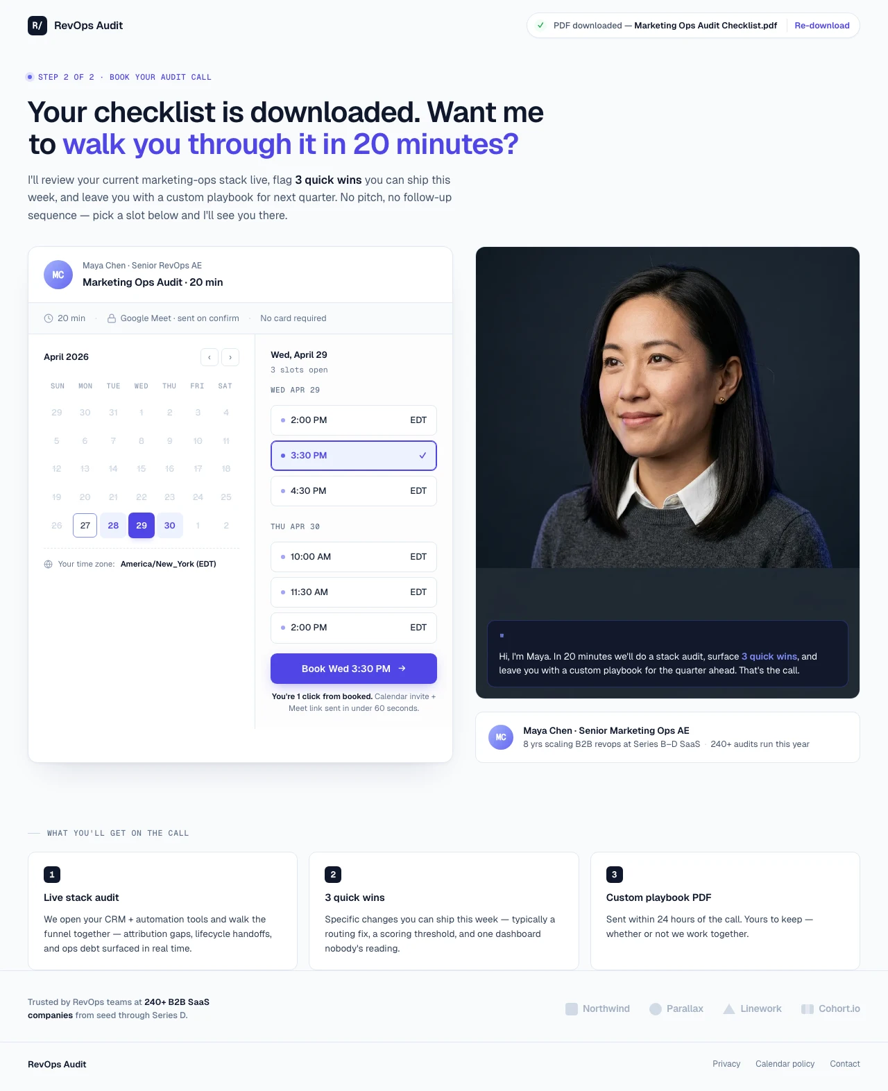
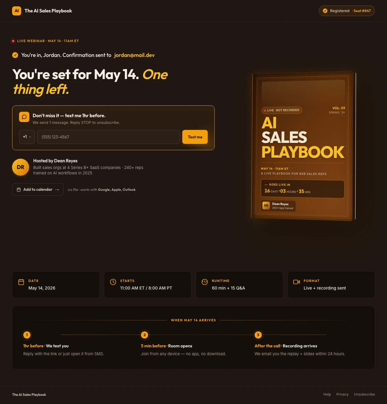
For B2B teams, the same surface unlocks a different mechanic: the calendar-book second-step. A lead-magnet thank-you page that embeds a Calendly or Chili Piper widget — framed as "skip the email back-and-forth" — routinely lifts demo-booking rate by 5–10 percentage points versus the default "we'll email you" wait. B2B SaaS thank-you pages with contextualised offers convert at 5–10%, vs 2.5–5% for direct demo CTAs (Powered by Search 2026). For webinars, the lift is even sharper. Text-message reminders triggered from a thank-you-page SMS opt-in increased webinar attendance from 11% to 68% — a sixfold increase (Mobile Text Alerts) — driven by the 98% open rate on SMS versus 20–30% on email reminders.

The friction in all of this isn't strategy. It's that most marketers ship the page once, never come back, and never measure it. A page with a single primary CTA converts at 13.5%, vs 10.5% for pages with five or more links — and that's the lowest-effort optimisation on the list. The thank-you page is also where attribution lives. A discrete thank-you-page URL is what GA4, Meta Pixel, Google Ads, and LinkedIn Insight all use to fire conversion events; an inline "submitted!" success state breaks attribution everywhere it touches. So even the marketer who isn't ready to add an upsell or a referral loop should still ship a separate thank-you URL — because without it, every downstream pixel is firing on a guess. For the post-conversion patterns marketers steal most often, the Lead-Magnet Landing Page Guide maps the second-step pattern that drives 60% of the wins. The operators who run this surface well share one habit: they don't think of the thank-you page as the end of the funnel. They think of it as the start of the next one.

Features

Everything you need to turn the second step into a second conversion.

Create a post-purchase OTO thank-you page

Any Thank-You Page — One Prompt Away

Post-purchase OTOs, calendar second-steps, welcome-video activation pages, referral queue mechanics, survey-segmentation pages, app-download bridges, webinar reminder pages. The AI builds the post-conversion page that fits your funnel — in minutes, aligned to brand.

Audit Complete

Idea: OTO conversion drops 40% past 8-min countdown — test 10-min.

Apply
Dismiss

CRO AI Agent

After launch, the agent watches scroll depth, share clicks, calendar bookings, OTO take-rate. Flags fixes you'd never spot in a heatmap.

Winner
14.2%
Variant A
vs
8.5%
Variant B

A/B Testing & Tracking

Test countdown duration (10 vs 15 min), referral reward tier, calendar slot density, survey-question phrasing, button copy ("Add to Order" vs "Get the Bundle"). Server-side splits, no flicker, statistical significance baked in. GA4, GTM, Meta CAPI, LinkedIn Insight — all wired by default.

99

Sub-Second Loads

Global CDN, sub-500ms loads worldwide. A 1-second delay cuts conversions 7%. Your buyer never bounces between the order confirmation and the upsell.

Mobile-First Pages

82.9% of post-conversion traffic is mobile. Smart Pages ship a swipe-based mobile UX with persistent CTA, thumb-zone buttons, and a sticky offer that doesn't get scrolled away.

What's your team size?
Solo founder
Marketing team 2–10

Smart Forms & Surveys

One-question survey segmentation. SMS opt-in for webinar reminders. Multi-step lead-qualification post-form-submit. Conditional logic that personalises the next step based on the answer.

SP

CRM, Email & Tool Integrations

HubSpot, Salesforce, Mailchimp, ConvertKit, Klaviyo, Zapier, Calendly, Stripe. Buyer is tagged + routed into the right nurture sequence the moment the page fires.

OTO
15-min only
$48
14
52
08
Add to Order

Funnels, Cart & Checkout

Built-in countdown timers for OTOs, post-purchase upsell flow, Stripe / PayPal / Razorpay checkout. The thank-you page sits inside a real funnel, not a static URL.

Startup
$29
Marketer
$69
/mo

Pricing Built for Operators

Start at $29/mo. No per-conversion fees. No traffic caps. Run the same thank-you page across every funnel for the same price as one. Unlimited A/B tests, integrations, analytics — all included.

Social Proof

Trusted by 7,000+ teams worldwide

4.8
★★★★★
G2
4.9
★★★★★
Capterra
300+ reviews
Conversions
★★★★★

"Conversion is incredible — I have an opt-in page that's converting 70%+ of visitors. The mobile experience is great. SwipePages is also super fast in performance."

David P.

Senior Strategist · G2

Speed
★★★★★

"The whole process of publishing a brand new landing page only takes 5-10 minutes top."

Kritcha B.

Owner · G2

Single CTA / Funnel Fit
★★★★★

"It's been so helpful for me in building and hosting fast and beautiful landing pages. It's effortless to use and does a great job at tracking my leads."

Vivek G.

Co-Founder · G2

A/B Testing
★★★★★

"I love the visual funnel builder, the page builder, the ability to easily add and manage global scripts and SEO metadata, and obviously the A/B testing feature."

Rick H.

Capterra

Mobile
★★★★★

"Swipe Pages is the perfect landing page builder for any marketer looking to create optimized, mobile-friendly landing pages quickly. For us, this service saves a lot of time."

Vitali K.

CEO · G2

Integrations
★★★★★

"Easy way to create landing pages for your business. They have integrations with most of the popular CRMs and email service providers, so connecting your business is super easy."

Hoang P.

Marketing Specialist · G2

Agency Fit
★★★★★

"For clients with regular business websites who want to make a new promo and generate more leads, we don't need to install a ton of plugins or make endless optimisations on main-websites. Because now we use Swipe Pages."

Daniel V.

Project Manager · G2

Ease of Use
★★★★★

"From zero experience with landing page builders, I was able to create a completely working landing page using swipepages in less than a day!"

Peter L.

BDM · Capterra

Value
★★★★★

"A wonderful tool to have in our collection as an agency."

Nebu K.

Marketing Consultant · Capterra + G2

FAQ

Frequently asked questions

Because the default screen loses three things at once: revenue, attribution, and trust. The buyer just said yes to your offer — their attention, trust, and willingness to take one more action are at peak in that exact moment, and the default screen lets all three drain to zero in the time it takes to read four words.

The revenue loss is the most measurable. Stores that ship a designed thank-you page see AOV go up 5–15%, referral traffic up 10–20%, and repeat-purchase rate up 8–12% (Convertcart 2026 benchmark) — without a single new visitor. One-click post-purchase upsells alone convert at ~4.7% on average; top performers hit 28% (Focus Digital 2025). Even the slower thank-you-page upsell pattern lands at 1.7% on the conservative side and 22% on the most-tested mystery-offer variants. None of those numbers are available on the default screen.

The attribution loss is structural. GA4, Meta Pixel, Google Ads, and LinkedIn Insight all rely on a discrete thank-you-page URL load to fire the conversion event cleanly. A same-page success state breaks attribution everywhere it touches — every downstream report (cost-per-lead, ROAS, channel performance, retargeting audience exclusions) becomes guesswork. Even teams that aren't ready to add an upsell should ship a separate thank-you URL purely because the math without it is broken.

The trust loss is the quietest of the three but the longest-tail. The default screen tells the buyer your funnel ends at the form. The designed page tells them they've joined something — and that next step (a video, a referral, a calendar booking, a community invite) is the start of the relationship, not the end of the transaction. That impression compounds across the next 30 days of email and retargeting.

Every thank-you page that converts shares the same eight elements, in roughly this order. Skip any of them and the page leaks.

A confirmation headline that resolves "did that work?" in one sentence. "Order #1234 confirmed — your serum ships Tuesday." Specific. Calm. The buyer's brain can stop checking and start paying attention to step two.

One — and only one — primary CTA. The upsell button, the calendar embed, the referral share button, the welcome video play, the App Store link. Pages with a single primary CTA convert at 13.5% vs 10.5% for pages with five or more links. Two CTAs cut the conversion rate in half — every time.

The supporting block tuned to the primary CTA. If the CTA is an upsell, that's a real countdown timer, the bundle product card, and one decline link. If it's a calendar, that's the AE photo + 2-line bio + the embedded widget. If it's a referral, that's the queue position number, the unique link, and the share buttons. The supporting block exists to make the CTA easier — not to compete with it.

A friction-reducer below the primary CTA. A short FAQ. A single review. An expectation-setter ("You'll get the PDF in 2 minutes. Plus weekly emails — unsubscribe anytime"). This block exists to neutralise the one objection that would have killed the click.

Mobile-first design. 82.9% of post-conversion traffic is mobile (industry benchmark, 2026). The CTA, the countdown, the calendar embed, the QR code — they all need to work thumb-first on a 375px viewport. Test on a real phone, not browser dev-tools.

A discrete URL. /thank-you-purchase, /thank-you-demo, /thank-you-ebook — one URL per funnel. Not a same-page state. Required for clean attribution and for retargeting carve-outs.

The original-action receipt at the top. The order confirmation, the appointment time, the download link. It sits above the upsell or referral, never replaces. Honour the original action first. The trust this builds is what makes the secondary action feel like an offer, not a switch-and-bait.

One small "what happens next" sentence. "Your downloads are on the way. Watch your inbox at 8am tomorrow for the welcome email." Sets expectations, reduces support tickets, and bridges to the email sequence.

The eight blocks combine to do one job: turn the moment after "yes" into a second yes.

The patterns split by funnel stage but share the same six rules.

Match the page to the action that just happened. The lead who downloaded a checklist gets a calendar-book second-step. The buyer who placed a $48 order gets a 15-minute one-time-only bundle. The webinar registrant gets a calendar-add + SMS reminder. The newsletter subscriber gets a queue-position + share mechanic. Pattern-match wrong and the page feels off — like getting a sales call after asking for a brochure.

Make urgency real. A 15-minute countdown on a post-purchase OTO is fine if the offer truly disappears. A countdown that resets every page-view is the single fastest way to teach customers to distrust your funnel. Real urgency lifts AOV 5–15% with no measurable refund-rate impact; fake urgency tanks the second-purchase rate that compounds over the next year.

Always show the original receipt above the next-step offer. "Your order #1234 is confirmed — your bundle offer below" beats "Get the bundle now!" by a long mile. The receipt earns the right to ask the next question. Without it, the upsell reads as a switch.

One CTA per page. This is the rule operators violate most often — usually because the marketing team and the support team and the success team all want a button. Pick the primary one, demote the rest to footer links. Single-CTA pages convert at 2–3x the rate of multi-CTA pages.

Mobile first, real device test. Smart Pages, swipe-based mobile UX, persistent CTAs, thumb-zone buttons. Test the SMS opt-in flow on an actual phone — not a Chrome dev-tools resize. The post-conversion mobile experience is where the deepest leakage happens.

Wire conversion tracking on the page URL itself. GA4 marks the URL as a conversion event. Meta Pixel fires on URL match. Google Ads conversions and LinkedIn Insight do the same. Use UTM parameters on every paid campaign that ends here, and split the URL by funnel (/thank-you-demo, /thank-you-purchase) so attribution stays clean per channel.

Bonus rule for B2B teams: the calendar embed beats the email sequence. A Calendly, Chili Piper, or SavvyCal widget embedded on the thank-you page after a lead-magnet download books prospects directly into AE calendars 4 hours later — cutting the email back-and-forth that loses 40% of leads to inbox decay. The most-effective B2B thank-you-page pattern by documented conversion lift.

The thank-you page has its own metric stack — separate from the lead-gen page that fed it.

Primary KPI: secondary-action take-rate. What % of visitors who hit the page take the second action? OTO purchase rate. Calendar booking rate. Referral share rate. SMS opt-in rate. App-download rate. The denominator is everyone who landed on the page — not everyone who took the original action — because some buyers bounce between the form submit and the thank-you-page load. Benchmarks vary wildly by pattern: post-purchase OTO 4.7% average / 28% top, calendar-book 8–15%, SMS opt-in 35–55%, referral share 8–25%.

Secondary KPIs:

Original-action completion rate. What % of visitors who hit the thank-you page actually completed the original action (the order, the form, the booking)? Below 95% means the redirect is firing too early — usually a Stripe webhook timing bug or a Calendly callback misconfiguration.

Second-action revenue or value. AOV on OTOs. Pipeline-from-calendar-booking on B2B. Referral-driven signup count on waitlists. The dollar (or signup) impact of the page itself, not the funnel.

Page-bounce rate. % of visitors who land and leave without any second-action click. Above 60% on a designed page signals headline-mismatch with the original action — usually the page is selling something the buyer didn't want yet.

Mobile vs desktop split on the second action. If desktop converts 4× higher than mobile on the second action, the mobile experience is broken (button too small, countdown not rendering, calendar embed clipped). Fix it; mobile is the majority of traffic.

What to A/B test, in order of impact:

1. The primary-CTA framing — "Add to My Order" vs "Get the Bundle" vs "Yes, Add for $14" vs "Make It a Set". Wording moves rate by 20–60% on identical offers.

2. Countdown duration — 10 vs 15 vs 20 minutes for OTOs. Shorter usually wins until it doesn't.

3. Reward tier on referral mechanics — 3-share vs 5-share thresholds, what the rewards actually are, whether to show the leaderboard. Small numbers, big lifts.

4. Survey-question wording on segmentation pages — the specific phrasing of the radio-group options drives 40%+ swings in click-through to the personalised next step.

5. Original-receipt placement — above vs adjacent to vs collapsed under the secondary-action block. Trust-driven optimisation that compounds over the funnel's first 30 days.

Essential analytics setup: GA4 marks the discrete thank-you-page URL as a conversion event. UTM parameters on every paid campaign. Meta Pixel and LinkedIn Insight fire on the URL match. CRM integration so every secondary action (booking, share, OTO purchase) is attributed back to the original campaign that drove the first conversion. A separate thank-you URL per funnel (/thank-you-demo, /thank-you-purchase) so attribution stays clean per channel.

Thank-you pages live or die on a short list of variables: speed-to-ship, single-CTA discipline, mobile execution, integration depth, and A/B testing cadence. Swipe Pages is built around those variables.

An AI that builds the whole page from a post-conversion brief. Describe what just happened (form submit, purchase, booking, signup) and what the buyer should see next (upsell, calendar, referral, video, app download), and the AI drafts a confirmation headline that resolves the "did that work?" tension, places the single primary CTA in the dominant slot, and frames the supporting block around it. Single-CTA discipline is shipped by default — not bolted on after launch.

Every thank-you page pattern, one prompt away. Post-purchase OTOs. Calendar second-steps. Welcome-video activation. Queue-rank referral mechanics. Survey segmentation. App-download bridges. Webinar reminders with SMS opt-in. You don't need a different builder for each pattern — one prompt, any post-conversion page.

Smart Forms for surveys, segmentation, and SMS reminders. One-question segmentation surveys to personalise the email sequence. SMS opt-in fields for webinar reminders that lift attendance from 11% to 68%. Multi-step lead-qualification forms when the post-form-submit flow needs more than one screen.

CRM, calendar, and checkout integrations that matter. HubSpot, Salesforce, Mailchimp, ActiveCampaign, ConvertKit, Klaviyo, Zapier, Calendly, Stripe, PayPal, Razorpay. The moment the page fires, the buyer is tagged, segmented, and routed into the right downstream flow — no CSV export, no 24-hour sync delay, no broken Zap on a Wednesday morning.

A/B testing built in, server-side, no flicker. Test countdown duration in week one. Test referral reward tiers in week two. Test calendar slot density in week three. Every test runs server-side with statistical significance baked in — no third-party tool, no flicker, no off-brand variant.

CRO AI agent watching the page after launch. The agent flags patterns humans miss. "OTO take-rate drops 40% past minute 8 — test 10-min countdown." "Mobile referral shares are 3× desktop — surface the share buttons higher on mobile." "Calendar booking concentrates on Tuesday slots — open more Tuesday capacity." An always-on CRO analyst that sees the leaks before you do.

Sub-second loads, globally. Global CDN, sub-500ms loads. The buyer never sits between the order confirmation and the upsell waiting for a script to fetch. A 1-second delay cuts conversions 7% — and on a thank-you page, the conversion is the second purchase, not the first.

Personalisation at scale. One thank-you page, ten audiences. Swap the headline for newsletter subscribers vs paid buyers. Swap the upsell for the matching SKU based on the cart contents. Swap the calendar AE based on the lead's company size. Same template, ten different message-matches, ten different funnels.

Pricing that doesn't punish growth. Start at $29/mo. No per-conversion fees, no traffic caps. Run thank-you pages across every funnel for the same price as running one. A/B testing, analytics, all integrations — included. No surprise bill on a Monday morning when traffic spikes.

7,000+ customers, 300+ reviews at 4.8–4.9 average, 14-day free trial, no credit card required. For operators who treat the post-conversion surface as the second funnel (not the end of the first), this is the builder.

Start building your thank you page

Go from "Form submitted!" to a real second-step page in minutes. Single CTA, mobile-first, integrated with your CRM, calendar, and checkout. 14-day free trial, no credit card required.

No credit card required · Instant setup